(5 years and 3678 days ago)
Photography and photoshop contests
We are a community of people with
a passion for photography, graphics and art in general.
Every day new photoshop
and photography contests are posted to compete in. We also have one weekly drawing contest
and one weekly 3D contest!
Participation is 100% free!
Just
register and get
started!
Good luck!
© 2015 Pxleyes.com. All rights reserved.

Awesome job! high-res lookes flawless. Excelent job leading to infinity!
I'm sure I saw the similar photo elsewhere but I can't find it again, this is the other one (http://rawimage.deviantart.com/art/Little-Helpers-32835969). However, I don't think you copy any idea and this is the accidental resemblance. High vote from me
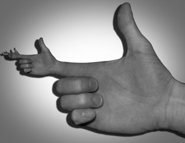
I love the idea here but it isnt flawless IMHO. The shadow is kinda dark and the render itself is kinda rough. Good luck
Langstrum, I swear I've never seen this image before. I honestly thought up the idea myself. Barnacle, I think the shadow is fine. You really have to be more specific as to what you mean by "render is rough".
No problem, I believe in you, as I mentioned. Just a kind of funny thing that many people come up with the same idea when they didn't know the other. The author of the photo that I gave the link also listed so many other works did the same thing
Hi, What i mean by "the render is rough" is, the outside of the thumb has a dark line around it, it doesnt happen in real life. And, The shadow (imo) should be more opaque. I like this but....
Use the pen tool, zoom in to the creases in the hand and cut out that black.... whatever it is
I'm sorry Barnacle, I usually respect your opinion but this is not one of those times. There's no dark line. That's shadow. I'm not changing it.
BTW, polygonal lasso tool is much more effective.
Langstrum, I saw that comment you left and I left them one as well. The image is in a PXL blog.
great work author...i would love to see its coloured version..good luck
I was going to make it colored at first but after trying a desaturated version I like it more.
LOL, ok, I wasn't talking about the shadow, look at the outside of the thumb, the right side of it, there is a dark line around it. Given the fact you have a shadow on the inner part of the hand, one would think the opposite side would be bright. Its kind of a law of bright and darkness . I couldn't care less if you change it or not. I say what I see. Good luck mate

Edit: oh it's you lol, that explains a few things
Our imagination starts bubbling when we see images like this! Nice!
Shadow is wrong...light source in source photo is from slight upper left. Added shadow is opposite.
Yeah Bob, I guess you got a point but honestly I can't change it anyway. I accidentally flatted the PDF and would have to start over to fix it. I think the shadow is very subtle to begin with and don't feel it's much of an issue.
Cool idea. Very original.
Very nice...good luck author
Howdie stranger!
If you want to rate this picture or participate in this contest, just:
LOGIN HERE or REGISTER FOR FREE