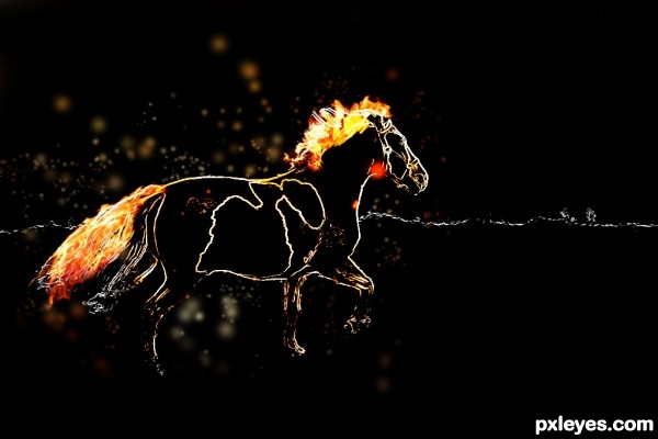
(5 years and 3087 days ago)
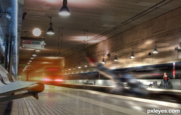
I added the feets and maded some lightning effects with clouds, and some burning effects. (5 years and 3124 days ago)
Howdie stranger!
If you want to rate this picture or participate in this contest, just:
LOGIN HERE or REGISTER FOR FREE
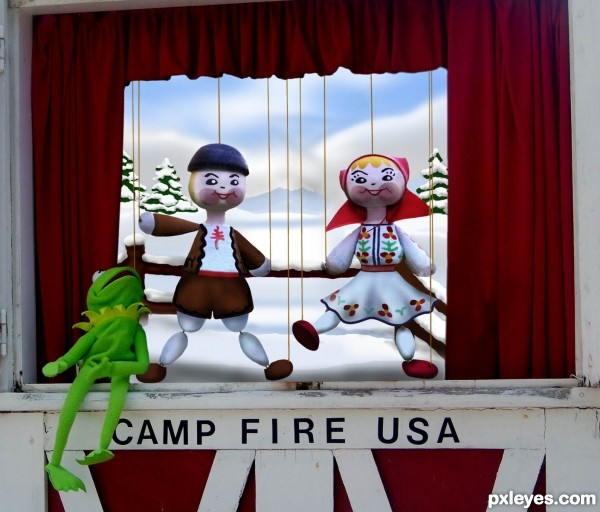
This puppet theater was at our county fair last year and seemed to be inviting these two little cuties for a performance. Kermit seems to like them!! (5 years and 3168 days ago)
Very Cute! 
very nice neat work...GL author
very good work, love the whole idea  Good Luck!
very nice work.......GL!!
Congrats!!
Howdie stranger!
If you want to rate this picture or participate in this contest, just:
LOGIN HERE or REGISTER FOR FREE
(5 years and 3206 days ago)
good imagination......
Great chop!
this is awesome! great creativity.
fantastic composition! good luck author!
thanks guys!
great sources. good balance of colours and a creative use of source.
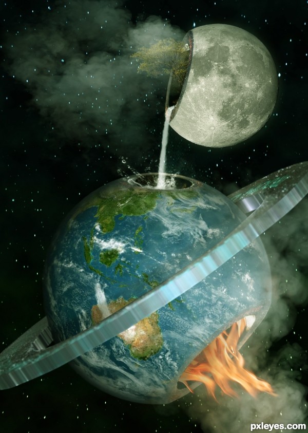
Nice surreal image! I like everything except for the texture on the ring. Although I can't recommend any solution to make it better. Good luck!
I'd get rid of the ring, less is more, you have a great concept, the ring doesn't have anything to do with it, and catches up the eye too much...
Oh happy day!!! wonderful imagination 
Mike is totally right on the ring, it's distracting.
Beautiful, but I hope such dreams will never come true 
Howdie stranger!
If you want to rate this picture or participate in this contest, just:
LOGIN HERE or REGISTER FOR FREE
Only source used. See SBS.
Please view in High Res. (5 years and 3206 days ago)
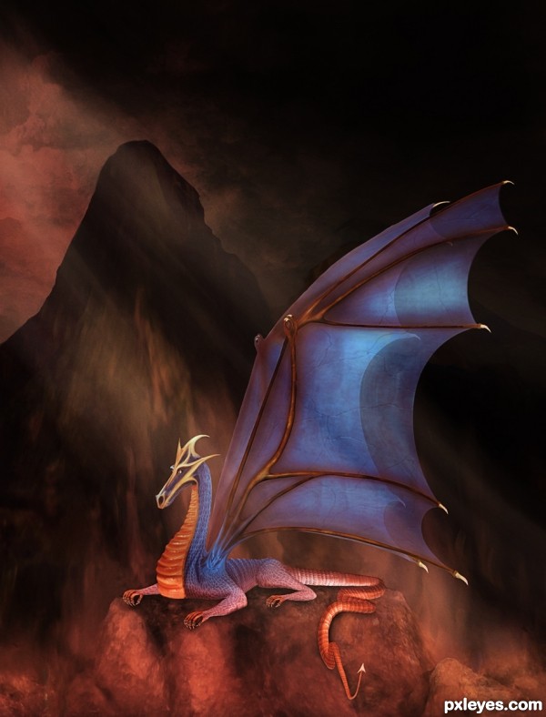
The "pedestal" the dragon is sitting on lacks depth. Even in high res, the dragon appears to be floating, rather than sitting on it. The shading under the dragon is causing this, as you have dark shadows on his belly, but the pedestal is light colored. The diagonal light shining down from the upper LH corner compounds the inconsistency.
Edited! Decided I didn't need sleep and agreed with Mossy so did what I could ... it is now a vertical image and I have done work on the pedestal to make it stand out more ... part of the darkness on the bottom of the dragon is because is heating up 
I don't have time to change the SBS but at least that way you can get an idea of what it looked like originally 
Nice entry....Love the dragon... good luck. The colors are just beautiful...
Excellent work, terrific sbs too, nice to see the original in the sbs, I think the edited version is much better though... GL 
fantastic work.., dragon is perfect and beautiful. good luck author.. 
I agree the edited version is much better, puts greater emphasis on the dragon which is so well constructed! Definitely check out the high res! 
Fabulous piece of work. Your SBS is amazing too. Work on a dragon is master piece. Great drawing but after that fantastic usage of the source image. This goes instantly to my favorites...very very well done
awesome! lots of work on this one
Amazing! 
OUTSTANDING! Can really tell this took quite a bit of time and coffee to put together. Good Luck author.
Thank you so much everyone! 
I almost didn't submit this one as I was running out of time and, yes, you are right Rod it took a lot of coffee!
This was something I have had in mind for a long time (I played with drawing the dragon a while ago and gave up); when I saw the seeds on the bun I felt it was time to go for it asI thought they would work quite well for the scales!
That was awsome....congrtulations for second.....!
Congrats Arca, it is one of the best dragons ever made in Pxleyes 
congrats...!
Congrats
Congrats on 2nd place!
Congrats... Nancie....
Congrats!!
great art! congrats
Howdie stranger!
If you want to rate this picture or participate in this contest, just:
LOGIN HERE or REGISTER FOR FREE
nice blending
Howdie stranger!
If you want to rate this picture or participate in this contest, just:
LOGIN HERE or REGISTER FOR FREE