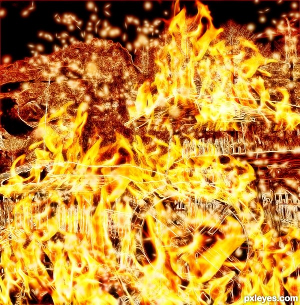
poor windmilk
dancing in fire (5 years and 3538 days ago)
- 1: source1
(5 years and 3544 days ago)
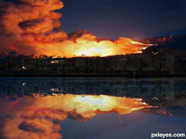
the reflection could use some work but cool pic
very intensive fire. GL author
What a catastrophic scene!
Howdie stranger!
If you want to rate this picture or participate in this contest, just:
LOGIN HERE or REGISTER FOR FREE
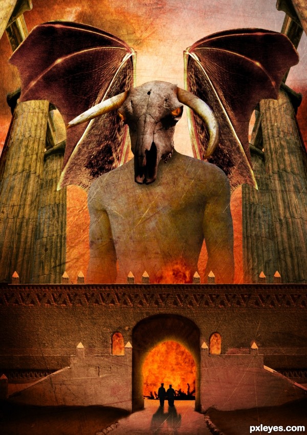
Thanks to Tilemahos Efthimiadis, Joyrex, Dave Hamster, Scallop Holden, Zeusandhera, Night_fate, Thomasje, Iversonic and Mimiliz for the lovely stock images ;-)
I found the inspiration for this work in a photoshop magazine of a friend. The name of the artist who describes a tutorial of something similar to this one is Adam Smith. Thx ;-)
comments are most welcome... (5 years and 3546 days ago)
Dunno why the wings are transparent, but it's a good idea & mood. IMO a bit texture heavy, but that's just me...good luck. 
Thx Cmyk46, i'm going to leave it like that for now  but like i said, comments are welcome. I spend a lot of time on this one
woohoo, love it author  its out there for sure :p
The scale is fantastic.. you can really tell you spent a while working with this one. I personally don;t like using textures much but i think you used them very well on this occasion. The silhouettes are a nice touch, but the building should cast the same strong shadows as they do.
Great overall work  Good luck!
Pretty nice scale on the things. But I would make the wings a lot bigger and work with the edges of the wings, as well as making them non-transparent. Could add some bones/veins or something on them to make them more realistic. They look pretty much cut/copy/paste/too big pencil when cleaning the edges now. Or you could try inner shadow effect for the wings. There are also some bit careless masking of the edges. Work with the windows and there is a major left-over from a colour mask on the right edge of middle part.. some dark trash there. Nice colours and eye sockets, worth working a bit more..
Very nice entry, that reminds me an illustration about mythic creatures. GL!
wow, awesome!
Thx Widiar, i will do something about those problems 
Good job with the wings, looking so much better now..
Thx for the nice comments 
great concept author...good luck
Thx 
Wish nobody to get to that gates 
Yep, it won't be a lot of fun 
Howdie stranger!
If you want to rate this picture or participate in this contest, just:
LOGIN HERE or REGISTER FOR FREE
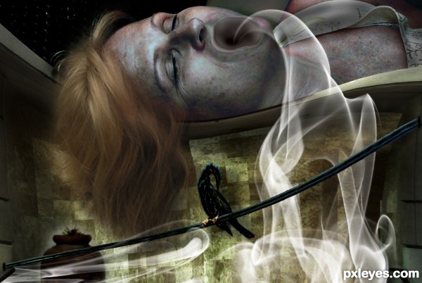
Impatient of my absence,
And grief that young Octavius with Mark Antony
Have made themselves so strong- for with her death
That tidings came- with this she fell distract,
And (her attendants absent) swallow'd fire
Source: THE TRAGEDY OF JULIUS CAESAR
Portia died eating hot coals...
She killed herself for the fear of losing her beloved Brutus... and being left alone with out him... (5 years and 3554 days ago)
Oh my, it's really tragic! It's possible to understand how lonely she was... she preferred to die than getting a broken heart! 
this is great i totally think this image will do well in the contest and the smoke is a nice touch to this incredible image!
great job
"It is better to create than to learn! Creating is the essence of life." -Julius Caesar
and you have created so much within this one work of art. you've portrayed death, the leaving of a spirit. and illustrated a great work of literature, but such an unrecognized part of that work. Oh dear, you've captivated me with this one. i keep coming back and looking. its amazing.

that smoke coming out of her mouth is perfect 

Howdie stranger!
If you want to rate this picture or participate in this contest, just:
LOGIN HERE or REGISTER FOR FREE
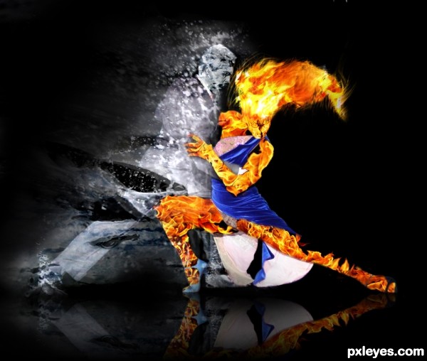
Born enemies become allies...
(5 years and 3559 days ago)
Very nice, impressive =) Good Luck !
Quite interesting.. you should crop the image where the ice-man ends, so it doesn't look like a failed mask edge. And you should anyways soften some of those huge brush edges on the mask, especially on the icemans top and under his straightened leg. Cool composition.
nice work author and great choice...gl
EDIT: Softened the water around the man, and added a splash under the right leg, and some drops on the left leg. Also lightened the water a bit.
Burned (hehe burning a fire woman? wtf? lol) the woman a bit more, so it blends better... hope so... 
Also crop the image as Widiar told.
@Widiar: Thx for the constructive comment! 
@Erathion and @Vlado: Thx for the support! I appreciate it!
Looks good on high resolution too now - a lot better. There is still one minor problem with the mask of the firewoman's hair, right above the hairline. You should smoothen and hide that straight line and her awesome hair looks even better. (I'm sure I'm not the only one who digs her hair..)
EDIT: Made the changes to the hair. Smudged, so the line is gone.
@Widiar: Thx again for the comment!
nice
Howdie stranger!
If you want to rate this picture or participate in this contest, just:
LOGIN HERE or REGISTER FOR FREE
um...windmilK?
??? good luck !!
nice abstract art...gl
Very hot... author, pls, correct the spelling of "windmilk" for "windmill".
lol thanks i totally forgot about that
XD
Howdie stranger!
If you want to rate this picture or participate in this contest, just:
LOGIN HERE or REGISTER FOR FREE