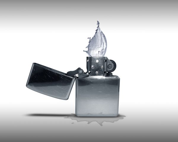
The water win.
I hope this is on theme. Thanks for view and comments. (5 years and 3741 days ago)
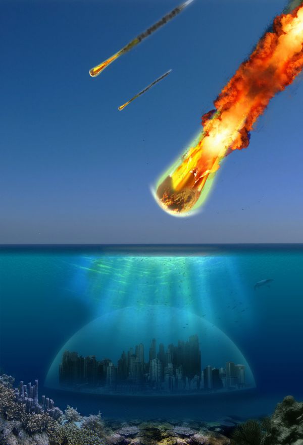
(5 years and 3742 days ago)
Source link for the city...?
k, sec
what about a SBS?
Recycle your last entry????
it was removed because it was placed under the wrong topic. It had its 3 minutes of fame, but I hope it will last longer now
you need to adjust the sun rays, as there is no sun, or sign of a sun in the sky, but the rays are shining over the city, which looks like the sun is right above the city. just and idea, overall it looks good 
You have a few perspective issues, but its an interesting idea. You might want to add another layer of coral further back, add some depth? Also your middle comet would have a smoke trail that runs off the edge of the screen. GL.
I agree.. I'll see what i can do
Congrats 
Howdie stranger!
If you want to rate this picture or participate in this contest, just:
LOGIN HERE or REGISTER FOR FREE
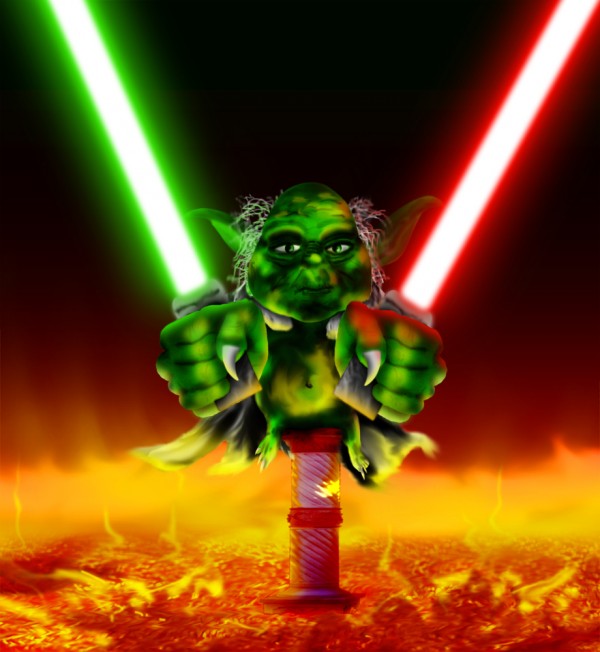
My idea - Old Yoda the master with two laser swords in the hell!
Done in photoshop without sketches and source images only my own idea.
Only photoshop and source image used. (5 years and 3779 days ago)
Excellent detail on the hands and face. Nice entry. 
Cool old Yoda! 
I agree, "excellent detail on the hands and face" I also love the glow you have on the swords... cool entry author.
This is thiinking well outside the box .. Nice work author
Howdie stranger!
If you want to rate this picture or participate in this contest, just:
LOGIN HERE or REGISTER FOR FREE
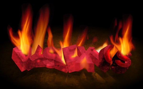
Used illustrator to produce text, everything else manipulated in photoshop using the fantastic tutorial by denisdesigns
attached. (5 years and 3781 days ago)
I'd love to see what you'd draw for the real lyrics  , gotta love those Kings of Leon! Nice job on the chop btw, GL
Very funny! When I first heard the song I heard something like ''this axe is on fire''.
Lol!
nice image author... nice fire ...great job
Howdie stranger!
If you want to rate this picture or participate in this contest, just:
LOGIN HERE or REGISTER FOR FREE
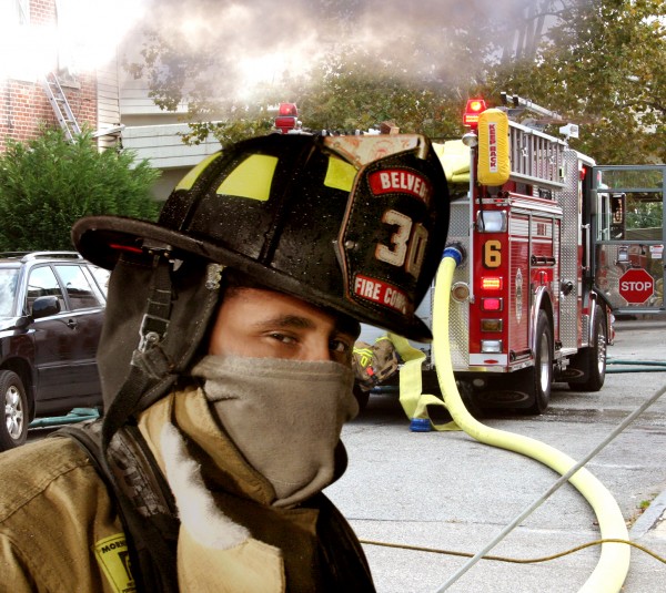
"smoke on the water...the fire engine guy"
(5 years and 3783 days ago)
you didnt do alot i'd say
You know it's impossible to have both the background and the fireman in focus right? I would blur the background a little bit.
Simple but well chopped
Oh, well good then you can look at your own photography and see that I'm right. It wouldn't be that clear in the background. There would be some level of OOF in the distance.
simple chop... great lyrics,,,, good presentation of misheard. NICE WORK AUTHOR>
Howdie stranger!
If you want to rate this picture or participate in this contest, just:
LOGIN HERE or REGISTER FOR FREE
seen before, but nice. ..wait is this the same flame as the image above?
youll have to put more work in than simply flipping the flame and putting it on a different object! I'd pull one image as they are too similar and it's obvious they are both from the same author. Only IMO of course
A nice idea but IMHO not really on theme. You are supposed to show how fire and water are fighting each other for dominance.
hmm... jawshoewhah is right; not exactly whats been asked but the idea is good and there is room for improvement...
Howdie stranger!
If you want to rate this picture or participate in this contest, just:
LOGIN HERE or REGISTER FOR FREE