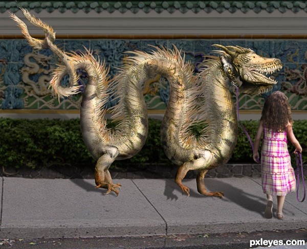
I used four of my own photos which I placed at the beginning of the SBS (5 years and 2641 days ago)
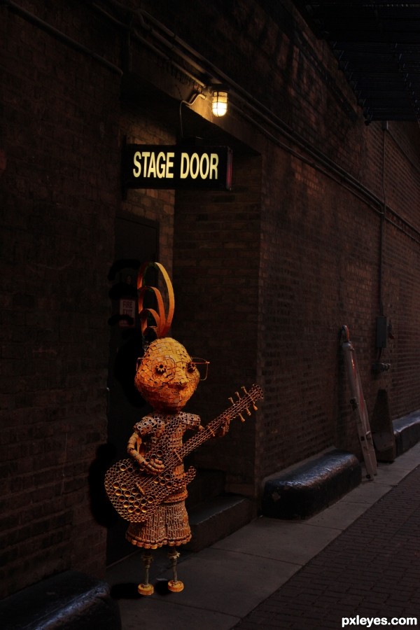
(5 years and 2696 days ago)
Nice mood. 
Ty
I love that you took the time to mask out the green in the little holes in the sculpture!
Thanks .. it took forever 
Nice work
ty
I think the little man needs to be less saturated. I think he would fit in better. As he sits now, I think hes too bright. Other than that great work. Good luck author!
Well composed image. Colors work well together.
The shadows need some work: they should be less opaque. Shadows on door and wall cannot be a single shape, because the door is further away.
I believe left part of the guitarist needs shadows and darkness , but at the end it is really nice
GL author
Congrats, Arlo!
congrats !
Congrats!!
very cool, love the mood.
Howdie stranger!
If you want to rate this picture or participate in this contest, just:
LOGIN HERE or REGISTER FOR FREE
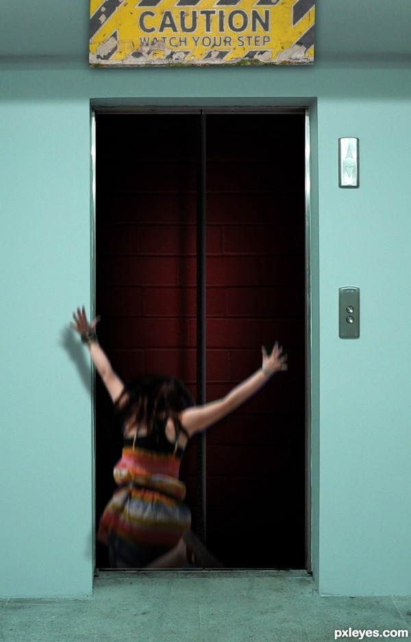
the cable was done with the line tool (5 years and 2742 days ago)
Howdie stranger!
If you want to rate this picture or participate in this contest, just:
LOGIN HERE or REGISTER FOR FREE
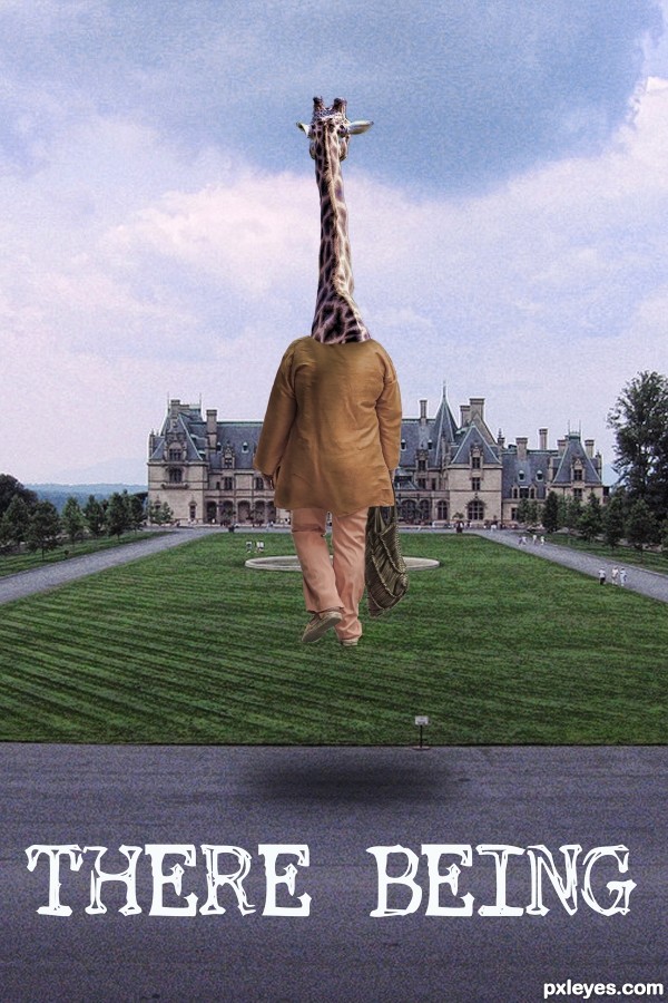
(5 years and 2756 days ago)
Nice chop, but you should put some shadows. Good luck author !
can't do it now, but I will next time LOL thanks
Howdie stranger!
If you want to rate this picture or participate in this contest, just:
LOGIN HERE or REGISTER FOR FREE
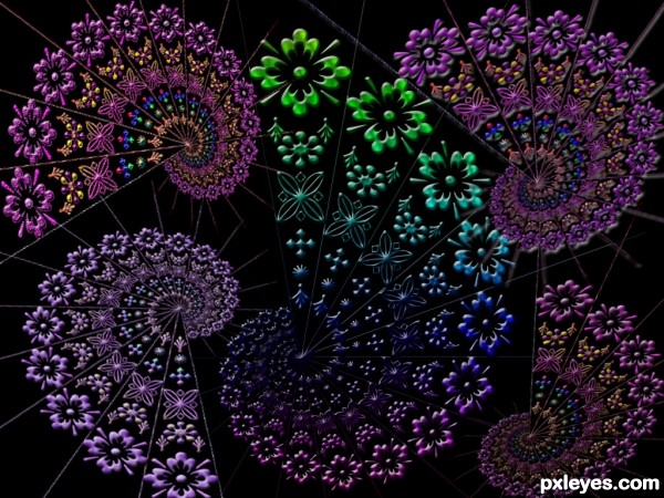
did just a little extra
added some bevel and emboss
satin overlay and some textures and did not delete diagonal lines
used only two gradients of pinks blues and one of the rainbow gradient. tutorial was awesome thank you
used only photoshop shapes
and this tutorial (5 years and 2770 days ago)
Howdie stranger!
If you want to rate this picture or participate in this contest, just:
LOGIN HERE or REGISTER FOR FREE
Try to fix a few masking flaws on the girl. Otherwise this is a great image!
thank you I will do
think I got them .... show me if I missed.... or tell what I do not understand because I am still learning
Great piece! Lots of work
some take a little more than other's as you well know.. ty
More time getting rid of a lot of blur and having the feet look like they are on the ground instead of floating would have made this a very good image. great idea .
ty and remember they are claws
Love this concept and choice of background. That's quite a creature!
ty ... wanted to get away from what we think is traditional dragon,,so tried more a chines flair
Congrats David!!
ty
Congrats, David. Love the idea of a chinese dragon. Lots of work in this one.
ty
congrats
Howdie stranger!
If you want to rate this picture or participate in this contest, just:
LOGIN HERE or REGISTER FOR FREE