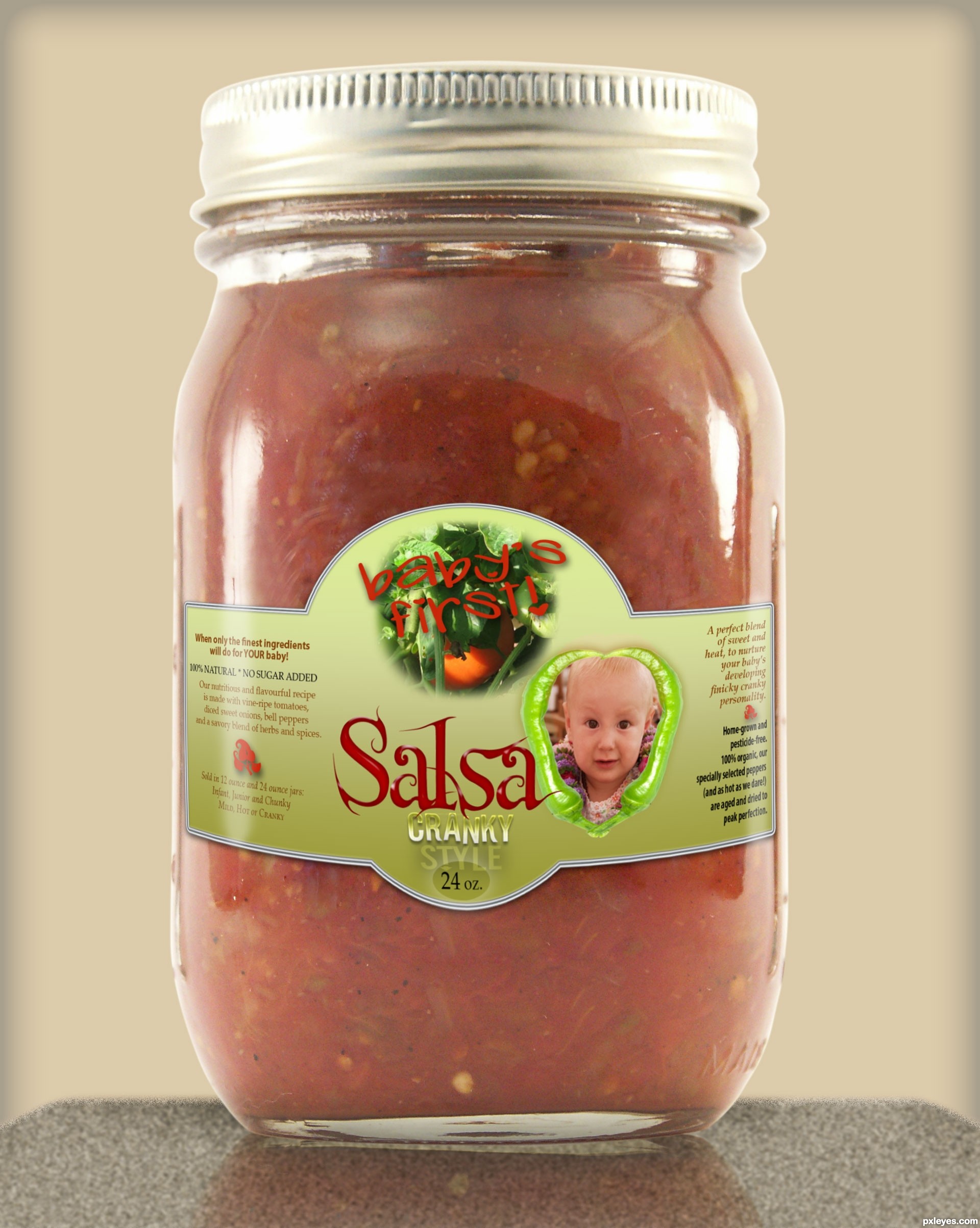
Please see sbs - tomato photo is from my own fall garden last year. Background made with texture, noise & blur for countertop with perspective, color and inner glow for back 'wall'. (5 years and 3133 days ago)
3 Sources:
(5 years and 3135 days ago)
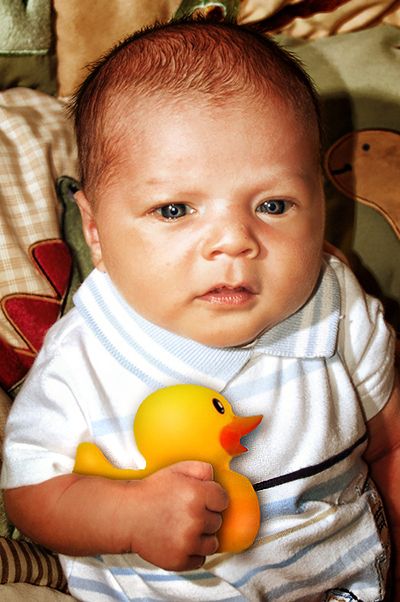
The shadows on the baby are far darker and sharper than the shadow off the duck. There is also a light shadow off the top of the duck which is totally out of place. The light source on the baby is very bright, while there is no real light source showing on the duck. You can try to use the Dodge Tool to create the light value refraction on the duck, but the shadows will need a lot of work separately.
the ducky looks flat, add alittle white (or near white-yellow) shine at the curved portion (example, the head area) and part of the beak..
the baby don't seem to be interested in the ducky, should find one that looks at the ducky 
That is a cute image anyway.... good luck.
Ahhhh how sweet, the baby is so cute, God bless! Best of luck author!
Howdie stranger!
If you want to rate this picture or participate in this contest, just:
LOGIN HERE or REGISTER FOR FREE
(5 years and 3141 days ago)
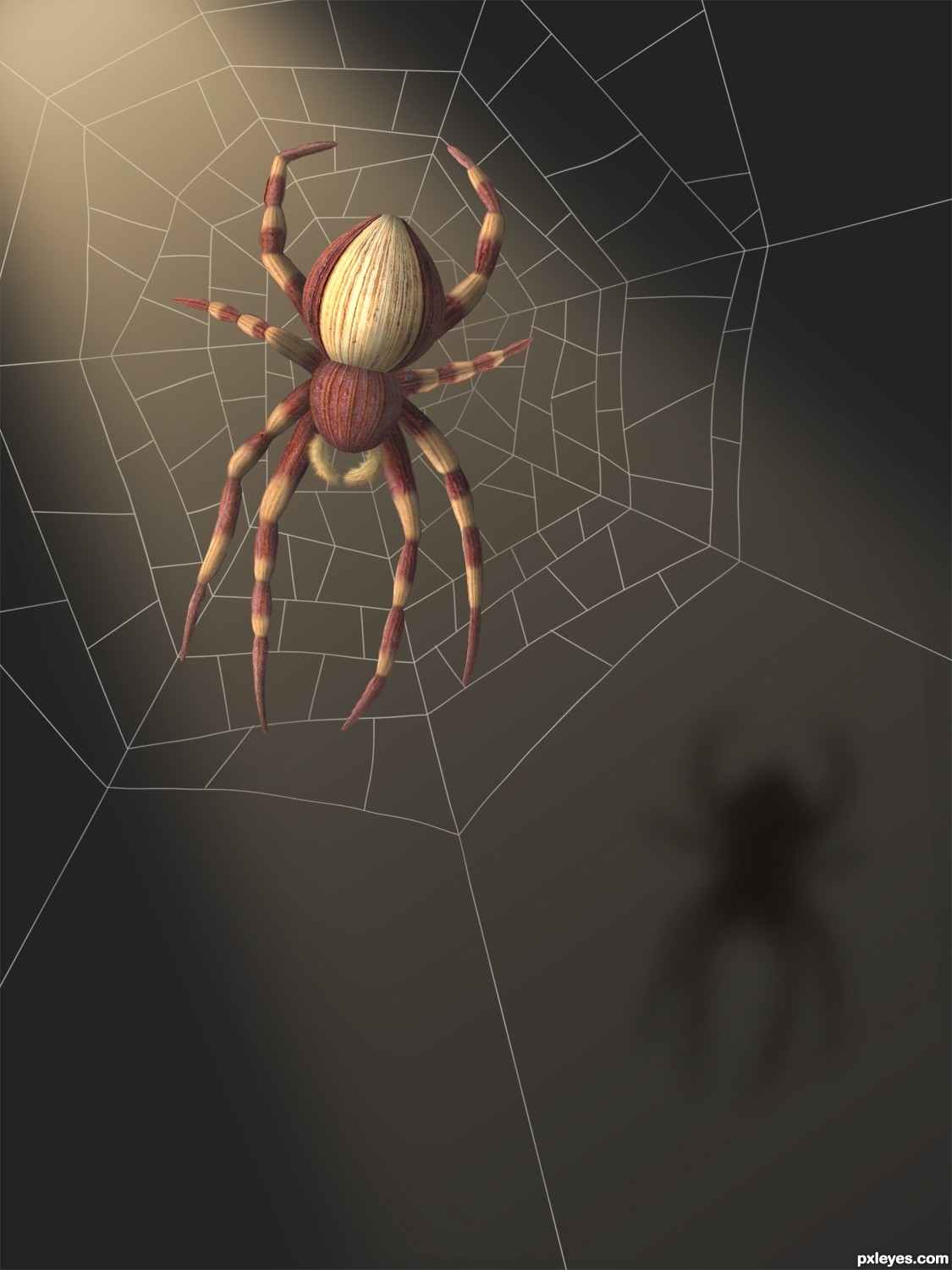
nice build of the spider and lighting -- just wondering if the web would not have just a hint of shadow seeing as the spider has one
Woo HOO and a Ham sandwich
Very clean work and quite imaginative!
Good lookin' spider! Might have been better to use a real web as reference, though.
Good looking spider....and a good job! Good luck author.
horizontal pair of legs seem too short
suggest:
1) add abit more shading to the spider
2) add little suggestion of web on the shadow as well (no need to have full web, just a bit here n there)
3) saturate the whole image (personal perference)
superb entry
really like the spider, great work
wish you had put a little more effort in making the web and background as amazing as the spider
really like the spider, great work
wish you had put a little more effort in making the web and background as amazing as the spider
still... my vote with you
Awesome entry
great work, very creative and well done. The net is a bit small for a spider this size, but I love this, nevertheless. 
very beautiful... this deserves a place...
nice work
Even thought I am not to die for spiders I must say this is an amazing work of art!!! Best of luck author, very well done!
@ Aheman: maybe you should spend a little time looking at the source pics before commenting.
And thank you again! Wow. Thanks! 
Beautiful work....congratulations for 2nd!!!!
Howdie stranger!
If you want to rate this picture or participate in this contest, just:
LOGIN HERE or REGISTER FOR FREE
(5 years and 3223 days ago)
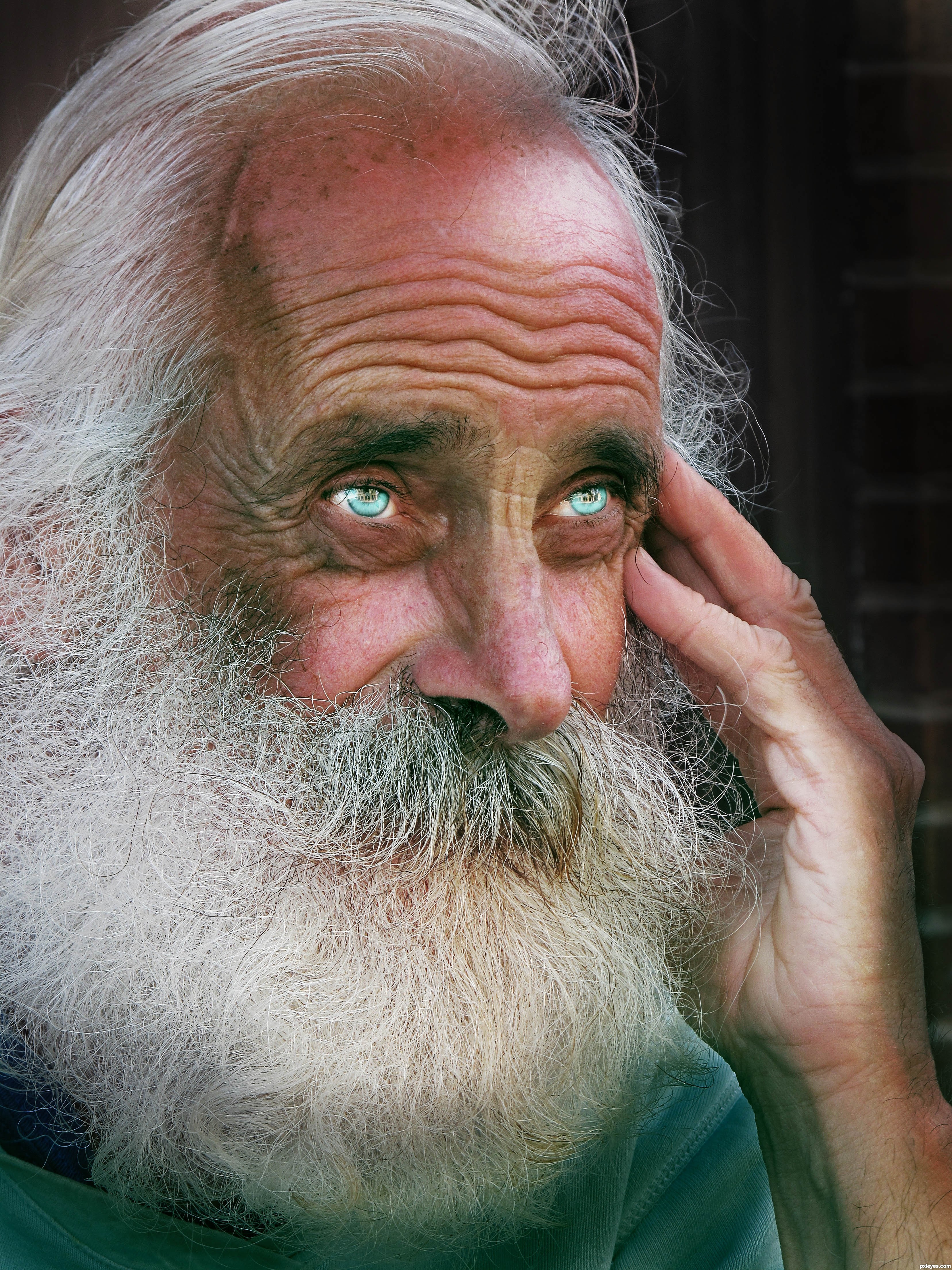
nicely done GL author 
is this a double entry?
no this is my entry only one
ahh ok, someone else must have picked the same source photo as you then. sorry
really good work , GL
Howdie stranger!
If you want to rate this picture or participate in this contest, just:
LOGIN HERE or REGISTER FOR FREE
(5 years and 3241 days ago)
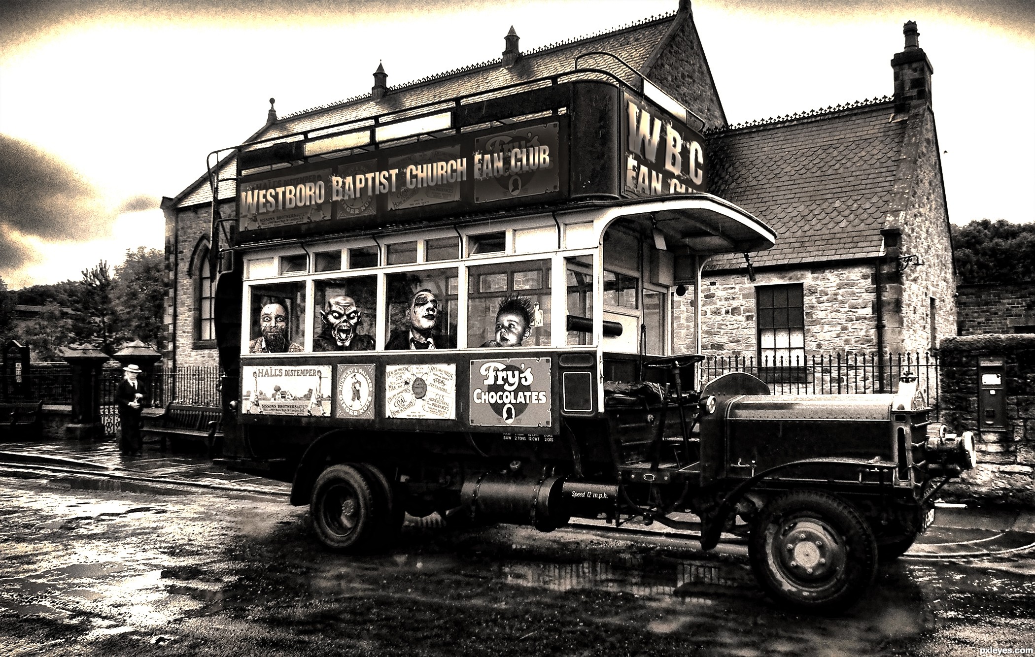
super cool work author...One crazy tramway for sure...best of luck
No wonder the driver left! Be afraid, baby, very afraid.
Howdie stranger!
If you want to rate this picture or participate in this contest, just:
LOGIN HERE or REGISTER FOR FREE
Photography and photoshop contests
We are a community of people with
a passion for photography, graphics and art in general.
Every day new photoshop
and photography contests are posted to compete in. We also have one weekly drawing contest
and one weekly 3D contest!
Participation is 100% free!
Just
register and get
started!
Good luck!
© 2015 Pxleyes.com. All rights reserved.


very cute entry (the label curve and blend is brilliant).. (Because of my eyes.. do you think an white Outer glow (instead of drop shadow) or a light white stroke might make the words "Baby's First" stand out more?.. (could just be my eyes..)IMHO
GREAT GARDEN!!!
Incredible entry! good LUCK
Yes, thank you, Ernie, that probably would have helped with the definition a bit. But it's all merged now and curved, with the white streaks of 'light' on the sides...and I'm outta time!
I didn't see the "baby's first," but saw the "Granny Style," and thought, "It's salsa made from babies?" LOL!
The bottom edge of the label curves up around the jar just a wee bit too much, as if it was put on crooked, but otherwise, this is very well done, especially the light refraction!
well i like your entry author
very realistic work
best luck
That's CRANKY, MossyB! lol - and yes, the label looks a little off to me, too, it was tricky as this is kind of a round-corner squarish kind of jar - and it was very late at night when I completed this, after looking at a computer all day. I did use guide lines for the warping, so they're evenly curved, though. Thank you for your comment - yours, too, kushpatel.
hahahahahahahahaha...great humor and neat work...gl author
I will take one please for my baby! Well done author!
congrats and a woo hoo!
Howdie stranger!
If you want to rate this picture or participate in this contest, just:
LOGIN HERE or REGISTER FOR FREE