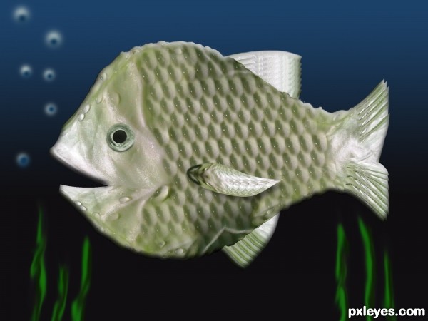
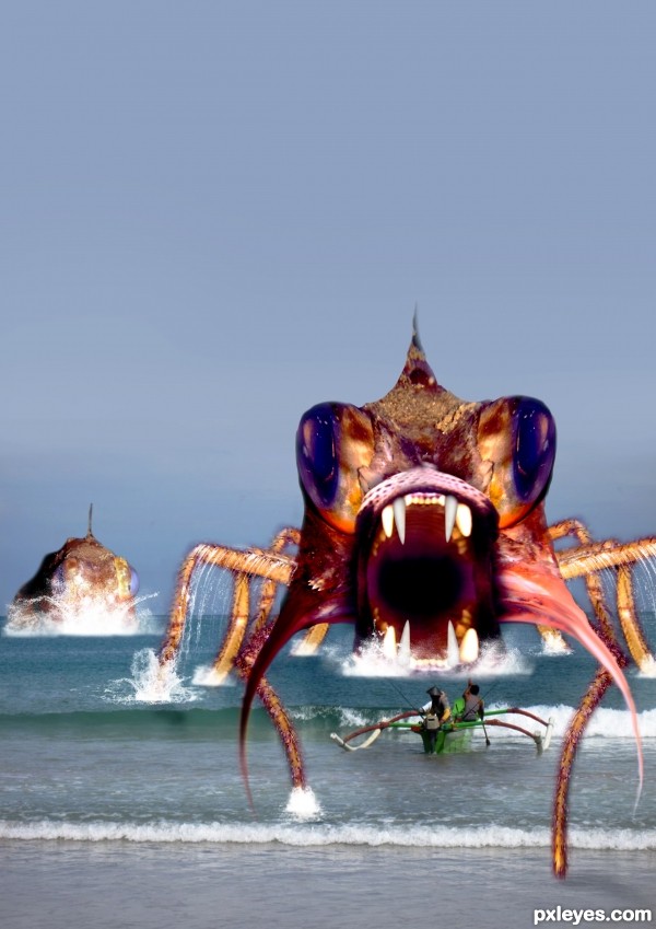
Magic wand, duplicate, transform, image (fish eye), layer style (5 years and 3176 days ago)
- 1: fish eye
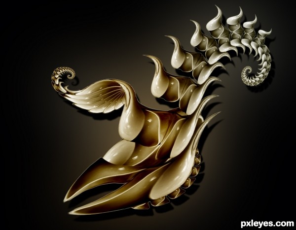
Source image used. (5 years and 3192 days ago)
very pretty fish 
superb entry
Beautiful color, graceful shapes! 
Lovely concept!
what is the rational behind? Although the title is fish but for me it looks like a crab claw....
congrats
Congratulations on 2nd!!!
Howdie stranger!
If you want to rate this picture or participate in this contest, just:
LOGIN HERE or REGISTER FOR FREE
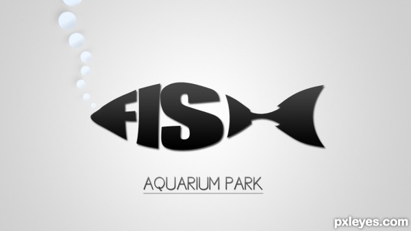
So, When i first saw this comp, i thought right on to the logos where the text forms a animal or a object. And i thought, which animal would fit for that? And a FISH was a perfect animal to do it with, so i did. (5 years and 3233 days ago)
Very cool! 
Wow 
this is cool man ... i mean this logo worth a lot
Simple and Clean
I like the simplicity. The lack of color is kind of blah, however, which doesn't really entice me to visit the park. I also think "AQUARIUM PARK" should be a bit more prominent and I might consider adjusting its kerning to make that text as wide as the fish above it.
http://www.bananadesign.co.uk/work/branding/little-black-fish-films-logo
it's right???................sorry!
Wow, I've never seen that before?! I never used any picture as inspiration, and i also did ALL by myself. I'm surprised that someone else did it too, but i promise, i never seen that one before.
I realize the link does look similar to the authors entry. In Art School we had a class in lettering design (hand lettering). Using words and letters to create shapes which we called cartouches and one assignment was to create shapes to match the words. Fish was one of the easiest to do and at least a third of the class did virtually the same design (the word Love in the shape of a heart was done six times).
I think the one you have done author looks better than the example presented above. looking good.
I agree there with Chapp. Although there are similarities, No comparison imo. This is a good presentation. Good luck Author.
good luck!
simple, and very well done!!
Howdie stranger!
If you want to rate this picture or participate in this contest, just:
LOGIN HERE or REGISTER FOR FREE
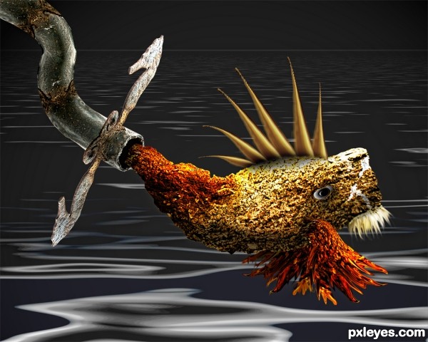
(5 years and 3241 days ago)
cool looking fish...is she/he eatable for all or just for plumbers...
Howdie stranger!
If you want to rate this picture or participate in this contest, just:
LOGIN HERE or REGISTER FOR FREE
(5 years and 3245 days ago)
Howdie stranger!
If you want to rate this picture or participate in this contest, just:
LOGIN HERE or REGISTER FOR FREE
IMHO you may want to smooth out the bottom jaw's tip (it's cut very hard, as are the tail tips) Blur and erase brushes may help to add to realism, SBS will help for higher votes... More help is surely on it's way

Very good job and good luck
Thank you, Drivenslush!
Why would there be drops of water on a fish underwater...???
(Blur sharp edges as said above).
It was deliberate, to show only the work removed from the original image, but your comment was very good, thank you, CMYK46!
It shouldn't be difficult to remove those drops.
The drops could just be fish warts. The lack of shadiing on the fish makes it seem overly flat. Also, the top and bottom (dorsal and anti-dorsal?) fins seem behind rather than connected to the fish.
very nice!
Thank you, DanLundberg and Derivatix !
congrats...
Howdie stranger!
If you want to rate this picture or participate in this contest, just:
LOGIN HERE or REGISTER FOR FREE