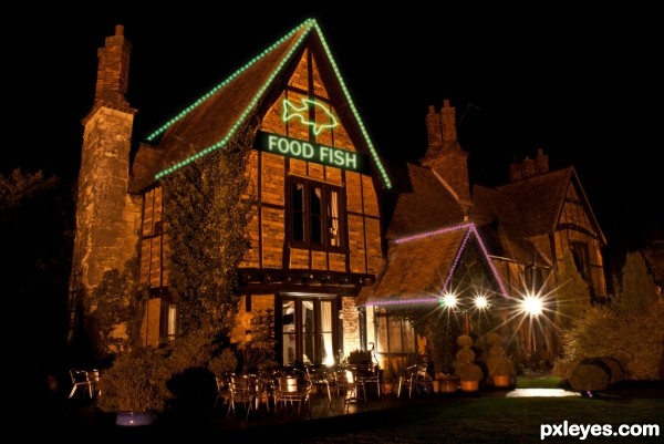
(5 years and 3328 days ago)
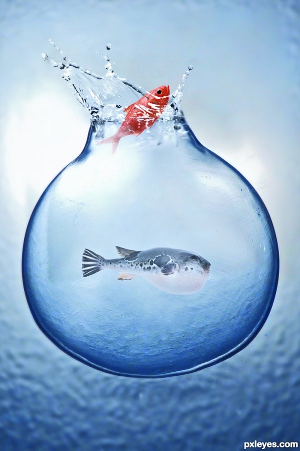
I thank the stocks and in particular the cybersb ... (5 years and 3346 days ago)
amazing great job GL 
I like this too, very nice = )
very cool work author...gl
Thanks 
Fabulous!!! O_O
Cute idea, love your lower fish choice, he's got a great expression! 
Thanks a lot 
And congrats again for a great third place!
Congrats for 3rd
Thanks a lot 


congratulations...
Congrats!!
wow thanks 
Howdie stranger!
If you want to rate this picture or participate in this contest, just:
LOGIN HERE or REGISTER FOR FREE
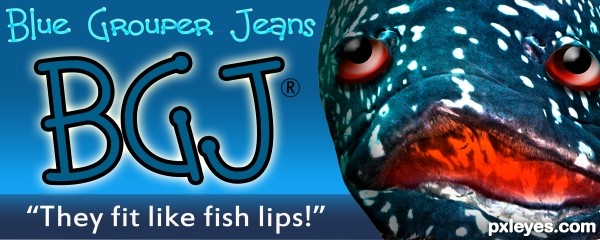
http://www.youtube.com/watch?v=uWlUu54muOs
That Went
Where ever I did Go
It's in His Trousers! (5 years and 3352 days ago)
hahahaha...cool...may i order one via Ebay?...lol
 I prefer the green grouper me self. Good work great looking "Logo"
I just like any grouper as long as some one else prepares it for me and I get to be waited on, (good tip as well LOL)
Howdie stranger!
If you want to rate this picture or participate in this contest, just:
LOGIN HERE or REGISTER FOR FREE
(5 years and 3375 days ago)
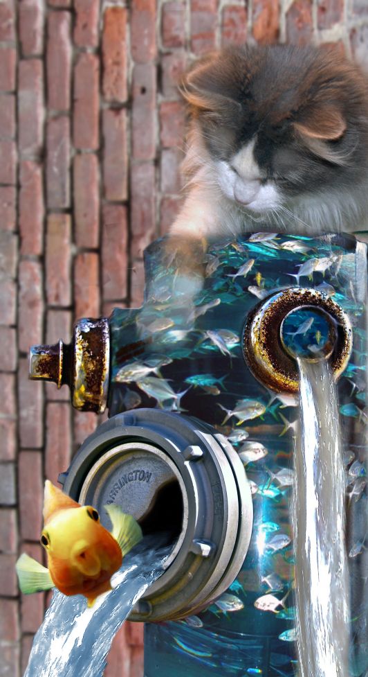
NICE IDEA ,BLUR THE BACKROUND A BITT AND COLOUR MATCH WILL GIVE IT A MORE REALISTIC EFFECT.
I did blur that back a bit, Changed the colors some. Look better?
Good idea, but the top rim of the hydrant isn't very well defined, and your background would look better if you rotated it 90 degrees so the bricks looked normal. This way it's distracting. GL author. 
Almost went *blub* again.. But I promised I would not do that again.. So I agree with @CMYK46, the background might look better when flipped. But then again, it's freedom of creativity.. GL author!
What a cool idea! 
Howdie stranger!
If you want to rate this picture or participate in this contest, just:
LOGIN HERE or REGISTER FOR FREE
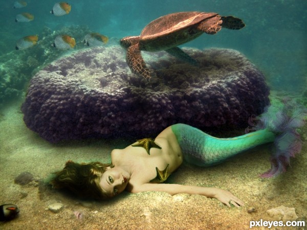
The only images I used that was not my own are the seashells which are credited to Emma-Frost-Stock and the Starfish provided by Pxleyes.
The other six images were mine. The end of her tail was a fractal I created in Apophysis.
*Update: I attempted to add adjustments offered by jawshoewah and greymval and Erathion.
I added several layers of colors to fix the overall feel of the image. Very curious to get more opinions. (5 years and 3395 days ago)
Nice chop! And kudos to using your own stock photos! My only nitpick would be maybe the edges around the starfish you turned into a bra. They just seem a little hard. Other than that, well done! 
Make a blue overlay over the model, so it blends better. ( create new layer of solid color - blue- right click on it create clipping mask so it only affects the model, Mode: Overlay Opacity-20%- more or less) You could make 2 clipping layers one blue on green so that you have a turquaz overlaying your model.
Your background also has some noise that should be present on the model, so you could either lower her opacity -95-98% or add a noise over.
There's also a masking problem on her hip, use some clone stamp to cover over her human skin :P
Thank you very much for the suggestions I'll start working on them right away.
Nice looks good ..gl.
Water is always hard to work with...This image have a great concept author and u could turn it in fabulous entry...I would like to give u few advices because i had similar problems when i created my underwater entry's...For better blending,solid color layers with different blend modes are always good thing to do. Val gave u advice to use blue overlay layer,and that is good thing to do. I would gave u advice to use dark blue overlay layer,with opacity set between 20-40%. Also in this case u have to make whole scene a bit slighter and for that dark brown layer with color blend mode and goldish layer also in color mode will done the work. Play with opacity of course. And now magic stars,add on top of these layers,dark green soft light layer,play with opacity and u will get crazy blue-green water color,and goldish layer will gave some nice mood.And finally u could add on top of these,blue/gray layer,blend mode set to color,with a low opacity max10%. And thats it,great underwater scene. And u could create some bubbles behind the purple thing to achieve better depth...Sorry for this novel author...
erathion.. if you make us have to do a report on your comment.. you will receive a severe beating.... (oh.. very nice chop by the way author... giggle snort) smooches erathion.. just kidding!!!
author.. you should be very proud of all the work you have done... I'm exhausted after looking through your sbs  ... GOOD LUCK
His comment was very helpful an I hope I was able to create the mood and feeling the were helping me achieve. I'm glad you appreciate the work because it was a very lengthy process. Either way I was very pleased with the end result
Now, who wouldn't help a hot naked chick lying on the ocean's floor  . Glad you like the end result.
You'd be a fool not to help
Yes! that looks much better! One of the best entries! GL author! 
Congratulations! 
Congrats...
Congrats for 3rd, cool
Howdie stranger!
If you want to rate this picture or participate in this contest, just:
LOGIN HERE or REGISTER FOR FREE
great work author...very realistic...best of luck
Howdie stranger!
If you want to rate this picture or participate in this contest, just:
LOGIN HERE or REGISTER FOR FREE