Photoshop Pictures: Fish (page 16)


results 76 - 80 of 159

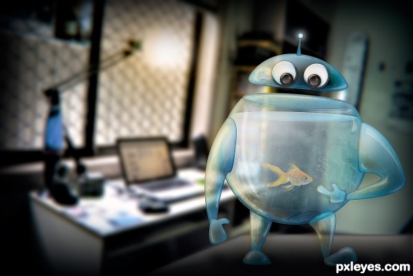
Please don't tap the Robot - created by Robart523


Please dont tap the Robot
Favs: 2SBS: 7Hi-resRank: 3/6Score: 57.8% (30)19876 views

Who doesn't want a robot powered by fish? I mean come on, you get a cool glass robot, that takes care of your fish for you!

Please take a look at the high res if you have minute, there is more detail than you can see in the small picture, thanks :) (5 years and 3263 days ago)

4 Sources:

avatar MnMCarta
MnMCarta says:

how cute!!!!

avatar Nickk
Nickk says:

Haha wish they could make robots working on only a fish and some water instead of tons of electricity Then a lot problems would be solved I like it author !
GL

avatar Christy
Christy says:

He is really cute!!! Best of Luck

avatar CMYK46
CMYK46 says:

Not bad. Goldfish should pop more.

avatar greymval
greymval says:

I really like the Hi-res you can see those bubbles & reflection of the surroundings. Good one

avatar Kid
Kid says:

Creative idea The reflection made it even better

avatar erathion
erathion says:

hahahahah....super cool...best of luck author

avatar JPDesigns
JPDesigns says:

Awww I love it! Very cool glass effect

avatar jawshoewhah
jawshoewhah [banned] says:

Congrats!

avatar erikuri
erikuri says:

Congrats!

Howdie stranger!
If you want to rate this picture or participate in this contest, just:

LOGIN HERE or REGISTER FOR FREE


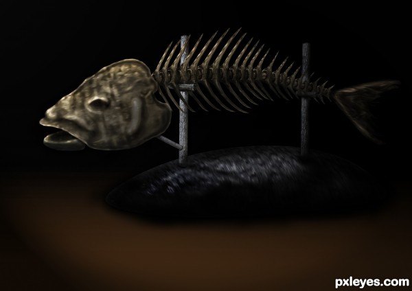
fish bone - created by smalapatekut


fish bone
Favs: 1SBS: 3Hi-resRank: 4/6Score: 55.1% (0)11844 views

just use a source image
liquify, burn, and dodge tool (5 years and 3264 days ago)

avatar erathion
erathion says:

Fantastic idea author and great execution...well done

avatar George55
George55 says:

I think you did a good job, even using liquify and burn/dodge tools.... good luck.

avatar JPDesigns
JPDesigns says:

Very interesting imagination that you saw fish bones from an old chair! Creative, and well done.

Howdie stranger!
If you want to rate this picture or participate in this contest, just:

LOGIN HERE or REGISTER FOR FREE


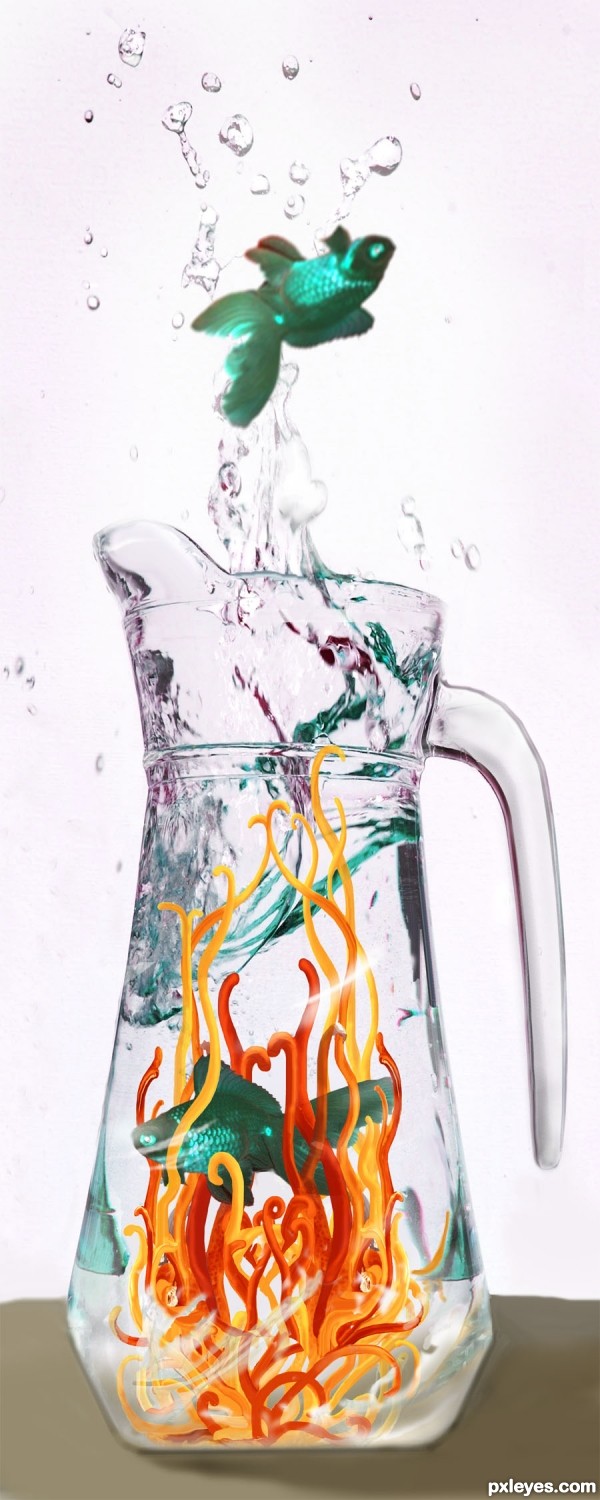
A Fish Out of Water - created by artgirl1935


A Fish Out of Water
Favs: 0SBS: 8Hi-resRank: 6/6Score: 51.2% (0)5820 views

Thanks to bliss at morguefile.com for the fish source photo; also, to kblount at mfile for reference I used to do the shapes from the lemon in the main source photo. (5 years and 3286 days ago)

2 Sources:

avatar MossyB
MossyB says:

Great job adjusting the color reflections at the top of the pitcher!

avatar erathion
erathion says:

cool work author...

avatar JPDesigns
JPDesigns says:

To Moderators: wow I'm screwing up all over the place, first I gave a VERY wrong vote, I accidently pressed enter too soon and the author ended up with a VERY low vote that was not intended, then I wanted to redflag you to let you know and forgot to write it in the text box there, very sorry. And sorry to you, author, a low vote was not intended for you, I like your creation.

Howdie stranger!
If you want to rate this picture or participate in this contest, just:

LOGIN HERE or REGISTER FOR FREE


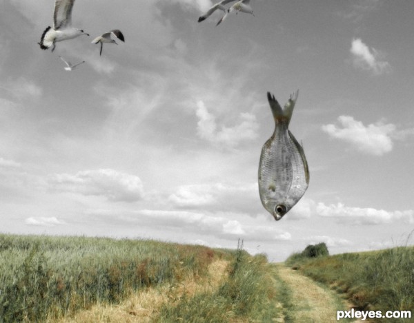
Dinner time - created by digitalpharaoh


Dinner time
Favs: 0SBS: n/aHi-resRank: 6/6Score: 51.3% (0)9356 views

(5 years and 3287 days ago)

2 Sources:

avatar MossyB
MossyB says:

The fish should have some color since so much of the image is desaturated...

avatar CMYK46
CMYK46 says:

Color ground, desaturated sky? Why?

avatar nanaris
nanaris says:

the idea i super, my advice:
- more seaguls
- colors on sky
- fish desaturated
- clone your backround or flip holrizontaly becouse the eyes is on the background
- transform fish strange shape
good luck!

author says:

Re: Color ground & desaturated sky...personal, artistic choice.

avatar dekwid
dekwid says:

xixixixixixix.........I like the idea,....

avatar George55
George55 says:

Right author...it is your idea.... and also your time to make something like this... it looks ok... good luck.

Howdie stranger!
If you want to rate this picture or participate in this contest, just:

LOGIN HERE or REGISTER FOR FREE


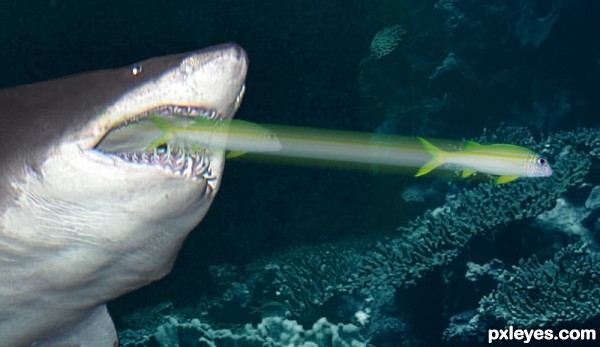
Missed Me! - created by MossyB


Missed Me!
Favs: 0SBS: n/aHi-resRank: 6/6Score: 47.7% (0)7976 views

Not interested in being a meal... (5 years and 3312 days ago)

3 Sources:

avatar JamesD
JamesD says:

just looks like a shark with a tractor beam...

author says:

And you would suggest fixing it how, exactly?
Criticism is fine, but just making a snarky comment with nothing positive to add, nor any suggestion on how to fix it really doesn't contribute much, James.

avatar arca
arca says:

Try duplicating the fish a number of times and motion blur each one a little then change the transperancy. You could also change it's size and/or shape a tiny bit ... does that help?

Great idea ... fish acutally looks smug about the whole thing!

avatar Geexman
Geexman says:

For realism I would definatly think about the fact that this is all happening in water, the water would have a cone of distortion from begining to end of the fish`s movement also I dont think the line would be so straight, fish use their tails in a side to side motion and although at speed seem to move straight its not really the case.

avatar JamesD
JamesD says:

try taking a picture of a moving fish... (or find a picture that hasn't been taken with a quick shutter speed (as the goal is to make it realistic - not what 'we' think it would look like); Analyse the shot, and then transfer your findings into your image (not literally of course)

avatar Chalty669
Chalty669 says:

Perhaps a gradient transparency mask, so it looks like the blur fades more towards the shark. Good luck!

Howdie stranger!
If you want to rate this picture or participate in this contest, just:

LOGIN HERE or REGISTER FOR FREE