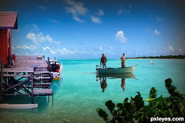
Credit and thanks to:
Mortimer?, ippei + janine, darkpatator, ^riza^, Mean and Pinchy.
Search Tags: Paradise Fishing (5 years and 3544 days ago)
- 1: men in boat
- 2: paradise
- 3: plant
- 4: shack
- 5: big fish???

Credit and thanks to:
Mortimer?, ippei + janine, darkpatator, ^riza^, Mean and Pinchy.
Search Tags: Paradise Fishing (5 years and 3544 days ago)
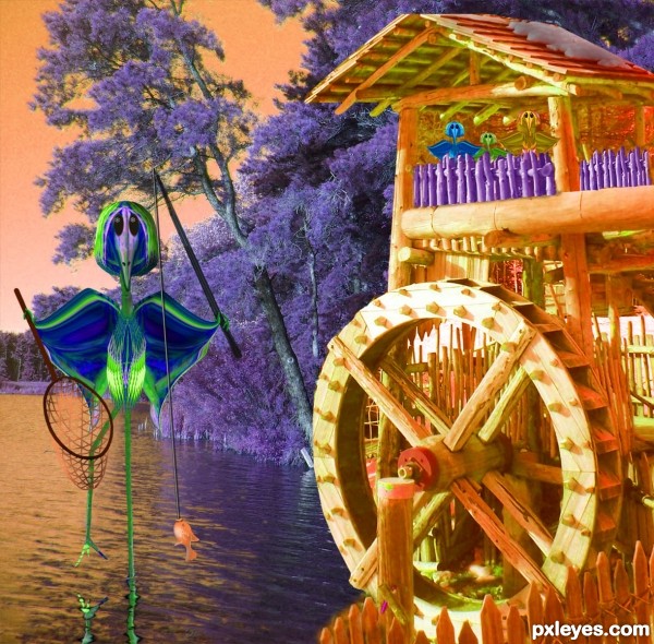
The source was used for creating the fishing bird and his family up above waiting for dinner. The background is from my own photo. The net and pole are drawn with the brush tools. (5 years and 3552 days ago)
hehehe.. very bold color choices.. the kids are CUTE!!!
this work is incredible
It's the first time I see a heron fishing like that! So funny, and so cute... Nice colors! 
Great humor author...LOL...best of luck
Howdie stranger!
If you want to rate this picture or participate in this contest, just:
LOGIN HERE or REGISTER FOR FREE
(5 years and 3552 days ago)
intelligent idea, good luck 


Like your idea, you should post a high res version.
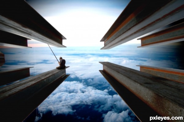
Very clever use of the source, I think the beams shadows are wrong for you image, the ones with the light face should be at the bottom and the dark face at the top.
very cool
Fantasy on the top... nice work! 
I just love it!!!!
Good job with such a simple idea. For some reason this reminds me one of those movie company logos, where that small boy is sitting on the half moon and there were clouds and stuff.. Dreamworks or something, perhaps?
I don't think the top beams are needed IMO...
I love the mood here. Great imagination! Wish there was a hi rez pic.
Very nice work author...good luck
Congrats for your second place!
Congrats! for 2nd place, Great idea. 
Congrats!!! 
Congrats
Howdie stranger!
If you want to rate this picture or participate in this contest, just:
LOGIN HERE or REGISTER FOR FREE
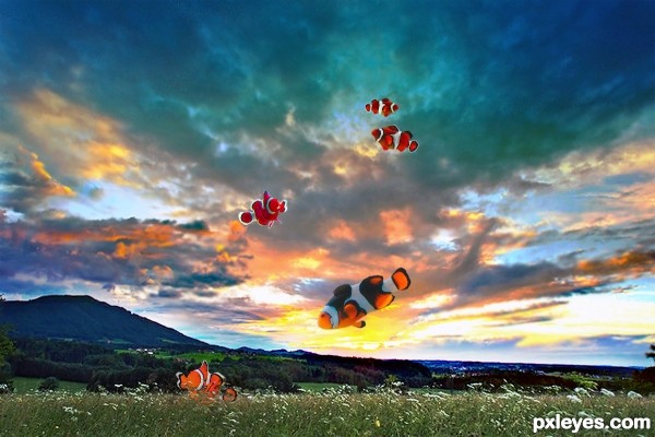
Thanks for the images goes to Michael needs more photo time, Wikipedia, and springm / Markus Spring (5 years and 3572 days ago)
Whoa..pretty simple, yet so powerful. Everyone seems to think very differently of the theme, but that's what the point of the imagination is, after all. Very nice idea. No time to examine the image closer right now, just wanted to tell you it's a great idea.
This is a mad world, I start thinking everything is possible... even fish out of water (but mudskippers, of course!)... 
Good one, wish I had thought of that = )
I gave it a closer look now. 2 bigger fishes on the foreground looks pretty good. I would maybe change the stripe colours for the ones on the back, as they attend to blend in a bit too much with the similar coloured sky. The concept is still one of the best on this contest, at least for my taste 
Excellent idea, and very well done!
hahahahahahahhahahahaahaha flying fish! AWESOME!
Howdie stranger!
If you want to rate this picture or participate in this contest, just:
LOGIN HERE or REGISTER FOR FREE
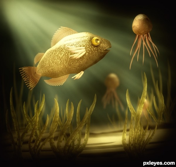
Only Source (5 years and 3580 days ago)
Good colours, good depth and great job on the jellyfish and fish fins... The image look great, author. But you really need to organise your layers palatte :-P
ponti55, you are right, I am very lazy for organizing, renaming and grouping my layers. Will keep your friendly advice in mind  Thanks
great work.. it looks gud...
i feel this is the best image in this contest
but
fish needs some shdows near wings 
other wise
Thanks mounirupa for advice, added shadow to fish.
Maybe a bit more refraction in the water as light rays change when traveling throw different mediums air to water/ air to glass you will get a change in the direction of light and some distortion. Will add more realism to the image. plus the shadow on the underside of the fish should run its full length
author i think once check the image.. all r gud but near starting of wings u just burned the fish than it look like this is not artificial...
and
bottom of water where lit ends fish had reflection... so give shadow
and
once again check the shadows in the whole image....
Good one.
I recognize this style, very nice job 
congrats again! 
Congrats again, Nasir! 
Congratulations for 2nd
Congrats..............
Beautiful entry, Nasir,
I feel honored to be a winner with you and Ponti.
Howdie stranger!
If you want to rate this picture or participate in this contest, just:
LOGIN HERE or REGISTER FOR FREE
Looking better at the plant, I see some masking flaws. Shack needs a bit more lighting (mornig sun, maybe?). But the whole image is very nice.
Thanks erikuri your comments are always welcome and helpful.
Nice idyllic feel. Perspective on shack element is off, however. The surface of the deck in front should be pointing at the horizon [see the original source], not aimed toward the sky like a launching ramp. Lower the shack so the far edge of the deck is below the horizon. I would also be tempted to delete the boat tied to the deck. Not only does it add little more than clutter, there's a scale issue between that boat and the one with the fishermen.
i like it
Thanks. @DanLundberg Totally agree with your comments, not sure if I'll have time to work on it before judgement but appreciate your input.
nice work ! g l
Howdie stranger!
If you want to rate this picture or participate in this contest, just:
LOGIN HERE or REGISTER FOR FREE