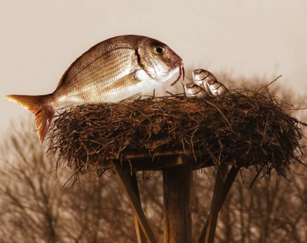
Thanks to RDSDESIGN (5 years and 3752 days ago)
- 1: Nest
- 2: Worm
- 3: Uploaded by RDSDESIGN
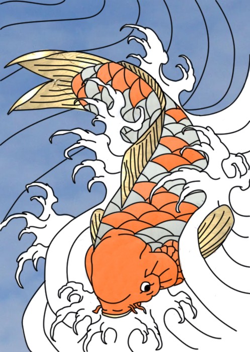
the source on the koi fish is kinda hard to notice, but it is use on all of the fish. I changed the color of some parts but it was the source that made it look that it was not used if that makes sense. (5 years and 3771 days ago)
Interesting image but poor use of source...doesn't even look finished.
the only thing that is not the source is the black lines and the white. everything else is the source. you cant tell its the source though because the source was to smooth. its there i know it is because i put it there.
Yeah but there's too much blank white space...
what should i add to to it. would it be better if i used the cold instead of the orange?
Maybe it would have been better if you had actually utilized the source image in some way instead of just colorizing a drawing with it.
gold sorry
too little use source images, it's like not using the source image that has been provided...
Though there is little use of source, the work is very good taking into account you use pen tool to develop it. I don't think you can do much but use the colours as you did. Japanese art uh?
Howdie stranger!
If you want to rate this picture or participate in this contest, just:
LOGIN HERE or REGISTER FOR FREE
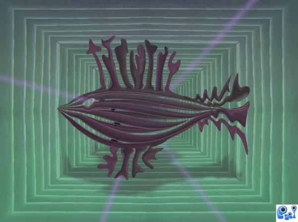
Started without having a clue what to make...ended up with a fish.
(all source) (5 years and 3785 days ago)
this one has a nice style to it.
Very fishy.  Like the colors...
I really like your addition of the shadow. Looks nice, author!
very abstract creation. your fish is very interesting. Good job and the best of luck to you!!
nice ... good luck
Howdie stranger!
If you want to rate this picture or participate in this contest, just:
LOGIN HERE or REGISTER FOR FREE
(5 years and 3785 days ago)
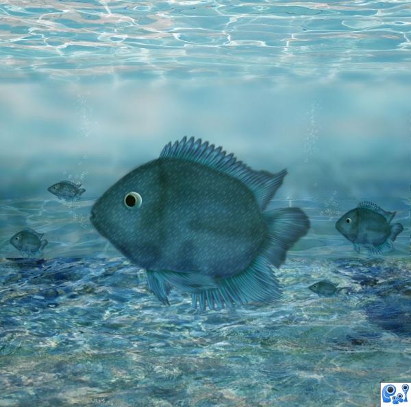
I like the fishies.
Sweety fishy! Love its curious eyes! 
A minimal use of the source.
Howdie stranger!
If you want to rate this picture or participate in this contest, just:
LOGIN HERE or REGISTER FOR FREE
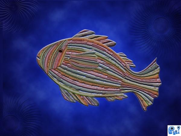
no external images used .with the source image design has been created with the filters and arranged to get a design (5 years and 3794 days ago)
nice.
Looks flat & the spiral things are distracting...
It is missing some definition and on the fish. Try some dodge and burn.
Though I like the final result...it feels that this could have been made with almost any source. 
sorry i agree with Pixelkid. still a lovely outcome. GL
Howdie stranger!
If you want to rate this picture or participate in this contest, just:
LOGIN HERE or REGISTER FOR FREE
Very nice, GL
this is great ^^
Funny...nice work!

funny
LOL cute
well done -- good concept!
very nice
congrats
Congrats on your placement. Well deserved.
Congrats for your third place, Nasir!
Congrats,
congrats !!
Congrats!
Howdie stranger!
If you want to rate this picture or participate in this contest, just:
LOGIN HERE or REGISTER FOR FREE