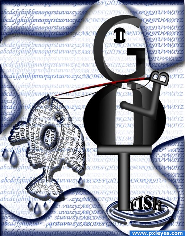
"I got fish" in ps.... (5 years and 3795 days ago)
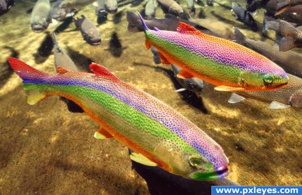
It should be fairly obvious. (5 years and 3799 days ago)
It's a good image, but I don't see how it's misleading...
Sounds like an opinion.
me thinks Rainbow Trout  . They do have a rainbow looking scales in the right light, but not nearly as pronounced as this colouring! Nice job
Yeah, but they really do have rainbow scales, so how is this misleading?
lol
rainbow trout...nice job
Very nice....
CMYK46: Just for you I will explain why it's misleading, even though it's obvious. Rainbow trout don't look this colorful in real life. It's misleading because by name alone because you'd expect them to look like this. Seriously, I don't know how you could have missed that.
Nice idea...I think it would have been better if you stopped the rainbow color at the eyes and mouth...and possibly near the tail. It would give it less of a layered look and more of an actual pigment on the fish. Just my opinion...
Howdie stranger!
If you want to rate this picture or participate in this contest, just:
LOGIN HERE or REGISTER FOR FREE
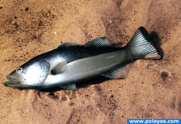
Another old entry. Unfortunately PSD and detail SBS has been deleted, found JPG from my collection.
used source for body.
Eyes, mouth and fins painted in photoshop.
Thanks to Elnias for background and fish picture
(5 years and 3810 days ago)
Very nice, good job!
yeah i remember this great work
Remember this too. Very nicely done fishy 
yup me2 throw him on the skilet 
Wow, i dont remember that. I believe you was never a beginner.
Good job.....G/L Author.
very nice 
Howdie stranger!
If you want to rate this picture or participate in this contest, just:
LOGIN HERE or REGISTER FOR FREE
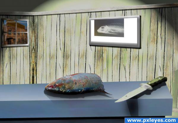
I thought the cause of death was quite clear, but the medical examiner wanted to be sure before he was sent across the street ;)
All made from source material other than links listed (5 years and 3820 days ago)
Blur some edges a bit, especially on shadows...maybe reduce shadow opacity a bit too. Interesting idea.
Thanks for the feedback, i'll try and tweak the edges/shadows
Looks a lot better now...good luck!  (Bring back your hi res pic!)
Excellent shadows.
thanks Ponti, as a beginner thats something I do struggle with a bit - I've only has Photoshop for a few weeks so still finding my way. The feedback from you guys on this site has been helpfull already though, this is by far the best chop site I have found!
Congrats for your second place
Congratulations
Congrats for your second place
Howdie stranger!
If you want to rate this picture or participate in this contest, just:
LOGIN HERE or REGISTER FOR FREE
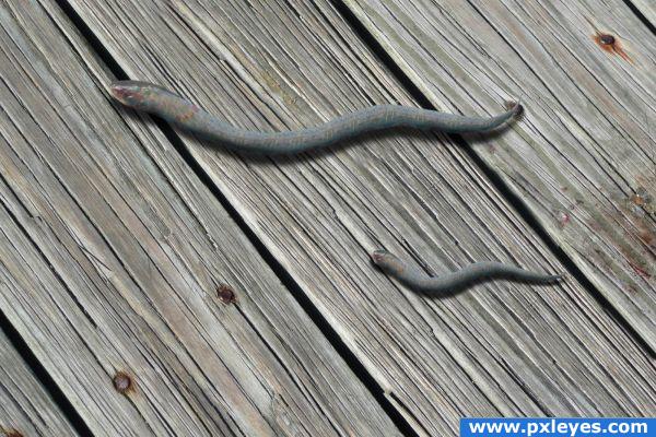
Only source image used. (5 years and 3822 days ago)
the fish look flying, isnt it??
What I think dimas86 means is that your shadows are a bit much and just tone them down a little. You used a drop shadow, correct? Then I would suggest making them bigger or just crop the snake so you can see the snakes better and also match either the original pattern of the fish head to the snake bodies or vice/versa. Unique entry though. I’ll come back and vote later.
Howdie stranger!
If you want to rate this picture or participate in this contest, just:
LOGIN HERE or REGISTER FOR FREE
lmao
what's the "b" for....lol .....big?
probably tht or posibbly 'by hook'....
gud work buddy
very nice
awsome entry. ON THEME> very creative.
Very creative and love the different fonts used for effect. Good Luck.
thank you all for nice comments......
great
thank you all for comments and votes....
Howdie stranger!
If you want to rate this picture or participate in this contest, just:
LOGIN HERE or REGISTER FOR FREE