Photoshop Pictures: Fish (page 28)


results 136 - 140 of 159

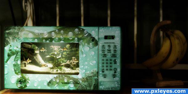
Dinner is in the Microwave... - created by Nellista


Dinner is in the Microwave...
Favs: 1SBS: 1Hi-resRank: 16/25Score: 54.1% (0)8257 views

I found the picture of a microwave, cropped it to get a closer focus on the microwave itself, selected it using the pen tool.
Selected window, copied it separately and deleted the center. Added the fish tank environment, resized it to match the size of the window, softened edges, added fish, added the window on top, changed blending mode to linear light and lowered opacity under 50% to get a better transparent look.
Colored the microwave using color balance and hue/saturation, added bubbles, fish and sea horse on the exterior. Added bubbles inside as well.
Added shadows and lights using adjustment layers and gradient tool. (5 years and 3726 days ago)

6 Sources:

avatar GolemAura
GolemAura says:

you are weird author.... absolutely brilliant.. but still coo coo bananas.. marvelous mind

EDIT: WOW!!!!! would have never guessed You amaze me

avatar Eladine
Eladine says:

really like the idea but the fish and bubbles on the outside of the microwave kinda is to me a bit overdone it takes away the focus from i nside the microwave

no avatar
Keiley22 says:

omg............ i feel bad that i just re-heated pizza lol ( extra anchovies please)

avatar pixelkid
pixelkid says:

Need to agree with Eladine. Good job...right on theme!

no avatar

good take on the theme. nice job on the micro.. however, i think i will keep my pets awAy from you just the same, if you dont mind. : )

avatar bddesign
bddesign says:

wow, nice to see an entry that actually follows the title of this contest... creative FISHTANKS.. not creative fish eyedroppers, or creative fish oil pills. XD anyway, if i had fish, and i saw this 'fishtank' i would probably buy it. nice work!

Howdie stranger!
If you want to rate this picture or participate in this contest, just:

LOGIN HERE or REGISTER FOR FREE


Fishtank App - created by theskepticaldesigner


Fishtank App
Favs: 0SBS: 4Hi-resRank: 19/25Score: 53.1% (0)8302 views

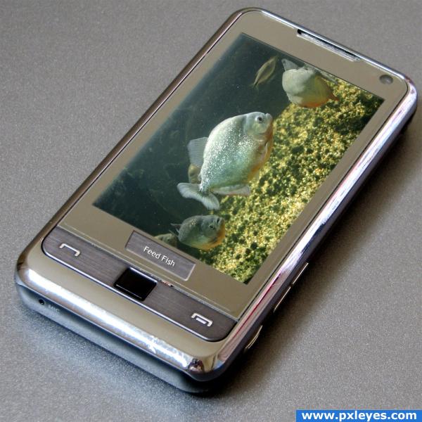
A combination of micro electronics and compression of space leads to a real fish tank for your cell phone.

This was done with a combination of layer masks and a blank layer to restore the depth in the screen. (5 years and 3726 days ago)

2 Sources:

no avatar

Well done!

avatar Richirajd
Richirajd says:

Nicely done.......... It will look more good if you make the left side of the screen more solid...............

avatar arkncheeze

Neat... I had those kind of aquarium widgets for my cell phone... Only one thing, the perspective of the the feed fish button is really off... See the other button...

avatar thomasms
thomasms says:

Nice image but arkncheeze is right you really need to sort that perspective button out. It is rather distracting.

no avatar
Keiley22 says:

wow!!! i cant even take a photo on my phone and you got fish swimming in yours lol ( probably shouldn't have gone to tha pub tonight hehehee)

avatar pixelkid
pixelkid says:

Nice job...try blurring the 'feed fish' ever so slightly. The surface it's on...isn't that sharp.

avatar wazowski
wazowski says:

Not bad, but you may want to make the left edge from the screen (the side above the fish) sharper and perhaps it can also do with a bit of inside shadow (see also the original cell phone image to compare). Good luck!

Howdie stranger!
If you want to rate this picture or participate in this contest, just:

LOGIN HERE or REGISTER FOR FREE


Garish Fish - created by GolemAura


Garish Fish
Favs: 3SBS: 13Hi-resRank: 6/25Score: 55.8% (10)8491 views

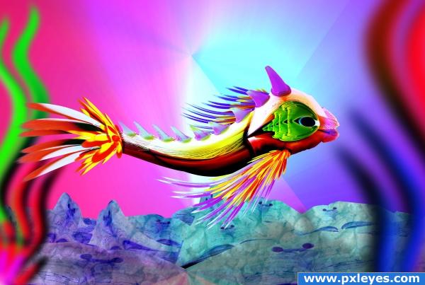
SOURCE ONLY (5 years and 3733 days ago)

avatar fille
fille says:

dämn great! very smart fish! cheers!!!

avatar mariosilva

ye bro i recognize your style, who more in this site is abell to do from a fish from a scull ehehehehe? u have a big imagination good luck author, high marks for everything

avatar nasirkhan
nasirkhan says:

Very nice work

EDIT : My guess was right, it was you and your unique color style

avatar CMYK46
CMYK46 says:

Title is indeed correct.

avatar nishagandhi

wow this is awesome!!love her expression

avatar ponti55
ponti55 says:

Interesting image, good luck!

avatar nehayash
nehayash says:

gr8 job

Howdie stranger!
If you want to rate this picture or participate in this contest, just:

LOGIN HERE or REGISTER FOR FREE


Dont go Inside - created by theskepticaldesigner


Dont go Inside
Favs: 0SBS: 4Hi-resRank: 25/25Score: 49.9% (0)11397 views

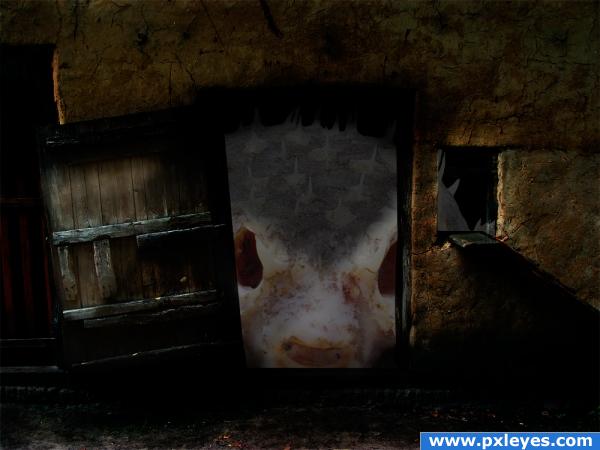
I found this image of a dead blowfish that I thought would be perfect for this contest. I have not worked with shadows all that much yet, so please be kind :). (5 years and 3743 days ago)

1 Source:

avatar ponti55
ponti55 says:

A little disturbing, i have to say .. good luck!

avatar k5683
k5683 says:

gross. lol

Howdie stranger!
If you want to rate this picture or participate in this contest, just:

LOGIN HERE or REGISTER FOR FREE


Snack Time - created by spero4


Snack Time
Favs: 0SBS: 23Hi-resRank: 4/25Score: 57.1% (20)26038 views

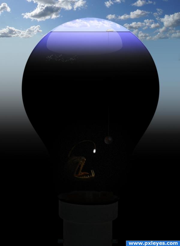
[ please view High Resolution to see all details ] (5 years and 3755 days ago)

7 Sources:

no avatar
peaches says:

very funny

avatar nemanja
nemanja says:

good idea...

avatar GolemAura
GolemAura says:

Those fish always creep me out.. the husband lives on her side where a hip would be... ewww.. wonderful job though

avatar Lya
Lya says:

Super nice idea !!

avatar ponti55
ponti55 says:

Nice xD

avatar CMYK46
CMYK46 says:

Good image, but the sphere is bigger than the ship...

avatar Tuckinator

i really love this image! the water could use a bit of work but hey, its a cool image!

no avatar

Nice chop

Howdie stranger!
If you want to rate this picture or participate in this contest, just:

LOGIN HERE or REGISTER FOR FREE