(5 years and 3879 days ago)
1 Source:
Photography and photoshop contests
We are a community of people with
a passion for photography, graphics and art in general.
Every day new photoshop
and photography contests are posted to compete in. We also have one weekly drawing contest
and one weekly 3D contest!
Participation is 100% free!
Just
register and get
started!
Good luck!
© 2015 Pxleyes.com. All rights reserved.

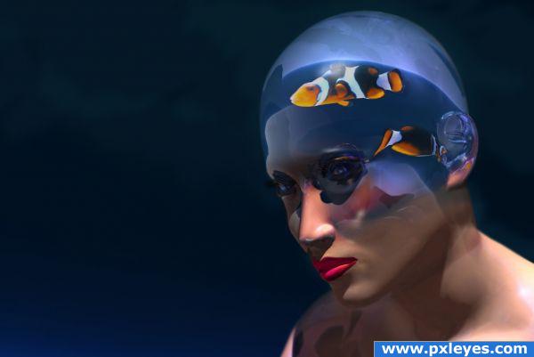
Good idea, good blend, but clear part of head looks better in step 4...
I like step four also...cool idea
Pretty cool idea! If you can manage to make the darker parts of the fish some more darker (but watch out that the orange wont get too saturated, in fact like how the fish looks like in step 4), the fishes may look even more part of the image. Good luck!
 !
!
Edit: better
wow!nice idea and excellentty implemented.this way it looks good but i also liked the fourth step more than this
I've adjusted the clear part of the head more towards step 4 and darkened the fish. THX for the tips
very cool! gl
There's something kind of intense about her eyes. I love it!
I love the image.. very clever
wow...that is a very creative place fr a fish tank! would have never thought of it; it looks like porcelain
Brilliant work. Step four should be the final result. I think its more effective without the skin.
Love it!
Howdie stranger!
If you want to rate this picture or participate in this contest, just:
LOGIN HERE or REGISTER FOR FREE