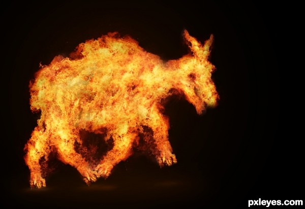
Check it in Hi-res :) (5 years and 3077 days ago)
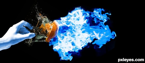
(5 years and 3078 days ago)
Please comment and criticize
Howdie stranger!
If you want to rate this picture or participate in this contest, just:
LOGIN HERE or REGISTER FOR FREE

(5 years and 3123 days ago)
AWESOME AUTHOR!!! Simple and to the point  (though bringing up the contrast on the reality burger might help, it's a bit TOO faded.. IMHO.. other then that.. RIGHT ON THEME
EDIT: MUCH improved... GREAT JOB!
ur right it is a bit faded, but it also adds to the point of reality. it dont come out lookin the right colors either ! lol at least in my experience, they never do......
updated the contrast. stil has the effect im lookin for of still not good enough (color wise)
Howdie stranger!
If you want to rate this picture or participate in this contest, just:
LOGIN HERE or REGISTER FOR FREE
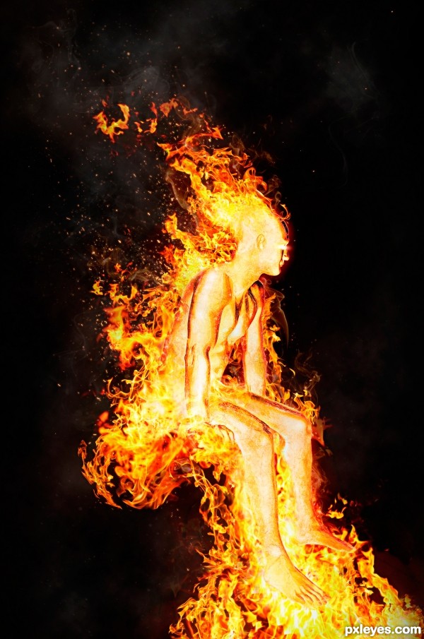
A friend of mine gave me an awesome source image to work from, of a guy sitting on a bed. So I decided to ditch the bed and have him sitting in fire instead! (seeing as this is a "fire people" contest I thought that was a good decision).
:) (5 years and 3395 days ago)
WOW! Nice chop author! My fav so far! GL!
AGREED!! this is phenomenal !! great job author!! best of luck
great entry, gl 
i agree with you all... this is genius...!
Wow thanks so much everyone! 
this is awesome
Really good
Excellent sources. Nice texture and work with the details and the shape of the fire 
Cool! Where's the throne? 
Haha Thanks! Well its not exactly a "throne", I was just going for the fact that he was sitting 
stunning work 
Congrats
Congrats!
Congrats...
Congrats
Congrats!!
Thanks everyone!! 
Howdie stranger!
If you want to rate this picture or participate in this contest, just:
LOGIN HERE or REGISTER FOR FREE
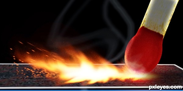
100% CS3
inspiration:
http://www.planetphotoshop.com/striking-match-part-1.html
http://www.planetphotoshop.com/striking-match-part-2.html
(5 years and 3650 days ago)
hmm why does this reminds me of my entry......
Se7eN0f9 I have no clue what you are talking about. Is it in this contest?
All from scratch makes this a very nice image. Good luck 
Nice work doing all that from scratch!! 
great work!!!
Good job on following the tutorial but you should try to change some of it to make it more original such as putting a motion blur on the match and changing the shape of the fire, good luck ; )
Edit:maybe you're right, I only watched the first half of the part 1 video 
Kid you need to take a closer look bud at the shapes you mentioned and negative about the motion blur. BTW, I recommend watching the complete tutorial parts 1 and 2, some good information there.
nice idea well done -- lighting around the head is well done
very very good
i like it  good idea and chop
Pretty realistic! I can also hear the match scratching the box... 
u are a master with the matches.. I know before....... (think.... that you too know...) Very very well executed work... OK take this from me.. 

Nice work! To further appreciate what the author has done, I recommend viewing the SBS. Great job, lots of subtleties.
very nice idea and great job...good luck author
I really like this, well made! Great job, author!
great job 
this is great, looks fast 
Look good.
congrats! 
Congrats 
congrats 
well deserved... congrats.... 
congrats well done  .. I love it

Congrats! 
Grats, Ichappell! Once again, great working on making all that from scratch.
looks nice 
Howdie stranger!
If you want to rate this picture or participate in this contest, just:
LOGIN HERE or REGISTER FOR FREE
Little like headcrab Anyway, good luck!
Howdie stranger!
If you want to rate this picture or participate in this contest, just:
LOGIN HERE or REGISTER FOR FREE