(5 years and 3425 days ago)

thanks to clix (5 years and 3754 days ago)
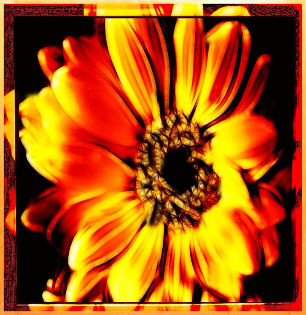
How have you used the source image?
i put the flower in the chalkboard and used it as a frame
It's a little bit on the "minimum source used" side but this source is kind of limited as it is.
BTW, what are all those little "Demos" in the high res?
The demos are because they used a demo version of a redfield filter plug in... 
Howdie stranger!
If you want to rate this picture or participate in this contest, just:
LOGIN HERE or REGISTER FOR FREE

(5 years and 3853 days ago)
Very nice job - like the various sources and the way the flame is used
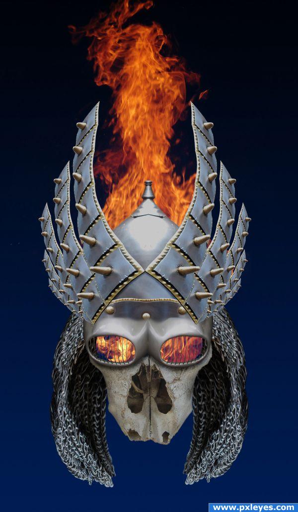
I like it. My only suggestion is to make the back of the hair alot darker. The light source indicates that the light comes from the top, so that area would be deep in shadow. Besides, I think it will make the skull pop up a little and give the hair a little depth. 
@ thefinalcut: Thanks for the suggestion...shadows added, looks better! 
Looks really cool! I do think the bone of the face needs some shading on the sides and more darkness inside the nose since the least light reaches there. Also the top of the flame has a straight edge where the image ended, simple clean up there. These are minor tweaks but I think they would really enhance an already good image IMHO.
Reminds me of my ex-mother-in-law! 
@ Spaceranger: Good eye...tweaks made! 
Nicely done...
nice job
nice perspective great entry Author 
Amazing work!
And also congrats for your third place! 
Congratulations for 3rd too
congrats
Congrats 
Congrats!!
Howdie stranger!
If you want to rate this picture or participate in this contest, just:
LOGIN HERE or REGISTER FOR FREE

(5 years and 3947 days ago)
nice twist on the idea.. good luck
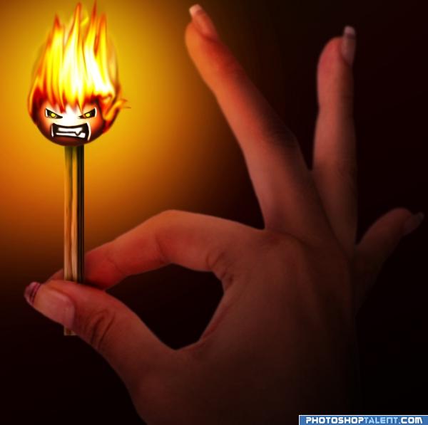
if you make the flame head a bit transparrent to see the match , a little more work to look like a real flame - cool idea 
thx gornats for the tips, i tried to make the match more visible and the hair more like real fire. i hope it looks better now.
and thx GolemAura for the nice comment.

nice idea. head is too dark
good idea and colour
i lightened the head. thx for the tip gopankarichal! 
very nice idea 
it's better now
Nice change of pace!
very nice 
Good Luck 
LOL  nicely created idea


nice lighting
Howdie stranger!
If you want to rate this picture or participate in this contest, just:
LOGIN HERE or REGISTER FOR FREE
Howdie stranger!
If you want to rate this picture or participate in this contest, just:
LOGIN HERE or REGISTER FOR FREE