(5 years and 3653 days ago)
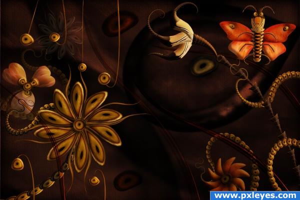
Only the source image is used plus a texture I did myself and described in the sbs. (5 years and 3913 days ago)
whoah cool
High marks from me. It reminds me of Bosch. Imagine Bosch getting his hands on Photoshop!
And who is Bosch? Sorry but I know only about Bosch drilling machines or something of the kind 

That looks really cool!WOW!

Hieronymus Bosch, one of my all time fav painters: http://en.wikipedia.org/wiki/Hieronymus_Bosch
Aaaaaa, thanks a lot for the link. Now I know who is that great guy. The problem is that my "creations" look like done with drilling machine in comparison with his masterpieces 
Wow, the more I look at it the more I love it. It kinds draws you in. The contrast between the foreground flowers and the background is amazing.
I don't know.. where's the Source???? giggle snort..hehehee (oh I kill me) Wonderful isn't it xtro.. Author is amazing...  like anything you didn't imagine times a thousand
Great work on this very unique image quality stuff!!
beautiful 
beautiful work author. love the colours
very nice 
Very Pretty....
very nice 
beautiful work 
Very good.
good job & nice composition .... GL 
Amazing work! Very beautiful. I love the way you used the eyes, just perfect!
Congrats! Well Done!
Congrats very nice indeed!
Congratulations for 3rd, really beautiful
Congrats Cornelia! 
congrats, good image 
Perfect is just not enough to describe this creation! Congratulation dear friend! Well deserved for a great talent, tremendous imagination and wonderful unique style!
Congrats!
congrats friend
Congrats!
Congrats!! Lovely work!!
Howdie stranger!
If you want to rate this picture or participate in this contest, just:
LOGIN HERE or REGISTER FOR FREE
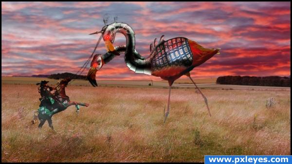
The worst enemy of nearby villages. Two headed evil flamingo against a hero. A rider with a whip. (Warning, Includes Violance). Step by step guide coming soon... (5 years and 3915 days ago)
awesome rofl
you is a nut burger author.. two head flamingo?!?!?!?! great imagination .. good luck!!!
Wowwee!! Nice job!
the lower half of the horse is too bright. the same goes for flamingo's legs 
he he ohhh funny.....very good imagation
There are a lot of technical things I don't like here, but I do like the sweet insanity of your image. 
really good imagination, good work!
nice work but one neck is not match with the body
very nice 
the legs are a but weird :O
very cool
Howdie stranger!
If you want to rate this picture or participate in this contest, just:
LOGIN HERE or REGISTER FOR FREE
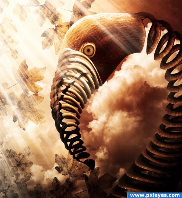
I got the image of a spring and selected it using the pen tool.
I put it over the flamingo in the source image after I made it bigger. I used the ctrl+Shift+I+ Del method to cut the flamingo into the spring shape. I played with the blending modes and opacities to get the spring to look more like the initial flamingo. I masked a lot using layer's masks.
Added leaves all around the image and sky in the backround. I added some gradient adjustment layers, brightness and contrast and shadows using different tones of grey.
Added some light beams and cropped the image for composition purposes.
SBS upcoming! (5 years and 3915 days ago)
hehehehe..I think I know..hehehehe
(your magnificent color tones are showing author.. MREEEOOWWWWWWW..purrrrrr..hehehehe) GREAT WORK
Do you....really??? Do you???? Do you???? Lol!
Beautiful stuff! Nice work, author. 
Super!!!! Great job, looks great! Nice atmosphere too!
it looks like a mythical creature! i like it
great mood, very nice chop
beautiful
wow, how u did that? it is simply amazing. the background, the light, the shadows. Really amazing. nice work and i hope you win this contest. see u
COOL!!! good luck is a very very nice one
Gorgeous image & colours very nice work indeed!....personally i think it looked better with out the light rays
cool very good
this is an amazing image ! Love it!! Best of luck!
this is an amazing image ! Love it!! Best of luck!
Nice idea Author  good luck to you
Thank you so so much for the great comments...! I haven't forgotten about SBS...will be posting it most probably tomorrow...as I have to work as well....unfortunately....lol....otherwise I would stay on Photoshop allllllllllll day long...!
Good image
nice work
very nice 
pretty cool
Good one.
Are you sure this is not 3D ? LOL. look better than any 3d soft can do. Congratulations and good luck.
congrats! 
Howdie stranger!
If you want to rate this picture or participate in this contest, just:
LOGIN HERE or REGISTER FOR FREE
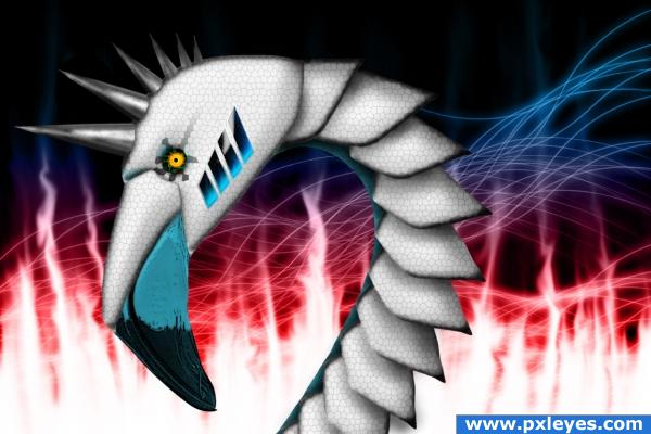
Source & Layer Styles as only source.
View in High Resolution! :) (5 years and 3916 days ago)
Wah??? Deja Vu???.. comment still stands on the use of the stain glass.. great usage without getting cheesy.. wonder why you had to resubmit? good luck
really cool!
to golem: Because they deleted my entry. I wrote a comment to my SBS and they told me something about it made it not-anonymous. I dont really understand but i edited it and it should HOPEFULLY be right now. I don't hope they delete it again 
creative
Nice work, really nice work. keep doing your work, because o do it good  see you later
Thank you Nikebot!!
very nice 
Thank you Chakra
Omg.... 11th place.
Howdie stranger!
If you want to rate this picture or participate in this contest, just:
LOGIN HERE or REGISTER FOR FREE
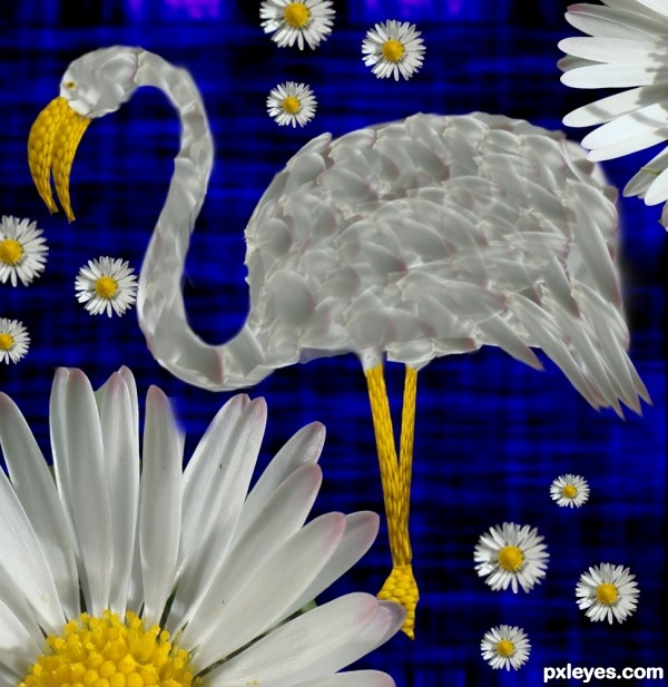
The feathers look a bit out of place, they should all be flowing in the same direction.
I am agree with samvio
the concept is very solid.. might want to add a bit of shading for depth.. but only if you think it needs tweeking.. this would be great in a Hotel Lobby... many places it could fit.. good luck
Feathers look a little better but I agree with Drivenslush about the shading, and maybe make the edges less blurred so that it isn't smudged into the background.
How about trying to smudge slightly the feathers to the same direction?
Nice idea, but imo the idea of using the petals as feathers is completely gone since they're beyond recognition. Go back to your Step 2, have a good look at your reference again and place then the petals in a logic order. May take a little time but is certainly worth it. Good luck!
Edit: looks way better now!
yeah..this entry looks rushed..but I like the concept
thanks Henk, i tried to change the feathers a bit, is it better now ?
nice idea
I think I would have used a different background the blue is a bit distracting from your nice flamingo. Good job though and GL
Howdie stranger!
If you want to rate this picture or participate in this contest, just:
LOGIN HERE or REGISTER FOR FREE