(5 years and 2738 days ago)

(5 years and 2853 days ago)
Great find of picture... but that is all it is, right now, a great find... background and picture found on internet... I think you can do something more with this, maybe atleast make it into a yin/yang zin/zang symbol...
Gimme a break! The Yin/Yang symbol is the most trite thing you could come up with in a contest like this. The meat of the contest is: "create a contrast of opposites based on the oriental theme". The concept of the pairs of opposites is fundamental to all philosophies, and many of the entries in this contest reflect that without using the Yin/Yang symbol.
I concur with what you are saying and would totally agree if you had made the mechanical arm yourself; or if you added something additional to the background you created! (people fighting robots or something like that!)
I faved in advance hoping you would tweak it just a bit... not to my personal suggestions... but just look inside and give it the extra boost it needs to be super duper awesome! 
Sometimes a good find is all it takes. I've seen it work many times, and all this one needed was some graphic impact in the background. Something like people fighting robots wouldn't fit what I had in mind anyway...I see this as a friendly handshake between the creator & the creation. That's why the title isn't Flesh vs. Steel.
I see your point! Sometimes the idea or creative imagination goes along way... 
as stated earlier.. really a great picture and concept!
great picture ..Hate your background... my artistic bias..LOL
good luck
Howdie stranger!
If you want to rate this picture or participate in this contest, just:
LOGIN HERE or REGISTER FOR FREE

(5 years and 3158 days ago)
nice..
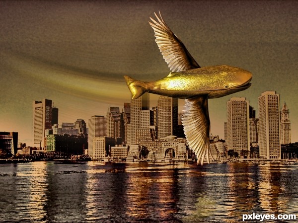
see if you can blend the wings' color (more golden) to that of the whale's...
small suggestion to consider, let the wing sweep the surface of the water, add water splash, water droplets...
agree with aheman author
nice work
GL author!.........nice job
What a clean and wonderful concept author! Well done!
Howdie stranger!
If you want to rate this picture or participate in this contest, just:
LOGIN HERE or REGISTER FOR FREE

(5 years and 3544 days ago)
I don't see Cubism here, just repetition of forms.
Cubism. N:
A nonobjective school of painting and sculpture developed in Paris in the early 20th century, characterized by the reduction and fragmentation of natural forms into abstract, often geometric structures usually rendered as a set of discrete planes.
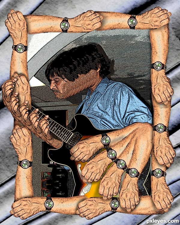
reduced to three elements.. the arm.. the face ... and the other hand... Geometric form of a rectangle of frame.. triangle arm.. rectangle head progression..
Three layer planes.. the background the frame the arm.. frontal head lobe
Fragmentation of natural forms into the abstract.. (not limited to geometric structures)
Did a 20 page thesis on Cubism in college.. got an A+ and also tutored others on the subject
It's amazing what you can learn when you are taught by a professor that really understands art
Where's the reduction and fragmentation of natural forms into abstract, often geometric structures?
Triangle around the arm in motion (Marcel Duchamp..Nude Descending stairs).. (abstract NOT non Representational)
Fragmentation of the playing finger into a half DNA Helix (another geometric structure)
The linking of the arms into the shape of a rectangular frame..fist over elbow
The repetition of the watch into a pendulum arc...(Arcs are actually geometric structures in their own right but the watch is ROUND.. thus another geometric form borrowed from the source picture)
(psst.. cubism, like a cube is trying to show other aspects of an image on different planes only on a FLAT SURFACE) I chose to show the FLESH, TIME, and MUSIC of the image I chose.. using a bumpy surface to display it on... 
"The creative act is not performed by the artist alone; the spectator brings
the work in contact with the external world by deciphering and interpreting
its inner qualifications and thus adds his contribution to the creative act."
(Marcel Duchamp)
awesome!
It's quite different of the others; I know Cubism had many phases, including collage of materials like newspaper, glass, cloth, wood... Nice work, author. GL... 
different approach author...gl
great ! i like it . g l
Howdie stranger!
If you want to rate this picture or participate in this contest, just:
LOGIN HERE or REGISTER FOR FREE
I love these neat colors
GL author
thanks!
Howdie stranger!
If you want to rate this picture or participate in this contest, just:
LOGIN HERE or REGISTER FOR FREE