Photoshop Pictures: Flight (page 3)


results 11 - 15 of 26

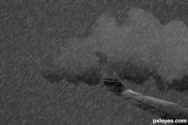
STORMY FLIGHT - created by jcfreak6363


STORMY FLIGHT
Favs: 0SBS: 4Hi-resRank: 12/12Score: 48.6% (0)5684 views

1st-removed chimney
2nd-Inserted jet wing pic
3rd-removed BG from jet wing
4th-Added photo filter adjustment layer
5th-Made rain effect above all layers
6th-Merged all layers then Image/Adjustments/Black&White (5 years and 3230 days ago)

1 Source:

author says:

I realize there are 6 steps in the description and only 4 steps in the SBS but you get the gist of it. Hope I spelled gist" right

avatar greymval
greymval says:

You could use the bouncing raindrops (light color) to create more contrast, paint them on the upper side of the plaine which should also be lighter, so that we can distinguish the form of the plain easier. I also think that cropping the image would help the composition - too much useless space right now

Howdie stranger!
If you want to rate this picture or participate in this contest, just:

LOGIN HERE or REGISTER FOR FREE


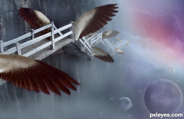
A Flight of Stairs - created by artgirl1935


A Flight of Stairs
Favs: 2SBS: 11Hi-resRank: 4/12Score: 56.6% (20)8530 views

Thanks to the following at flickr.com: hypergenesb for the planet photo; alternakive for the stairway to heaven photo; CharlesLamb for the flying bird;Also, to kconnors at morguefile for the aurora photo. (5 years and 3244 days ago)

4 Sources:

avatar MnMCarta
MnMCarta says:

NICE JOB! This is really unique

avatar arca
arca says:

Very clever concept!

avatar Drivenslush

creative angles and a great new concept.. what clever author you be.. hehehe.. love the creation.. great WORK

avatar CMYK46
CMYK46 says:

Since the stairs are attached to the cliff, what are the wings doing on the left side?

avatar jcfreak6363

Awesome!!!

author says:

Stairs have just taken off in flight, so had better have wings on both sides - although I have no documentation to prove it. lol Test Flight, I guess!!

avatar vimal
vimal says:

nice.......

avatar erathion
erathion says:

Fantastic concept author...best of luck

avatar pingenvy
pingenvy says:

Nice concept and composition, author.

avatar pearlie
pearlie says:

Very nice idea and execution, author!

avatar jericho
jericho says:

Good work

Howdie stranger!
If you want to rate this picture or participate in this contest, just:

LOGIN HERE or REGISTER FOR FREE


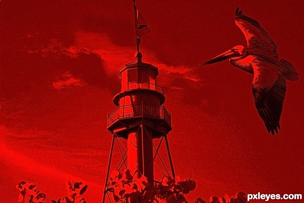
Flight - created by birdhm


Flight
Favs: 0SBS: 8Hi-resRank: 10/12Score: 52.5% (0)5695 views

(5 years and 3279 days ago)

avatar MossyB
MossyB says:

It's too blurry, and the tower is crooked, leaning to the right.

author says:

Any better? I straighten out the tower.

avatar greymval
greymval says:

That seagull is a pelican

author says:

Yes, it is. I wrote seagull by mistake.

Howdie stranger!
If you want to rate this picture or participate in this contest, just:

LOGIN HERE or REGISTER FOR FREE


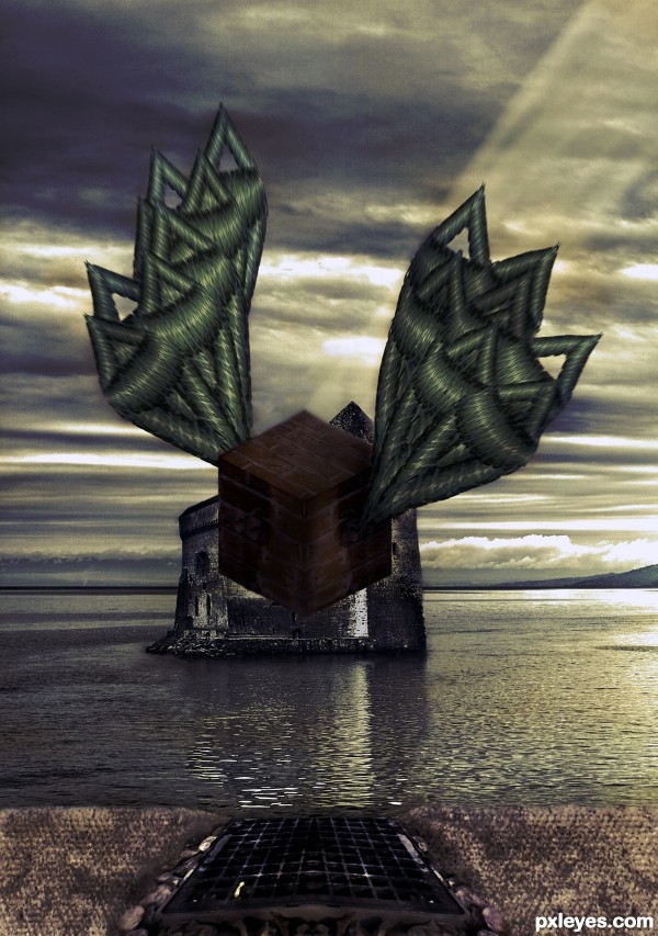
Flying Brick - created by xwd


Flying Brick
Favs: 0SBS: 10Hi-resRank: 9/12Score: 52% (0)10396 views

(5 years and 3280 days ago)

1 Source:

avatar CMYK46
CMYK46 says:

Motion effect should be on the entire object, (wings too) not just one part.. Interesting use of source.

avatar erathion
erathion says:

Very interesting approach...maybe u could use some color adjustment layers to achieve more dramatic result...with colors like this i suggest dark blue overlay layer,dark brown color layer, maybe gold-ish color layer and at the end blue/gray soft light layer...Of course all layers must have adjusted opacity...just an idea author...best of luck ...

Howdie stranger!
If you want to rate this picture or participate in this contest, just:

LOGIN HERE or REGISTER FOR FREE


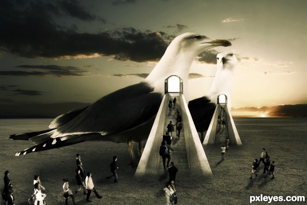
Flight to Heaven - created by dreamboy


Flight to Heaven
Favs: 2SBS: n/aHi-resRank: 8/12Score: 56.5% (0)8445 views

Made by using Color Adjustment, Brushes, and masking Techniques.

Thanks to http://night-fate-stock.deviantart.com (5 years and 3334 days ago)

7 Sources:

avatar Alan2641
Alan2641 says:

nice idea like the overall look of this -- one thing as the light from the door appears to be quite strong would not the person in the door be in silhouette?

(fixed by removing)

avatar Ressiv
Ressiv says:

Nice overall feel, but I see a lot of different perspectives. The stairs look like they go down, the people in front look like they're falling towards the viewer. Gl

author says:

Thanks both for suggestion, I worked on it.

avatar arca
arca says:

Great surreal image ... I say this before you worked on it some more and I definately like it better now. I did like the guy in the doorway before but I can see why you took him out. Either way, wonderful work IMO!

author says:

Thanx for liking. And sorry for the guy was removed by mistake.Now I add it...but unfortunately now I have unable to submit it.

avatar swordfish
swordfish says:

lovely concept .........

avatar erathion
erathion says:

Amazing idea and great execution author...I like overall mood and colors...good luck

author says:

Thanx for liking.

Howdie stranger!
If you want to rate this picture or participate in this contest, just:

LOGIN HERE or REGISTER FOR FREE