Photoshop Pictures: Flip


results 1 - 4 of 4

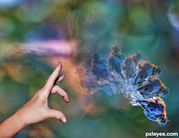
Flip The Bird - created by racystcy27


Flip The Bird
Favs: 1SBS: 2Hi-resRank: 15/23Score: 62.8% (0)6917 views

1. I created this background in Photoshop with a bunch of colors
2. I took a photo of a Bluebird that I had taken, removed it from its background and added it several times in different positions and opacity.
3. I took a picture of my hand making a flicking motion, and since my hand is old looking, I smoothed it out in Photoshop.
4. I combined all to make this.
5. Step 1 photo shows original bluebird photo
6. Step 2 photo shows original hand photo (5 years and 2454 days ago)

avatar CorneliaMladenova

Interesting concept

Howdie stranger!
If you want to rate this picture or participate in this contest, just:

LOGIN HERE or REGISTER FOR FREE


flip the switch, go green - created by jaescoe21


flip the switch, go green
Favs: 0SBS: 7Hi-resRank: 6/23Score: 58.2% (10)8501 views

(5 years and 3609 days ago)

avatar ponti55
ponti55 says:

Your guide is very difficult to see, perhaps try it on a darker background. The image itself is very nice!!

avatar Graphopoly

the idea of the neon light is good but the choice of the font color combined with the background color is bad. I would suggest to add a shadow to the text so it can pop out a little or to go with a darker backround. Good luck anyway thought

author says:

how is this? is it better???? should i put something back...

avatar CMYK46
CMYK46 says:

Glass part looks good, threaded base should be metallic...

no avatar
maXed says:

Go green, turn your light on? .. Isnt it like better to turn your light ofF?

author says:

this is suppose to be one of those light bulbs that are better for you. I forgot what they are called, but the ones with the curl in them.

avatar chakra1985

great

Howdie stranger!
If you want to rate this picture or participate in this contest, just:

LOGIN HERE or REGISTER FOR FREE


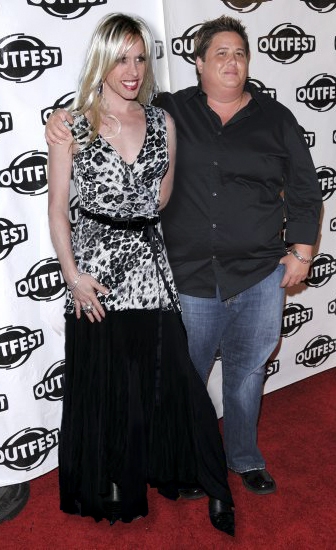
Flip Flop - created by vapaholic


Flip Flop
Favs: 0SBS: n/aHi-resRank: 12/23Score: 56.8% (0)10938 views

Chaz and Alexis (5 years and 3767 days ago)

2 Sources:

avatar ponti55
ponti55 says:

Nice one

avatar CMYK46
CMYK46 says:

Source links don't work

avatar Tuckinator

great job

avatar CMYK46
CMYK46 says:

Bad source links

author says:

Thanks CMYK46, for the heads up.I updated the source links. Let me know if those aren't working.

no avatar

Haha, Chaz. Just because you want to be a man, doesn't mean that you have to look like chris farley. Except for Alexis' left arm, they look like they're originally in the same photo.

avatar OliviasArts

so far the most believeable image ive seen in this contest lol..... good one them ;p

avatar sparklen
sparklen says:

Best one so far! Great sources and blend.

Howdie stranger!
If you want to rate this picture or participate in this contest, just:

LOGIN HERE or REGISTER FOR FREE


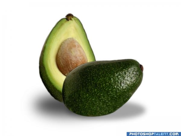
Flip - created by achiver


Flip
Favs: 0SBS: 4Hi-resRank: 23/23Score: 49.9% (0)5002 views

change the position of the food (5 years and 3797 days ago)

avatar GolemAura
GolemAura says:

Very nice work here... but the front half needs to be a bit bigger to match the back fruit.. if you want the proportions to match

avatar Tuckinator

pretty cool

avatar Ory
Ory says:

Far to simple. Its nice work so I wont vote it down, but really simple Also I agree with Golem, to fix the perspective make the Avacado at the back smaller.

avatar devangel
devangel says:

interesting idea. make me smile. very nice. good job

avatar LKY
LKY says:

very nicely managed......gud work....

avatar gopankarichal

simple work

avatar zatrix
zatrix says:

Ory - maybe it's just a bigger avo but yes, too simple

avatar chakra1985

nice

Howdie stranger!
If you want to rate this picture or participate in this contest, just:

LOGIN HERE or REGISTER FOR FREE