(5 years and 399 days ago)
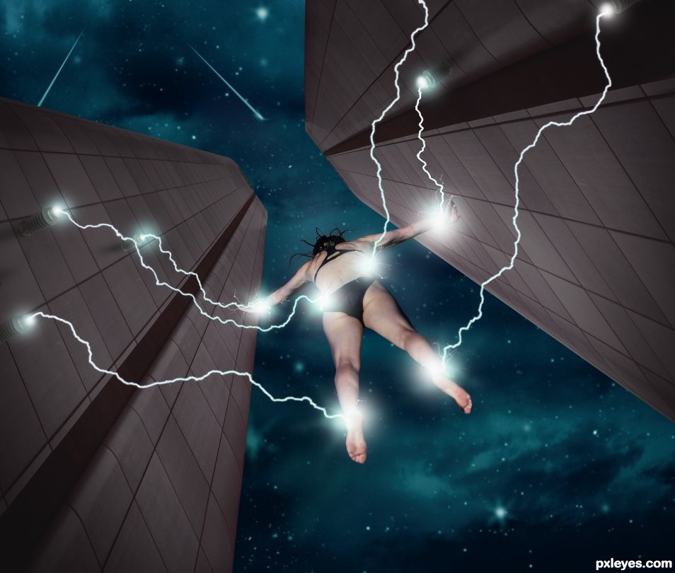
Girl suspended from lightning. Made a Step by Step too, so have a look. Not much of a source image to work with. (5 years and 828 days ago)
Wow, the lightnings are dazzling, like real ones 
This was a weird contest. Only 3 people could think of anything haha. These may be the best contests really since they are so hard to come up with an idea.
Congrats BW  This is... electrifying
Thank you
Congrats BWR terrific 
Thank you
Great work..🤘🤘 bdw congratulations 😉
Thank you
Howdie stranger!
If you want to rate this picture or participate in this contest, just:
LOGIN HERE or REGISTER FOR FREE
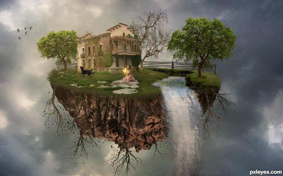
Composited with many sources. This was one of the most fun Photoshops I have ever done. Had no clue as to how to make a Floating Island, but through perseverance, it got done. Mods the Tomato Root was used to mask the "Dead Tree" to make some of the roots. More sources:
http://maxpixel.freegreatpicture.com/Waterfowl-Geese-Flock-Migrate-Migration-Migratory-2143952 - Birds - CC0 Public Domain
https://pixabay.com/en/stones-gravel-wire-pattern-207880/ - "Falling Rocks" by the roots - meineresteramp
https://pixelstains.deviantart.com/art/3-Particle-Brushes-for-Photoshop-517711672 - Particle Brushes by Tree Leaves and Roots - pixelstains
https://moonglowlilly.deviantart.com/art/PNG-TREE-AB-330801213 - Both Green Trees - Moonglowlilly
https://gd08.deviantart.com/art/dead-tree-png-211271091 - Dead Tree for Roots - gd08
https://frostbo.deviantart.com/art/Fence-Stock-02-265326504 - Fence - FrostBo
https://gd08.deviantart.com/art/Grass-02-png-258792386 - Grass - gd08
(5 years and 870 days ago)
Good work. 
Thanks mate. Good fun. On a side note it's amazing how many mistakes you can find once you actually submit your entry. You can check it 400 times in Photoshop and not see a flaw. Then you submit it, and all hell breaks loose. 
Congrats BW, maybe we'll meet there some day!
 Sounds good to me.
Howdie stranger!
If you want to rate this picture or participate in this contest, just:
LOGIN HERE or REGISTER FOR FREE
(5 years and 871 days ago)
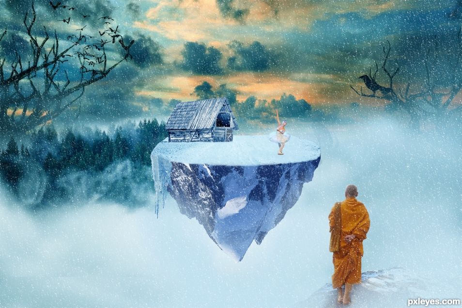
Could just be a big rock...we can't see if it's floating or not.
I hope its better now, thanks for feedback
Very well done, it looks well like an island now! You should just erase the cutting tracks left around the dancer. They are very visible in high res.
Is the monk secretly in love with the ballerina? Or is he spying on her to learn some moves for the Shaolin Ball? Perhaps she is trying to "woo" the monk with her beautiful dance..
A few suggestions. The bottom of the barn is not blended in well with that snow. Quick and easy fix would be to clone some snow on top of the barn. Just "dab" with a soft round brush to to make high-ish and low-ish points so it's not just a straight line.
That blue in her skirt-thing is distracting. A quick fix would be to Clip a Hue/Sat Layer and adjust the "Lightness" of either the Blues and/or Cyans to make them more white. After that, make sure the Adjustment Layer's Mask is all Black to hide what you just did. Then paint white on the mask where the blue yucky stuff is. Now it's all gone. Also as Zizounai said, there is a bunch of residue garbage all around the girl. It shows up when you are zoomed in.
In my opinion her skin is too warm so you may want to give it more of a blue tint to reflect the "Coolness" of the snow scene. Perhaps a Cooling Filter, masked only to her skin, would be easiest or however you see fit. There is too much black under her foot, and when you cut her out you missed a nice chunk between her knees.
Besides that, it's a pretty cool fantasy scene. 
nice idea... different to the norm, WD ,,, would've scored higher if it didn't have the telltale 'cut-and-paste' look, try softening/feathering the edges of your montage elements (just by a few pixel) you'll be surprised the difference! Pix xx
Good work ajzaib47. Nice chop. Voting was weird on this contest.
Howdie stranger!
If you want to rate this picture or participate in this contest, just:
LOGIN HERE or REGISTER FOR FREE
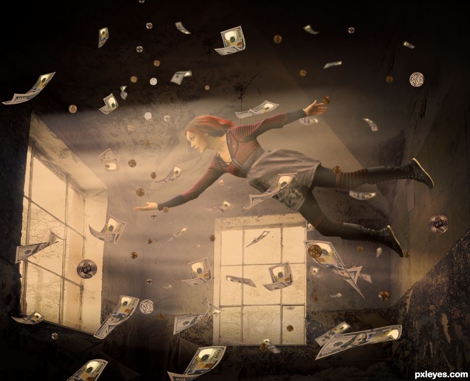
*****PLEASE VIEW HI-RES. THE PREVIEW LOOKS BLURRY*****
3 sources. Had to do a lot of perspective work on the room. Used 1 $100 bill with a lot of warp and transformations to make it look like falling money. Had no clue how to do it, but figured it out. Yay me! Girl was cut out and puppet warped. (5 years and 909 days ago)
Give her a bag before she opens the windows!!!
Haha. If she opens the windows, she gets no money. It's part of the game.
But if she stays in the room, she won't be able to spend the money? Not even a computer cash machine for her bitcoins 
Congrats BWR, nice work 
Oh darn!! I forgot about this contest and didn't vote. But TY MM.
Congrats BW! how could you forget about this chop, when you spent so long trying to make Photoshop swallow the source image 
Ahh nice, the website is back up. It was down most of the day.
I don't know Z. My heart just isn't into Photoshopping as much. 
Howdie stranger!
If you want to rate this picture or participate in this contest, just:
LOGIN HERE or REGISTER FOR FREE
Congrats B
Howdie stranger!
If you want to rate this picture or participate in this contest, just:
LOGIN HERE or REGISTER FOR FREE