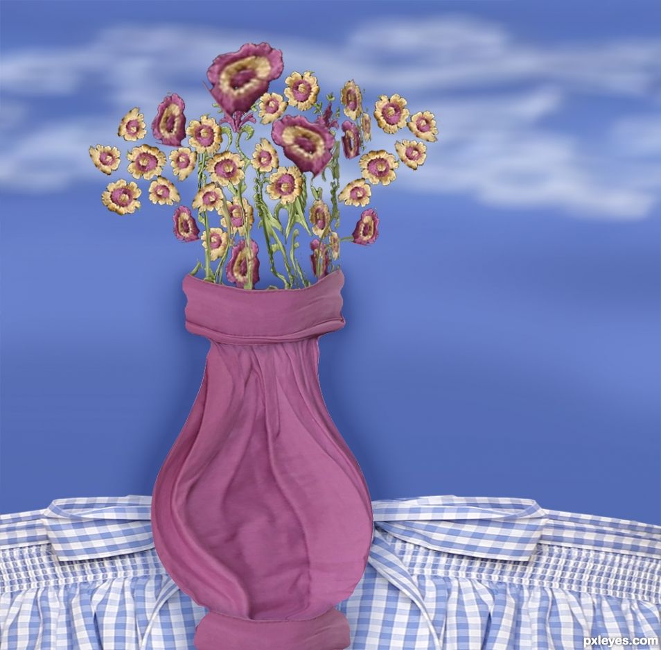
Kinda Valentine's day themed. I really liked the fabrics, so I went with them. Even the clouds and sky are blurs of the blue dress. (5 years and 1249 days ago)
All is created in Photoshop (5 years and 2671 days ago)

Thanks 
Howdie stranger!
If you want to rate this picture or participate in this contest, just:
LOGIN HERE or REGISTER FOR FREE
I use only source image and
some floral brush (5 years and 3162 days ago)
Howdie stranger!
If you want to rate this picture or participate in this contest, just:
LOGIN HERE or REGISTER FOR FREE
The image is mainly created in Illustrator then additionally manipulated in Photoshop.
Guidelines: http://www.online-photoshoptutorials.com/2008/09/creating-a-retro-grunge-poster.html (5 years and 3244 days ago)
Howdie stranger!
If you want to rate this picture or participate in this contest, just:
LOGIN HERE or REGISTER FOR FREE
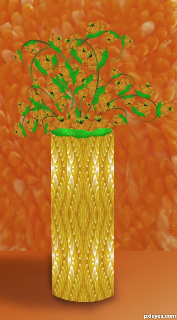
For artgirl1935 :) (5 years and 3695 days ago)
The orange background makes the orange flowers hard to see. The floral arrangement seems a bit undersized for such a large vase.
Agrees with Dan. Also, the corn vase you made, lacks depth. The shadow in front of it just gives the illusion that it's floating. I would suggest looking at an actual vase and maybe make it the same shape of a vase, but include the corn niblet texture.
Nice effort, but I agree with both. How about changing the color of the flowers? 
darker shade at the bottom will help.... good luck 
thanks for your suggestions, its the first time im trying this style , i will do better next time 
Maybe you could spherize it a little bit... So it looks more 3D. 
all the best ............. 
Great idea and nice work. To make your beautiful flowers easier to see, maybe next time you could use hue and saturation to change the color of the background to a more neutral color. That would let your flowers be set off against the background. As for giving the vase more rounded shape, you could use a simple gradient overlay layer style. By using that, you can set it to mirrored type gradient and use black and transparent for your colors in the gradient. You can adjust the size of the gradient as well. Keep up the great work though, I will be looking forward to seeing what you do next.!GL
Maybe you could study the color wheel. The use of complementary colors between flowers and their background will help them become the center of focus rather than the vase.
Thanks Lois  I'll do better next time
Beautiful sunny colors 
nice
Howdie stranger!
If you want to rate this picture or participate in this contest, just:
LOGIN HERE or REGISTER FOR FREE
What an incredibly creative and interesting idea!!! You may want to look into the perspective of the cloth (you can use Distort/perspective to give it some depth) Experimenting with the burn tool to give the vase some dimension.. just gently rubbing the edge to give it some roundness.. not necessary just a suggestion.
You may want to anchor the flowers (though floating them is effective) the choice is yours. Adding stems would be a bit of a work out, but it would make the image come together tighter.. well in my eyes any way.. and my eyes are pretty effed up so take that with a grain of salt.
GOOD LUCK!! (and great job)
I agree with Driven. The concept is incredibly unique and creative but would look a lot better with a 3D dimensional effect, some stems on the flowers and using some perspective on the blue check to make it look more like a table with a tablecloth on it than like an apron.
Howdie stranger!
If you want to rate this picture or participate in this contest, just:
LOGIN HERE or REGISTER FOR FREE