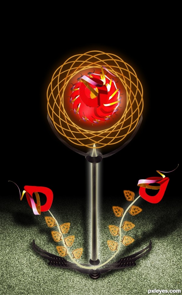
only source image and PS.
(5 years and 3297 days ago)
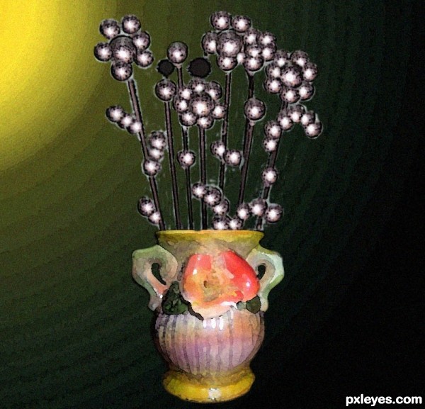
i made this wisk into a steel flowers in a vase using cs5. (5 years and 3319 days ago)
Nice concept, but the background leaves a bit to be desired...
Howdie stranger!
If you want to rate this picture or participate in this contest, just:
LOGIN HERE or REGISTER FOR FREE
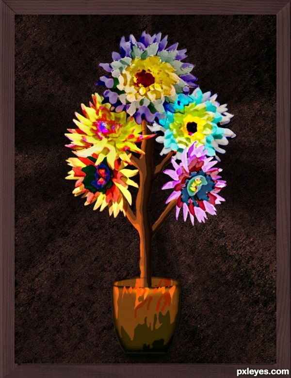
I like paintings although not very good at it. The source flower look great and had the idea to make it look like watercolor. (5 years and 3347 days ago)
very nice work author...this is really Van Gogh style...best of luck
Thanks erathion. 
appreciate the work!!! good luck
Howdie stranger!
If you want to rate this picture or participate in this contest, just:
LOGIN HERE or REGISTER FOR FREE
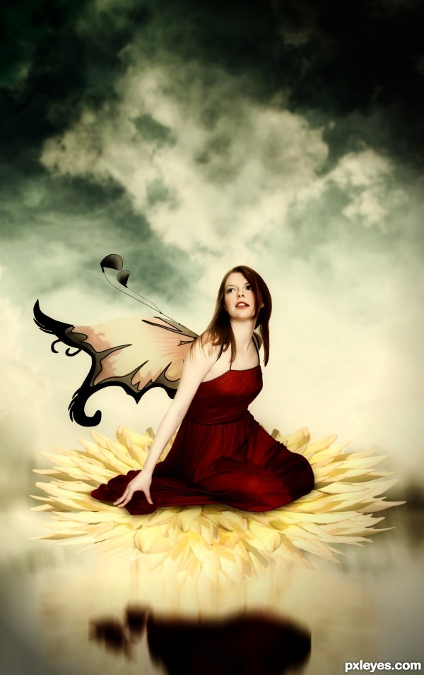
flower are made by duplicating flower from source image. Gave it shape using wrap tool. (5 years and 3348 days ago)
very very nice work author...very cool mood...i know that is on the original image but i would change that wings...they look very unnatural...maybe u could try to create some wings from the source image...just an idea...best of luck
Nice colors. Like the loving gaze. Flower looks great. Would like to know how you achieved it. Gaussian blur would make it wonderful. GL 
@erathion Thanks for your nice comment and suggestion.
@locale Oh! Thanks. why not...sbs has added.
Congrats for 3rd
Congrats!!
congratulations...
Congrats!
luv the colours... congrats...
Howdie stranger!
If you want to rate this picture or participate in this contest, just:
LOGIN HERE or REGISTER FOR FREE
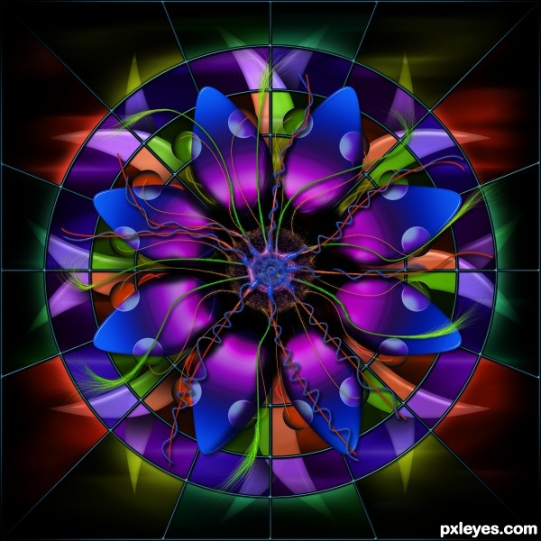
I submitted this piece for "Stained Glass" digital drawing entry, but was unaware the guidelines have changed (haven't been here in a while) so this entry does not fit the criteria for that particular contest. Figured all this work shouldn't go to waste and submitted it here. (5 years and 3355 days ago)
Still a wonderful image, shame it couldn't be used in the DD contest. Good luck, high marks from me 
don't worry about it.. oh glorious talent.. it works well here as well... I love the fact that everything in this image is Yours.. and that is AWESOME 
interesting!
Woah! Quite eye candy to say the least. Beautiful job, author. Really love the symmetrical yet random approach.
Mesmerising, love the dreamy colors 
And very well done I must say.
Ah, that's why it got removed. GL! 
Glad to see this in this contest...it is beautiful and I loved it in the other contest and I love it in this one too! 
Awesome colors.........Good Job.....G/L Author.
Super cool work author with great colors....GL
Beautiful work here, you're quite an artist, checked your site recently - great work!
Howdie stranger!
If you want to rate this picture or participate in this contest, just:
LOGIN HERE or REGISTER FOR FREE
Creative for a CBR, but the lighting and shadows are totally inconsistent, with the black background only adding to the visual confusion.
It's imaginative and creative, but not cohesive as a visual image - I'm sorry, but it's like a "Photoshop doodle."
Excellent construction and I can see the source perfectly, and i can see it all through the please.. the original image is clearly visible...
the lighting is perfectly fine for a frontal flash, great job author
the triangular construction is very well balanced and cohesive, and nothing is flat,
I really like the work author, and the entire image is completely yours and you didn't have to "borrow" an image from a stock site
and don't be sorry MossyB, Just try to learn more about non representational-ism, it's in every hotel and hospital waiting room in the Art Deco district of South beach, and this image would fit in perfectly
Great Job AUTHOR.. good luck
Thank you very much for your great support and comments.. Drivenslush..


@ mossyb: Thanks
I FULLY understand "non-representational," DrivenSlush. That has nothing to do with my comments to the AUTHOR, but thank you for presuming to educate me.
Agree with Drivenslush...top job author. Your lighting is fine, reality does not always have to play in these images.
MossyB.. well from your statement, calling this a CBR'd piece is incorrect, and then saying your sorry for ripping into it with a confidence only seen in the likes of Bill O'reilly is down right weird, not to mention calling it NOT COHESIVE when it's in the shape of a triangle, one of the most balanced forms in the universe (check out the Last Supper) leaves your comment somewhat to be desired.. but then again this is IMHO.. this is a very excellent chop, and it made grand use of the source.. complimenting it, then calling it a doodle, is just not that cool
Nice imagination and well constructed image author ......all the best to u .....
Hi friends!!.. I really appreciate your comments for my entry.. Drivenslush vs Mossyb.. both are very talented artists and making this site always keep active with their comments and suggestions..

Wonderful detail and a very delicate touch! Don't know about "real" or "not real" but I do know that it look almost surreal to me and I find the lighting works.
Howdie stranger!
If you want to rate this picture or participate in this contest, just:
LOGIN HERE or REGISTER FOR FREE