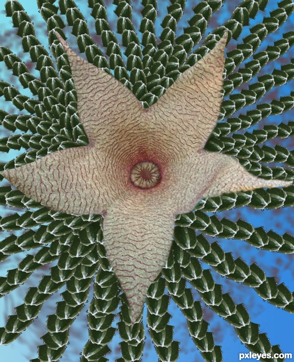
Made only from source image (5 years and 3582 days ago)
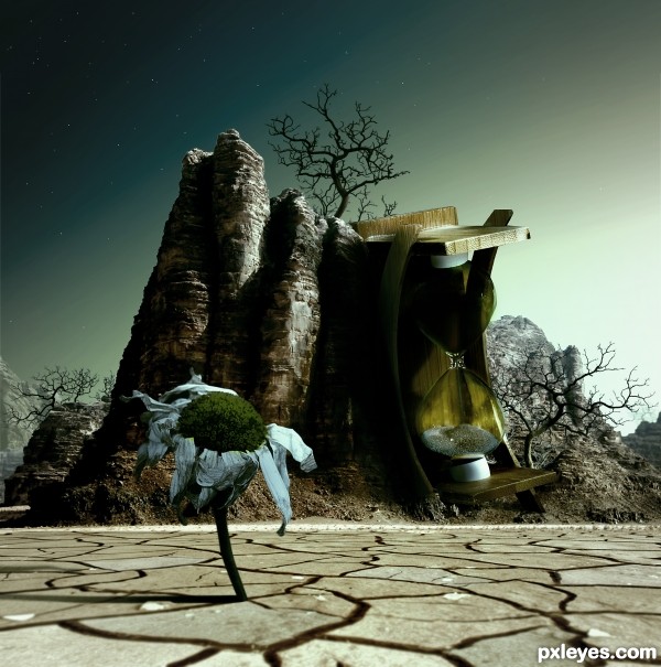
Now a lifeless world.
Thanks to pepemczolz for the flower image. (5 years and 3592 days ago)
Good choice of sources and a very nice blend
Well done author! This looks really creative and nice to look at. Keep up the good work! 
Well done author! This looks really creative and nice to look at. Keep up the good work! 
Stunning...
love how the hourglass is leaning on the mountain... very nice blend
very good!
i have to say. this is pretty freakin cool. i like it a lot, good job
Fabulous! One of the best I've seen! GL!
good luck
CONGRATS!!!!
Congrats for your second place!
Congratulations for 2nd
Congrats! for 2nd
Congrats on 2nd place 
luv the idea.... congrats...
Howdie stranger!
If you want to rate this picture or participate in this contest, just:
LOGIN HERE or REGISTER FOR FREE
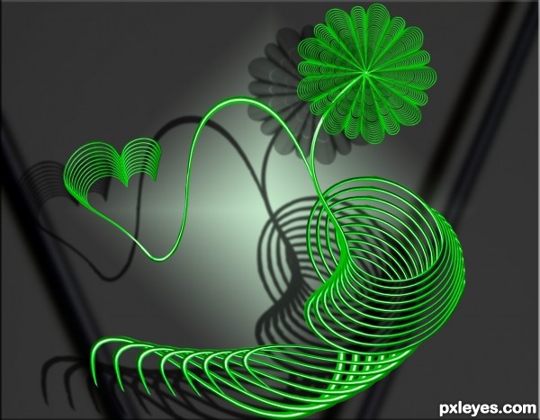
Supplied source used. (5 years and 3603 days ago)
beautiful work .................. the flower is very nice.................. all the best to u............. 
it is very good
awesome work 
Nice work, GL 
this is the kinda image this type of work is called for  fits beautifully
It's quite beautiful, you are very talented...
Agrees with Slushie. 
I love the color nice work 
Great work author...best of luck
really cool
very good work
Howdie stranger!
If you want to rate this picture or participate in this contest, just:
LOGIN HERE or REGISTER FOR FREE
(5 years and 3603 days ago)
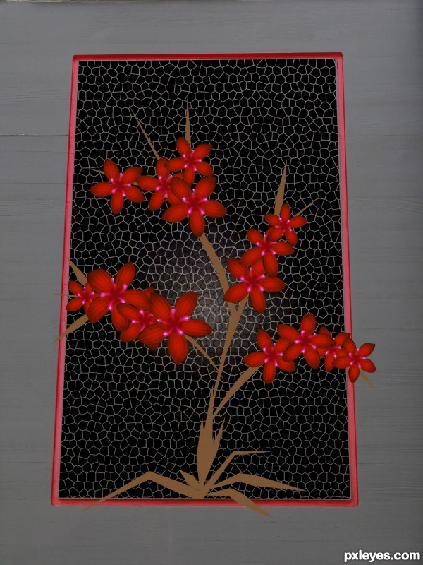
this is lovely. the only thing I would suggest is to burn the tan parts and the part of the flower that goes over the beveled edge to make it look like it also is beveled.
I agree with k4583. Stems and and leaves need more work... 
i like the layout from sbs better
good work ........... 
nice having it coming out of the frame.. good luck author
GL
Beautiful! 
nice
congrats...
Congratulations!!!!! 
Howdie stranger!
If you want to rate this picture or participate in this contest, just:
LOGIN HERE or REGISTER FOR FREE
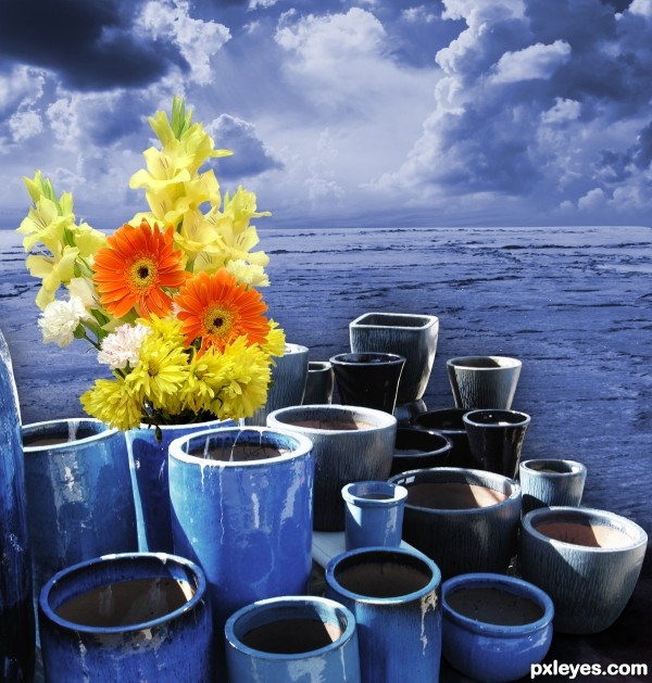
Please comment, I'd love to make improvements. (5 years and 3610 days ago)
it looks like a collage more then real portrait... i like the complementarity between warm and cold colours, except the gray scale background...
what would you suggest as a color scheme for the background?
Maybe if you give the background a bit more contrast it wil look better 
light sources dnt match, try and fix dat...gud luck
try the same atmosphere of cold blue from the pots...
all the best ................
gl
Howdie stranger!
If you want to rate this picture or participate in this contest, just:
LOGIN HERE or REGISTER FOR FREE
nice ......... gud luck to u ...........
Howdie stranger!
If you want to rate this picture or participate in this contest, just:
LOGIN HERE or REGISTER FOR FREE