Only Source
(5 years and 3676 days ago)
(5 years and 3679 days ago)

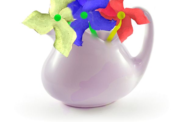
Compared to the pot, the flowers look very fake. Edges of the flower stems are not edged good, don't quite appear to be coming out of pot. Perhaps play around with dodge and burn to get a better result. I'll hold my vote.
better now ?
Um, no actually worse. Now it looks like they are part of the pot. I am assuming you did not save the PDF, meaning a file with all the layers used but if you did, try using polygonal lasso tool and edge the pot then select the flower stem layer and erase it that way. Just keep trying. You get it. 
nice 
Howdie stranger!
If you want to rate this picture or participate in this contest, just:
LOGIN HERE or REGISTER FOR FREE
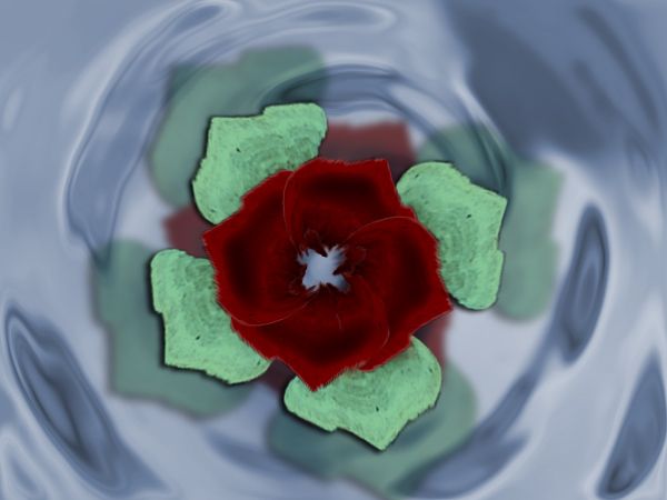
its a really simple job . Hope you like it. (5 years and 3681 days ago)
Howdie stranger!
If you want to rate this picture or participate in this contest, just:
LOGIN HERE or REGISTER FOR FREE
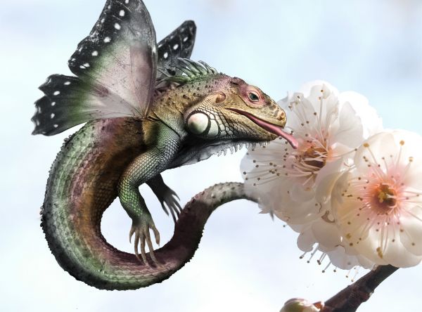
Part butterfly, part iguana. (5 years and 3685 days ago)

not bad
hey I don't know for sure if yours was the iguana in the cave entry, I'm thinking it was...anyway what a shame it was removed I thought it was a great chop 
The places where you've joined the body segments are way too obvious, and the wings should probably be further back, but it's still a good idea.
Different! Everybody thinks of dragons, dinosaurs... 
PS: Like the colors...
very creative, reminds me of a college project where I combined animals with black and white drawings.
haha this is great! i love the idea
Incredible
I think it is lovely, love the whole concept and the use of colour
very very very nice GL
nice I like it! goodluck with contest
oh man grt idea i would have never come up with this idea coooooool
very nice
nice
Great! 
Great! 
congrats!!
Congrats!! 
Howdie stranger!
If you want to rate this picture or participate in this contest, just:
LOGIN HERE or REGISTER FOR FREE
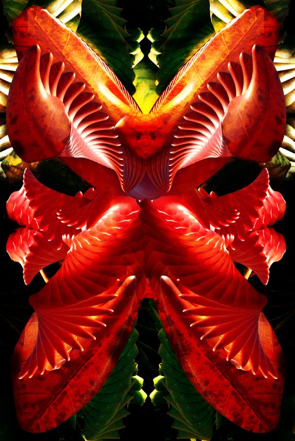
Thanks to Ale_Paiva and Gurss for the nice stock. (5 years and 3704 days ago)
Good work. 
Stunning image --but I have no idea if this was really from the source? Except for the colors, need more to see how it was done.
I was still uploading the SBS  . Patience :-b
OK now that is awesome ! well done.
Wow, looks assume !!!
great 
Howdie stranger!
If you want to rate this picture or participate in this contest, just:
LOGIN HERE or REGISTER FOR FREE
excellent
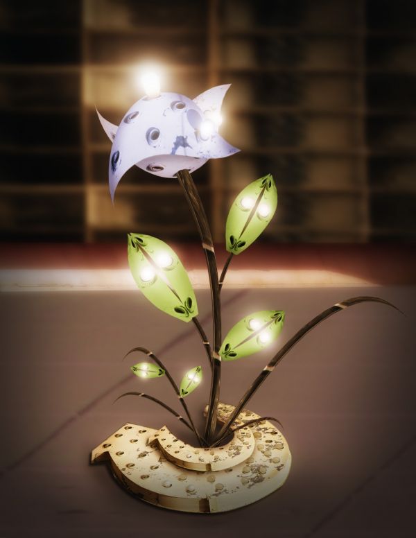
Great work! Finally you come back . I have a suggestion of removing the shadows of the bulbs and metal string still remain on the "flower vase"
watch out the bottom... how can i point out that portion... its the middle of arrow cut is not well curved.. neeed more finishing with shades. thats all .. this is an exellent job
hiteshnp thanks for comment. langstrum thanks for comment and suggesstion. I have removed bulb shadows and metal string from vase. hereisanoop, thanks for suggesstion, I have made some changes to bottom.
great Great GREAT Idea
Very interesting and luminous idea!
Nice chop! GL!
very creative!
Great work...few minor observation's...bottom part is a bit crucked...try to fix that author and made some shadows for the lieves...good luck
Very neat use of source! ; )
This could make a fantastic reading lamp for my bedside table
Very creative idea.........G/L Author.
congrats
congrats nasir !
Howdie stranger!
If you want to rate this picture or participate in this contest, just:
LOGIN HERE or REGISTER FOR FREE