(5 years and 3698 days ago)
(5 years and 3700 days ago)
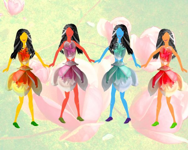
cool and funny!!!!
Nice.....
Cool!
very colorful 
Cute cartoon like image!
Howdie stranger!
If you want to rate this picture or participate in this contest, just:
LOGIN HERE or REGISTER FOR FREE
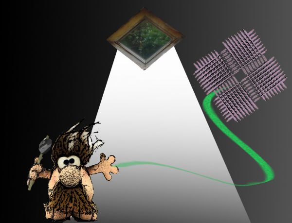
a caveman that lost his kite.
(thanks to Imamon)
btw im 14 (5 years and 3702 days ago)
i think i would've used some more time chopping 
lol..

Howdie stranger!
If you want to rate this picture or participate in this contest, just:
LOGIN HERE or REGISTER FOR FREE
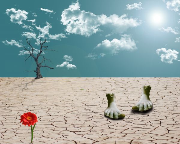
Jenna S.C. -http://venom-stock.deviantart.com/
Piotr Bizior-http://www.sxc.hu/profile/bizior
My hero has real wings.-http://wingsofahero.deviantart.com/
Mila Vasileva-http://milavasileva.deviantart.com/ (5 years and 3710 days ago)
Lighten the shadow a bit maybe....
this is pretty.. although why is there a single Gerb. growing out of stone???
Howdie stranger!
If you want to rate this picture or participate in this contest, just:
LOGIN HERE or REGISTER FOR FREE
(5 years and 3713 days ago)
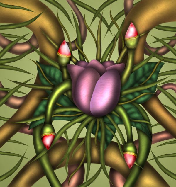
Looks like a painting....Good work.....Though there are some apparent things like the flowers look in the front layer....Overall nice effort...
very metallic.. nifty 
Did you use only the burn tool for the shadowing? If so, you're an expert!
Excellent work!!! good job!
Nice shadows and highlights! Good job.
lovely flower!!
Love its vibrance! 
I like it!
Nice shape and color work. 
Howdie stranger!
If you want to rate this picture or participate in this contest, just:
LOGIN HERE or REGISTER FOR FREE
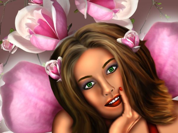
Wonderful work!!! gorgeous!
awesome her hair needs a bit of work.. also remove the flower from her forehead....

otherwise everything is great!!
I agree with Nishagandhi, the image is excellent except for the flower on the forehead, and i think that the bottom bart of the hair should have a few more ends, try using the smudge tool at 1-2pxls. Good luck.
I made some changes and i think now it's better... thank u all for your comments
Great! creative and very nice..
Very rpetty image!
I won't lie: I do like the image, still some small remarks: there's a bit of a difference between the softness of the hair and the sharpness of the eyes! Also, the green color of the eyes makes her face look too cartoonish, maybe darken the green just a touch or add some shadows and highlights to them! I do agree with the flowers in the background, you could find a better choice and instead try either loosing one of the two flowers in the hair that makes her look like having teddy bear ears or place more flowers of different sizes in random positions on just one of the sides...! Best of luck!
Not bad, but did you not have a pre sketch? It's very strange to outline and shade something in this way, without starting with something underneath.
Congrats for your third place, Chakra!
congrats
Howdie stranger!
If you want to rate this picture or participate in this contest, just:
LOGIN HERE or REGISTER FOR FREE