Whatch HD (5 years and 694 days ago)
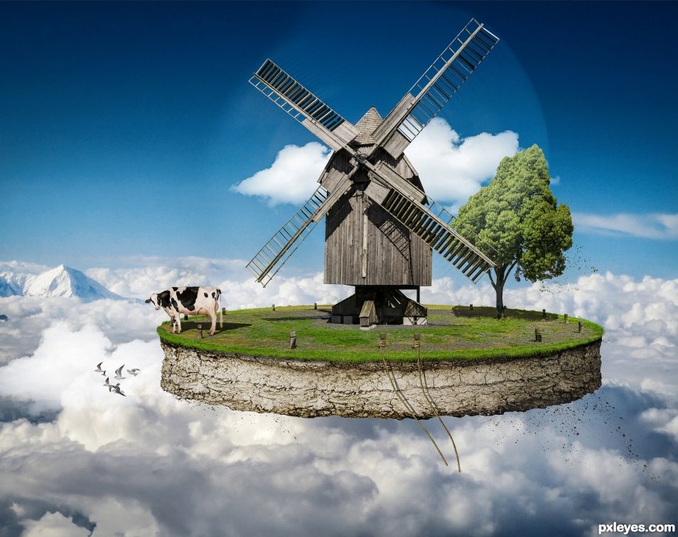
terrain:
https://freestocktextures.com/texture/ground-soil-clods,724.html
sky:
https://pxhere.com/en/photo/754665
clouds:
https://pngtree.com/freepng/clouds--clear--sky--cloudy_506704.html
http://www.pngpix.com/download/cloud-png-image
cow:
https://www.flickr.com/photos/usdagov/16802162424
bird:
https://static.pexels.com/photos/54462/gulls-bird-fly-coast-54462.jpeg
rope:
https://pxhere.com/en/photo/695067
tree:
https://static.pexels.com/photos/414147/pexels-photo-414147.png (5 years and 778 days ago)
Pretty neat composite. Looks like a cake in the sky. Good work making the rope and terrain.
Gorgeous !! It's very well done.
ha ha ha ha ha ha.....this is truly magnificent. The message and oh that poor poor cow. The tonal qualities are really great and it doesn't look photoshopped at all but like the real McCoy....hold on....I have to look out my window to see if it is passing by. WONDERFUL WORK.
Congratulations on the win. Excellent work.
Congrats, great job 
Thanks to all
Felicitations....wonderful. I told you so :-O 
Congrats 
gj eMatoma
Howdie stranger!
If you want to rate this picture or participate in this contest, just:
LOGIN HERE or REGISTER FOR FREE
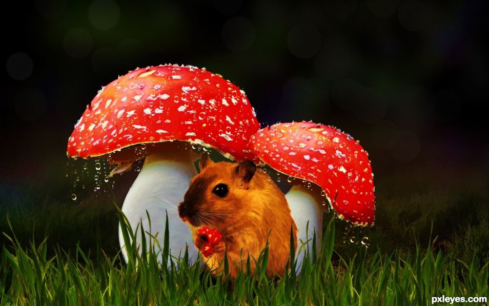
Once upon a stormy night there was a hungry little mouse who found some shelter from the rain under some yummy mushrooms. He was nibbling on a tasty morsel when the rain stopped but drops of water continued dripping off the caps.
Did he stay because the food was too good or did he leave to find a dry place for the night? (5 years and 1322 days ago)
Great job on the warping of the mushrooms. A suggestion (no big whoop) but there is some ghosting around the water droplets. Not a big thing, but to enhance the wonderful realism, that sheen can be easily removed. You can only see it on the left side of the image but it sticks out like a soar thumb. (The WONDERFUL MASKING is also very apparent...kudos! I suck at masking hehehe) Just a suggestion to help you get higher votes.. GREAT JOB!!!
Thanks for pointing that out. I think it must be part of the bokeh overlay which is causing the problem. I can fix it.
Simple fix.. but a WORLD of difference... greatly improved... massively 
Thank you for your kind critique and help. It is good have other people point out what you may overlook yourself.
hehehe, you don't know how many times I upload a chop and then see it in High Res and go.. "HOW DID I MISS THAT?".. doesn't help that my eyes suck.. Great fix.. really makes the image solid now... 
Howdie stranger!
If you want to rate this picture or participate in this contest, just:
LOGIN HERE or REGISTER FOR FREE
1.new layer with mushroom iris blur, render fibers,difference clouds
2.background-radial blur render difference clouds (5 years and 1327 days ago)
troller?
Author, while I'm all for the abstract, something you see in almost every bank in America, but what you've done is completely obliterate the source and created something where You can't see the source at all. I'm sure a mod will contact you and explain. It's great to see the effort, but for this contest, you might need to rethink it.
Howdie stranger!
If you want to rate this picture or participate in this contest, just:
LOGIN HERE or REGISTER FOR FREE
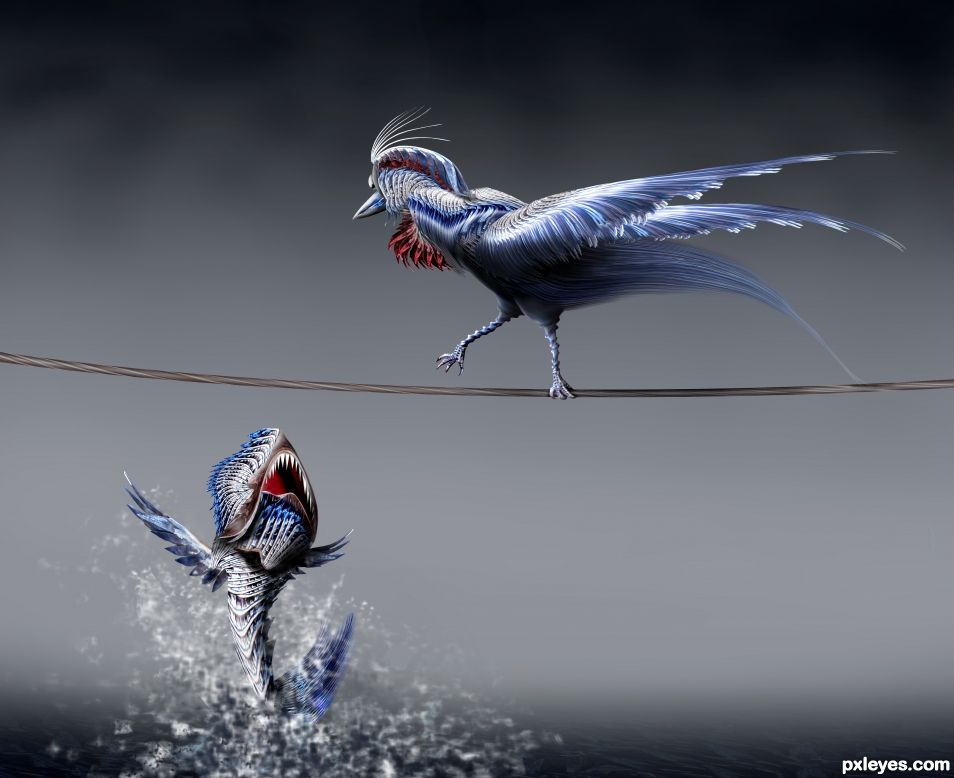
You better fly .... if you got wings (5 years and 1618 days ago)
Excellent work, author! My only suggestion would be to give the teeth on the fish some dimension and fix the blurry side of his head. The lighting is superb.
You are right CMYK I will try to fix it. Thank you for your advice !
Beautiful!
Thank you Wysiwyg
Very nicely done! I agree with CMYK46 but it's a minor tweak and doesn't affect the good score this deserves. 
Thank you Spaceranger!
Beautiful work. Very good and dynamic figures 
Thank you Hereisanoop!
I like the texture given to the bird and fish. Good job!
Thank you George
Great job using the source! Very creative! Good luck author! 
Congrats! 
Congrats!
Congrats!!
Thank you all for comments favs and votes
congrats for second place. great work!
Howdie stranger!
If you want to rate this picture or participate in this contest, just:
LOGIN HERE or REGISTER FOR FREE
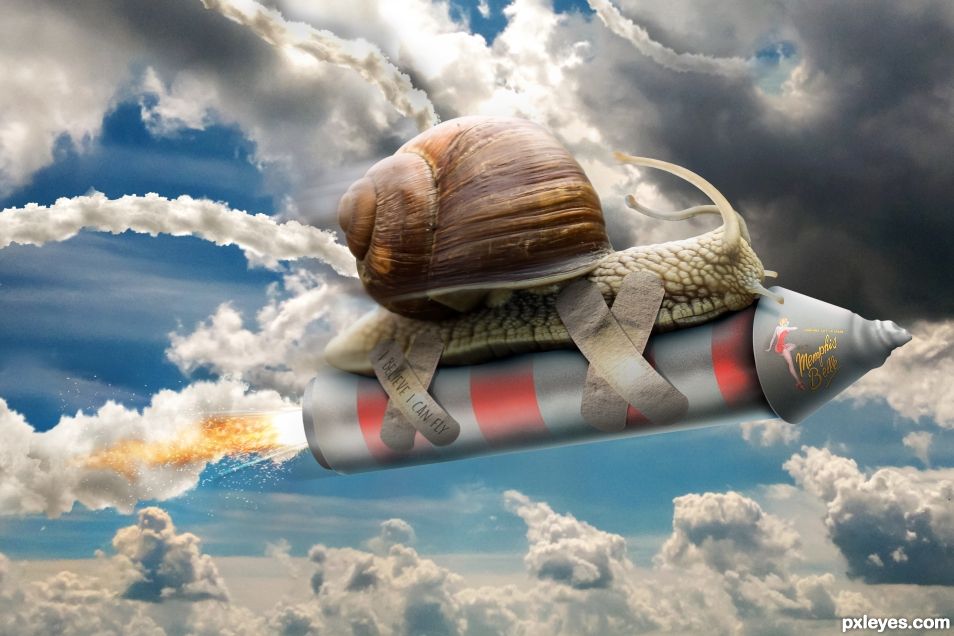
Nice Chop. Shadowing is a little dark IMO. Oh and it's "Memphis" without the 'N'.
Fixed
Yep, shadows should be more transparent. I assume you made the rocket...you have a stray piece of the shadow at the back end to remove, and I'd darken the background sky so the smoke trail is more visible.
yes for the rocket, I tried some fix.
great picture and with humour ! you have my vote author
WEEEEEEEEEEEEEEEEEEEEEEEEEEEEEEEEEEEEEEEEEEEEEEEEEEEEEEEEE!
the eye stocks being forced back by the wind is hysterical!
Congrats!
Congrats !
Thanks to All
Congrats for first place !
Congratulations.
Congrats!
Howdie stranger!
If you want to rate this picture or participate in this contest, just:
LOGIN HERE or REGISTER FOR FREE