(5 years and 3788 days ago)
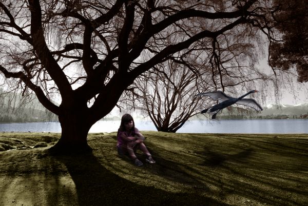
The girl is unhappy as the swan has flown away.
(I also thought I'd try turning a black and white background into a colour one)
hope you like it.
*edit*
I took the comments on board and made a slightly different version.
the swan is more defined and less motion blured.
The girl has more darkness/shadow and the light coming threw the trees making brighter gaps in the shadow.
please let me know what you think.
thanks for all the imput so far.
(5 years and 3795 days ago)
I don't see a trace of the PXL source....
please see SBS
Ummm, okaaaay....
I like it, although I do not like the swan, you took your time on the whole picture but the swan seems sort of sloppy ... you should have left source image and had girl watching swan.... I do how ever think the work itself is very nice and very well done, especially adding colour to a black and white photo... Good luck Author 
Not a good use of source.. however i like the background, looks very realistic, and the girl is well blended.. maybe make her a tad darker. Good luck.
Maybe the swan could be a little less blurry... yes, as ponti55 said, the girl a little bit darker.
I like the little girl but I think the swan still needs improvement...I think you have done a fantastic job on this piece ..with the exception of the swan x
Extremely minimal use of the source
Howdie stranger!
If you want to rate this picture or participate in this contest, just:
LOGIN HERE or REGISTER FOR FREE
Only one source was used. (5 years and 3821 days ago)
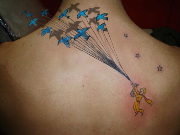
ahhh the little prince 
source link isn't working.
Fixed
Very nice. I had the same thing in mind, but you beat me to it  GL
GL 
Very nice work 
Nice effect....Nice way of showing a feel that the birds are flying away...
nice
Nice source pick, but if you're able to recover the person's original skin under the birds image, would be nice. Right now it looks a bit blurry. Good luck!
Waz I did cover the person's skin. Se my SBS
very nice work and effect! 
Wonderful work! and Nicely done!!!! GL
nice job with the shadows
great job.gl
And also congrats for your third place!
Congrats! 
Congratulations for 3rd too.
Congrats again for 3rd 
Congrats! 
Howdie stranger!
If you want to rate this picture or participate in this contest, just:
LOGIN HERE or REGISTER FOR FREE
A lot of images with the same idea it seems.. but as I finished this one already, gonna submit it anyways - took a lot of work.
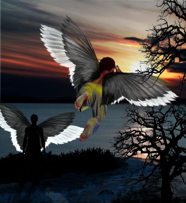
I cleaned the tree picture and removed the girl from the sunset image. Made several pairs of wings with slight adjustment with rotation/perspective tools. Made an invert for white wings. Made the black wings a bit transparent with masking.
Made a new foot/leg and pants for the flying boy with pattern tool and coloured the pants with gradient map tool.
Used duplicate layers to alter sunset image colours and enchanced them by hand (more red, etc..)
Finally added a bit unrealistic but fun shadow/halo wing effect for the silhouette man.
* update **
Added a shadow for the bushes also, as Langstrum suggested. (5 years and 3822 days ago)
nice try, but I think the higher tree branch should be behind the wing or you can delete that one. Moreover, the bush also needs the shadow as the man standing in front. The opacity of the tree is quite low, so it's not stick to the scenery. GL
Thanks Langstrum. I added the shadow for the bushes, but there are 2 different trees for the picture, one in front and one further away, behind the boy. So I'm gonna left that one, thou I see you can think it's the same tree.
The perspective of the tree becomes a little bit of hinderance to the wings as the guy flying looks behind from the perspective whereas the branches of the tree are behind the wings in the picture.....Otherwise nice work....
The wing is coliding with the tree....lose the tree! overall, good chop!
I'd still like to point out, in my mind and eyes there are two trees, and the boy's wings are in the middle.. the lower section tree is also further away from the boy.. so no collision - yet . .?
Congrats! 
Howdie stranger!
If you want to rate this picture or participate in this contest, just:
LOGIN HERE or REGISTER FOR FREE
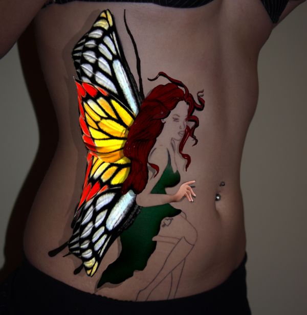
Im hoping this is ok... my eyes are closing and I really need feedback as I can't seem to do any more.
Help would be lovely with this contest, I tried really hard to make my hair look a bit more real and the dress.
I played with shadowing, help there if needed :)
Thanks to
Demordian@sxc.hu
Amukherjee@sxc.hu
Lucy-stock@DA for the tattoo image
To the mods, I will send private email to photographer of hands as my name on sxc is as the one on here :) (5 years and 3822 days ago)
Maybe a little bit of shadow under the hand. It looks a bit flat now 
It would look more realistic if the tips of the wings had shadows too. I know that the original pic but it doesn't look right.
no worries... thanks guys I will add shadow to those two parts right now 
EDIT: Have played with the image a bit more  hope it is improved. Changed her hair as well.

Good work, maybe just fade the shadow a bit, or add a blur to it...  GL
GL
thanks loopyluv 
Lightened shadowing and added a bit more blur 
Howdie stranger!
If you want to rate this picture or participate in this contest, just:
LOGIN HERE or REGISTER FOR FREE
Full of fantasy... Nice!
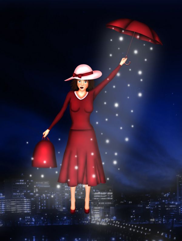
I KNOW I KNOW I KNOW... call on MEEEEEEEEEEEEEEEEEEEEEEEE supercalifragilisticexpealidocious
hehehehe Langstrum you are correct.. I'm going to leave the misspelling because its funnier that way.. hehehe.. thanks langstrum
chim chim cheroo!
GJ!
cute, @ slushie the fact you know how to spell that amazes me ..you googled it didn't you lol .. a spoon full of sugar.. makes you hallucinate flying nannies and a weird cartoon world... GL author
He didn't google, because the correct name is supercalifragilisticexp"i"alidocious, and I googled
Fantastic work...good luck author
wish she would come to my house and clean the kids room lol
awesome
F.A.N.T.A.S.T.I.C. image! The lady in red looks so wild!
I LOVE this type of cartoony effect(reminds me of some types of birthday cards)... well done xx ( I wish she'd come to my house and make my KIDS FLY AWAY !!)
Congrats for your second place, Chakra!
Well done on 2nd!
congrats
congrats Chakra !!
Congrats!!
Howdie stranger!
If you want to rate this picture or participate in this contest, just:
LOGIN HERE or REGISTER FOR FREE