(5 years and 3464 days ago)

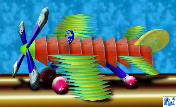
source with cloud pattern back with gradient run way
Made this on my work computer and the lighting is horribly bright... (being naughty at work :) (5 years and 3794 days ago)
Author, you are not Feodora, so why attribute the pic?
in the olden days they used to name planes after women and this source picture is hers and she's a really nice girl
Well, since this is supposed to be "fun" I guess it's Ok for the perspective to be off...
BACK TO WORK!.. your image could do with perspective work. PROP. Tail Fin. I like your runway and you have used the source pic in a fun way. GL
Very nice creative work...Just few minor observation...Wings and fins are a bit out of the perspective....propeller too....rotate body of the plane a bit and wheel is maybe too much...beside that this is really really nice creative work...gl author...
HE HE HE... I built this in a super old version of PS (called 5.0 limited (came free with a 1.3 pxl camera we bought for the store) 1998) we use it ..at work to make coupons and signs around the gallery, but thanks for all the suggestions, but I'm off work to day and Have no way of getting the file home LOL. .. just something I threw together (Business has been very very very slow)
It's ok for something you just threw together. Where do you work? Must be great being able to chop and get paid for it. Agrees with the wings perspective.
wow...jajaaja
Howdie stranger!
If you want to rate this picture or participate in this contest, just:
LOGIN HERE or REGISTER FOR FREE
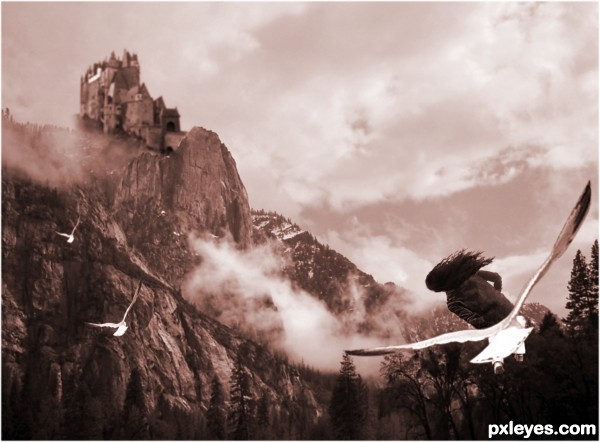
Idea is good, but the girl definitely needs legs (unless she's half human, half bird). If you flip the castle it will receive the same light as the mountains & I think you'll be better able to fix the main entrance (which is now fading away and has a bit weird perspective).
Now that I'm checking the composition (which is not bad), you may want to flip the mountain image, put the castle left on top (so it'll become higher) so you get a nice diagonal composition between the foreground (girl, right under) and the background (castle, right above). Just an idea. Good luck!
wazowaski, thank you for your constructive comment - I made the changes and it does look better thanks
I think the birds could be better not so symmetrically positioned in the air, for a more natural feel, IMHO.
Howdie stranger!
If you want to rate this picture or participate in this contest, just:
LOGIN HERE or REGISTER FOR FREE