(5 years and 2951 days ago)

P is for Puppet & for Psychotic!
May this just be the possible cause??
http://www.youtube.com/watch?v=iKnhTUBt5xI (5 years and 3236 days ago)
That is a really nice work.... nice SBS. Good luck.
That's awesome.
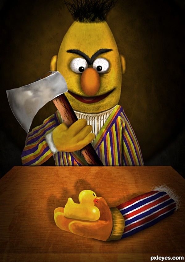
The stripes on the arm holding the axe are not the same as the rest of the stripes of his sweater, but this is a delightfully creepy image!
thats cutting edge art !!!
Creative, but seems rushed to me. Aside from Mossy's comment, the way you have your light source wouldn't put so much shadow on the duck's underside. A lot of edges could be smoothed, too. Make it better with some tweaks...it's mostly funny and well done! 
scary! they were best of friends, now fight over a ducky? poor Ernie...
suggestions:
1) for more 3d, add bright n dark tones to Bert n arm with ducky.
2) add white shine on the edge of the axe, perhaps a starburst to suggest sharpness of axe
3) fade the top part of the shadows on the table (Ernie's arm n ducky)
4) side-thought, you can very well add a "spot light" to just lit the face, axe and arm for a more sinister feel
 cool chop
great...
Hilarious lol.
Poor Ernie
Hahahahahahahahaha...super cool work author...Great humor and excellent execution...high marks form me....
Creepy 
lol it's so cool It's remind me of my doll, when I was a child I've done that to her hand too hehe.
Just wonderful and creative idea!
2nd congrats.. scary entry
congrats for second.....!
Congrats!!
Congrats for second place..
congrats Geexman
congrats!
Howdie stranger!
If you want to rate this picture or participate in this contest, just:
LOGIN HERE or REGISTER FOR FREE

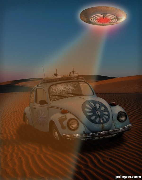
The source has been used in both flowers and the foot, as well as the texture and some color on the car. And how could you not make a 'saucer' from this source?!
Lots of layers on this, more involved than it might seem. Basic layer adjustments and tools. (5 years and 3590 days ago)
The cracks are passing the limit of the glass...
Good observation, and as a matter of fact I was debating on whether or not to erase those further, thinking the black edging was on the inside of the windows. I think you're right, tho, and I have uploaded the revised version. 
Howdie stranger!
If you want to rate this picture or participate in this contest, just:
LOGIN HERE or REGISTER FOR FREE
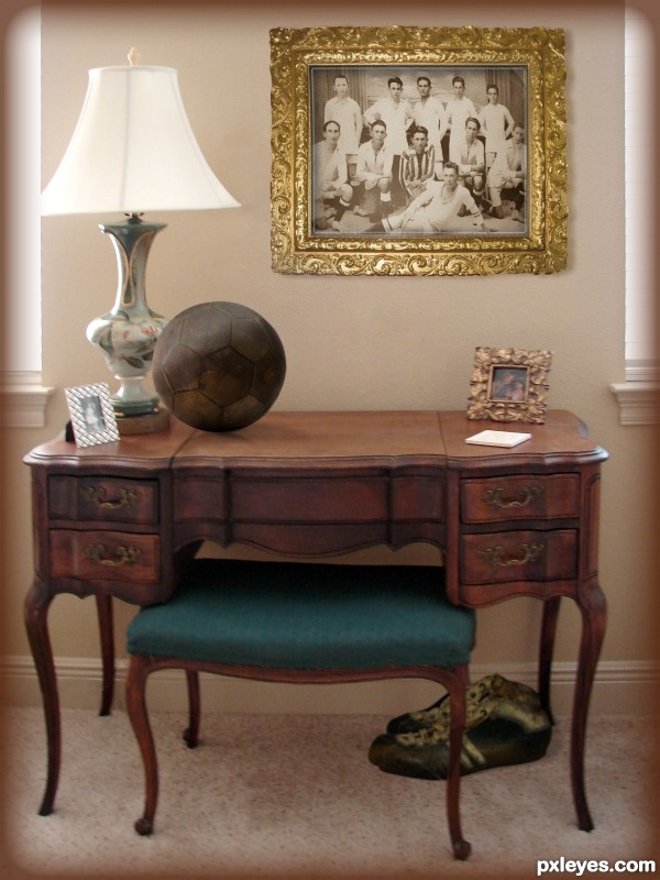
Ball is too big, otherwise nicely done.
Thanks, Bob, I just wasn't sure about that. Based it on the shoe size, which I based on the furniture size. Have reduced it about 80%.
Outstanding job with that ball. Shading and reflection look convincing too me. Nice job overall...those shoes look like they'd be putrid for sure.
Thanks, Loyd. Yes, and they were dunked in Lysol!
Sticky shoes, sticky shoes
 GOOD LUCK!
Always makes me smile
Sticky shoes, sticky shoes
Next time I'll avoid the pile
Love Phoebe Buffay
That's 'p' as in Phoebe, 'h' as in Heebe... must be the same pile where the smelly cat hangs out. TY!
I think the shoes need something. As they sit now, they don't look like they fit in the image. Maybe add some shadow to them and blur them a bit. Good luck author.
Thanks for the nudge, Terry, I increased the blur and moved the shadow out further, seems to fit better now.
I agree! Good luck.
lovely!!!
Thank you!
CONGRATS!!!
Thanks, Ernest!
Congrats!!
Thanks, Rein!
Good job Bubbette.
Thank you, Loyd!
Howdie stranger!
If you want to rate this picture or participate in this contest, just:
LOGIN HERE or REGISTER FOR FREE