(5 years and 3252 days ago)

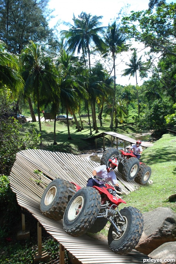
background image is snap by me, thanks! (5 years and 3287 days ago)
sugggestions:
1) should darken the lower part of the vehicle, especially the last wheel behind
2) change color of the second vehicle to create contrast
great sport, take me there 
Howdie stranger!
If you want to rate this picture or participate in this contest, just:
LOGIN HERE or REGISTER FOR FREE

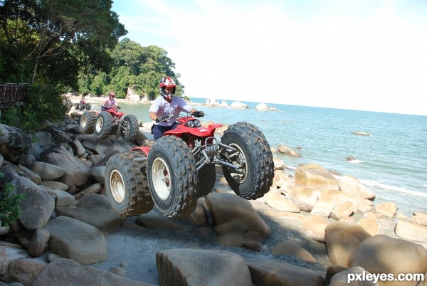
for the beach photo is own by me! thanks! (5 years and 3288 days ago)
The background lighting is inconsistent with the contest source.
Notice how the wheels of the vehicle are fully lit? Yet you have both versions riding over rocks that are in the shade. Just doesn't work, visually...
Consistency of lighting and shadows is hard, but is one of the most important things in almost any entry in these competitions. You can try lightening the rocks with the Dodge Tool, or find another beach background image to use that does not have such obvious shadows beneath the riders.
Howdie stranger!
If you want to rate this picture or participate in this contest, just:
LOGIN HERE or REGISTER FOR FREE

(5 years and 3343 days ago)
FANTASTIC!!!!
yuck!!!! lol though this is very creative, im lovin it!
I love it 
lol this is great. Good luck
cool work author...there is slight difference in the resolution of the sources...u could blur a bit edges of the feet/tongue....good luck
OMG!!! Good work!!!  GL
GL
This is just kinda gross....love it!!! Hey...if you add some texture from the actual tongue onto the toes it would be cool. Just a thought. 
Curious why you didn't use the original 'bling', but this is nice and different, I like it. 
Congrats for your second place, Rick!
Congratulations 
Congratulations for 2nd
Congrats!!
Howdie stranger!
If you want to rate this picture or participate in this contest, just:
LOGIN HERE or REGISTER FOR FREE

Thanks to laura-s and leocub for the sources. (5 years and 3413 days ago)
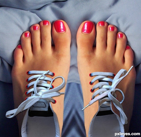
Good idea, just add some shadows on the laces and maybe a metal ring around the holes (a small metal colored ring will do and use blending modes > bevel to give it a round edge)
Thanks for the suggestions!!! Is it better now? 
author..when using an outside source, I think it would be beneficial to use BOTH shoes and make the laces anti symmetric ( don't get me wrong, the resulting image is quite nice, but I think if you paid for the two images it seems a shame not to use Both of them.. that's if you were aiming for realism.. if you were aiming for simple surrealism.. great job.. but if you used BOTH shoes.. I think you would get a much more Powerful image.. but that's IMHO.. good luck
EDIT:.. OH YEAH!!!.. makes it so much more interesting.. to me anyway..LOL (I get lazy alot too LOL.. ).. great job!
Really unique and cool idea.
Drivenslush, you are right and I was too lazy  Thank you very much for the advice! I tried to make it like you said and it definitely is better! I hope you like it more now and I am looking forward to your comments (not only his/her).
Now what a great shoe............... that would save me so much time lol
Super cool intelligent work author...well done
WOW! Excellent and fun image. Beautiful work on the blending ... so real and surreal all at the same time! Definitely a fav!
Nicely done, great summertime shoes! 
Good idea... I would have liked to see SBS.... still good.... GL author.
great fun very good chop
Congratulations! 
Bravo and congrats!
Thank you, guys!  I thought it would be on 3rd place after the crocodiles, but I was very happy to see that I am 2nd and only a little behind the 1s place :P
Congrats!!
congratulation...
Howdie stranger!
If you want to rate this picture or participate in this contest, just:
LOGIN HERE or REGISTER FOR FREE
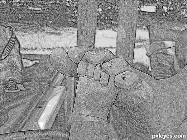
What dit your original photo look like?
Source?
Author, you need to post the source of your photo or the original image if it is your own. This is a truly lovely image, it would be a shame to have it removed!
im new so would you mind telling me where and how i would have to post the original?
Author.. go to MY STUFF.. then go to MY CONTEST ENTRIES and look for the button to ADD STEP BY STEP and upload the original image there .. hope that helped (red flag if you need more help as well)
Thankyou very much
Howdie stranger!
If you want to rate this picture or participate in this contest, just:
LOGIN HERE or REGISTER FOR FREE