(5 years and 3389 days ago)
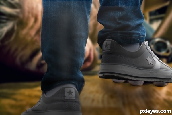
With thanks to andres.thor for the image of the prostrate man. (5 years and 3430 days ago)
Good idea, but edges need cleaning up, especially on the left leg. Part of the background is still there between the jeans & shoe on the right side, and there's some sort of patch beneath the man's eye.
Now for once, CMYK46, you're very wrong - the legs are perfectly cut out, they are in fact seperate legs and clean as a whistle - am going to add them to my sbs now ( thought I'd done that) The patch under the man's eye is just part of him , (his lower lashes I believe) - does look odd though I must admit. I think you can see that if you look at the original pic in SBS's. Off to add the clean cut legs now........
Legs now No. 7 in sbs. Not had time to doctor them so that's how they were and are! 
I can wait for a little apology - but bear in mind that I am booked in fot the "Horse og the year show" NOVEMBER 2011 
This is nitpicking, but on the jeans beneath the man's eye, compare to the source image...there's some sort of irregularity there that looks like it's patched in. And at right of the left shoe, directly below the cuff, there's still a triangular piece of background that the arm of the star is pointing at. 
The figure is a bit too sharp in focus. A little Depth of Field blurring would help the visual believability.
The left leg is problematic to this piece. Looking at the DOF blur of the floor and the angle of the camera, that left foot should be slightly larger at the heel, and toe needs to be angled upwards a bit, not "flat" on the bottom edge of the image. Also, the pant leg on the left leg is doing a weird "pinched in" mirror effect at the ankle, and shows an odd gray fade mark running about 10 inches up the back of the leg and stopping.
The light source on the man's face is very strong, striking his chin and lower cheek from the top. This would make the shadows of the legs stronger on the left.
I cannot visually "read" the forearm with the watch on it. It looks like a brushed metal pipe, not a hairy forearm...
Personally, I'd suggest darkening those eyelashes. The light reflection on them is too distracting to your overall image.
MossyB - I'll need a day or two to digest all the info, but thanks for it all the same. CKYM46, I QUOTE "And at right of the left shoe, directly below the cuff, there's still a triangular piece of background that the arm of the star is pointing at." It is in fact the black strap of the man's watch! With regard to the jeans just below the man's eye - it's just where the jeans fold on to the shoe (foot) Baggy jeans man!! 
Tomorrow, tomorrow............
LOL...the LEFT shoe! 
THE END! (Baggy jeans and all!) Thanks for all the comments, they really have been appreciated - have simply done my best! I realise it may not be good enough......
Dude, it's a good entry, don't get discouraged, we've all seen a hell lot worse. People here are just trying to help u improve, it would be more unpleasant not to have any feedback.
Very good.
looks great.... you did a good job.... good luck
Aw, thanks George!
Congrats.., very nice entry
Howdie stranger!
If you want to rate this picture or participate in this contest, just:
LOGIN HERE or REGISTER FOR FREE
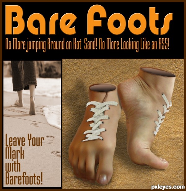
basic combination of 2 sources, used burn around the laces & lace holes to give depth, used eliptical marquee with a gradient fill for the shoe openings. (5 years and 3594 days ago)
nice idea, GL
Amazing, clever and funny!!!! Well done!!
Oh, my God, author, can you read thoughts? Better, did you read my thoughts? I was thinking of something alike to do, but now... 
It's a really really cool work, gl! 
Very funny!! Best of Luck 
awrsome!!!
definitely AWRSOME.. and awesome.. (love the way awrsome sounds better though  )
)
nice job
Great creepiness factor! The feet positions are odd when divorced from their source -- why not display the Barefoots on pedestals with a blurry sand background? I really like the concept of adding a level of content by making your entry an advertisement plus I think "Leave Your Mark" is a great slogan for these unconventional shoes. BUT The two pics on the bottom should have identical heights. The headline calls the product "Bare foots" (two words, initial cap only on the first word [I think]) while the text at the bottom refers to "Barefoots" (one word). Both lines of text at the top should be stretched so the left and right margins match the left and right edges of the double-pic montage underneath.
nice
original idea, well done 
Crazy idea! Pretty good executed too. Good luck!
Great idea author,and very nice execution...good luck
Great thought . . . . All d best to u . . . . 
Lol. I was going to create the same shoes. Great Job! 
Great concept.....G/L Author.
Congrats for your third place, Geexman!
Congratulations for 3rd
Congrats! for 3rd. Great idea and well executed. 

Congrats for 3rd place... great work!
innovative... congrats...
hehehe, so cool 
Howdie stranger!
If you want to rate this picture or participate in this contest, just:
LOGIN HERE or REGISTER FOR FREE
(5 years and 3712 days ago)
heehee 
Howdie stranger!
If you want to rate this picture or participate in this contest, just:
LOGIN HERE or REGISTER FOR FREE
my photos and source (5 years and 3713 days ago)
Nice creativity....
Soooooo cool!
Howdie stranger!
If you want to rate this picture or participate in this contest, just:
LOGIN HERE or REGISTER FOR FREE
hahahahaha...cool work author...warm is fabulous small touch...well done
thnx erathion, much respect
Howdie stranger!
If you want to rate this picture or participate in this contest, just:
LOGIN HERE or REGISTER FOR FREE