(5 years and 3245 days ago)
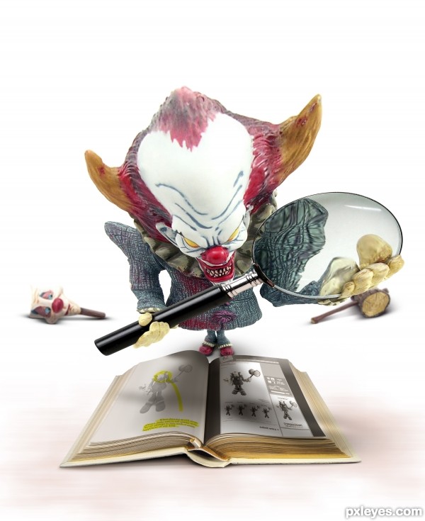
This evil, narcissistic clown offers help for those who have problematic eyesight. Used snapshot of PXLeyes website. See high res. (5 years and 3260 days ago)
Creepy and disturbing--which of course is the whole point. The unsharpness of the clown's head weakens the impact IMO. I also think the open book pages are too white/bright, notwithstanding that the book source has surprisingly white open pages (but I'm willing to accept the accuracy of that image while I, perhaps naively, question the realism of this more complicated image).
Lots of fun in this image, LOVE the Magnifying glass 
like it
well done 
Very different image and definately a fav 
Funny and well done! 
Really funny 

cool work, author!!!! wonderful idea!
Wow this is amazing...Great effective work author...As always details are top of the notch...adding of the clown in the book is perfect...well done and instant fav from me...
Nicely done! Very creepy indeed  Love the details in the book
  Best of Luck Author
Very creepy image and definately a fav! GL!
Nicely done, I love the perspective of this. 
Congrats on 1st place
Congrats for your first place, Rob!
Congrats Rob 

Congratulations 
Congratulations for 1st, great work
Congrats Kido  very funny work, well done
Good job getting 1st place............... ;p I knew ya would 
Congrats!!
congrats!
Congrats !
great
Nice Job Congrats
This is just awesome....... congrats on the 1st place
Howdie stranger!
If you want to rate this picture or participate in this contest, just:
LOGIN HERE or REGISTER FOR FREE
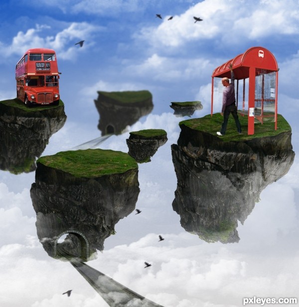
I made ​​some changes, hope you like (5 years and 3270 days ago)
I like this image 
Love the concept, but your SBS doesn't show how you assembled the elements, and the islands are all basically the same. Try to introduce a little variety.
you're right, I tried to differentiate a bit, by the way I add some more details as the tunnel, birds ... thanks for your comments
I like that with the islands you're also telling a story. Good job!
thanks, tried to be a bit unusual in a subject as seen, and there are many castles, lol
Howdie stranger!
If you want to rate this picture or participate in this contest, just:
LOGIN HERE or REGISTER FOR FREE
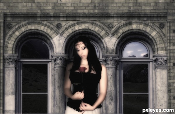
Model:http://lunebleu-photostock.deviantart.com/gallery/#/d2fhjh0
background provided by contest
Mountain view :http://www.pxleyes.com/images/contests/mountain-road/fullsize/sourceimagesmall.jpg
Other stocks, brushes used are mine by purchase
done on photoshop (5 years and 3273 days ago)
How is the image of the mountain road your source #2? It has no meaning to this entry. What "other" stocks and brushes were used?
Ohhhh, I finally see a tiny bit of the mountain road image in the back of the right side arch.
the brushes are used to smooth the skin of the model, the hair, flower and makeup
Howdie stranger!
If you want to rate this picture or participate in this contest, just:
LOGIN HERE or REGISTER FOR FREE
(5 years and 3284 days ago)
i like what you decided to do with the chips, very creative and very impressive
interesting!
super cool work author...great imagination and execution...best of luck
Wow! The color choice are great. GL author!
Howdie stranger!
If you want to rate this picture or participate in this contest, just:
LOGIN HERE or REGISTER FOR FREE
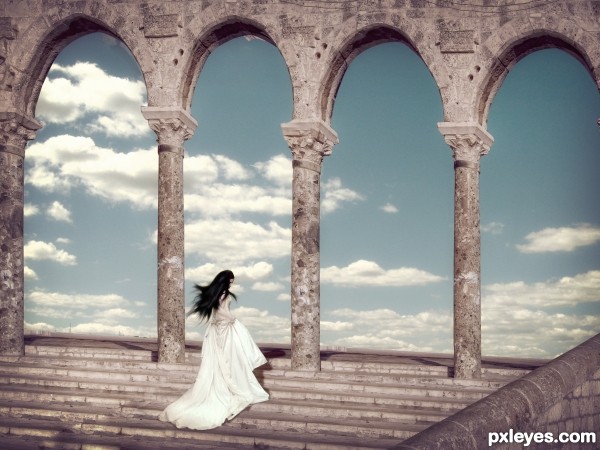
Girl' s shadow is in the opposite direction compared with those that columns cast.. Vignette effect doesn't work for me..some tweaks can make this image very effective.Your idea is brilliant though
Thanks for the comment, derdevil ! i really appreciate it, but what concerns the shadow of the girl, i can't say it's opposite! if you look at the central columns, imho...
Hey Nice work author!
hey! thank you!!!!
great image, good luck!
many thanks!
beautiful....best of luck!!!
Congrats Olga! Nice work!
congrats!
thank you!
Howdie stranger!
If you want to rate this picture or participate in this contest, just:
LOGIN HERE or REGISTER FOR FREE