(5 years and 3759 days ago)
(5 years and 3761 days ago)
nice idea 
thank you 
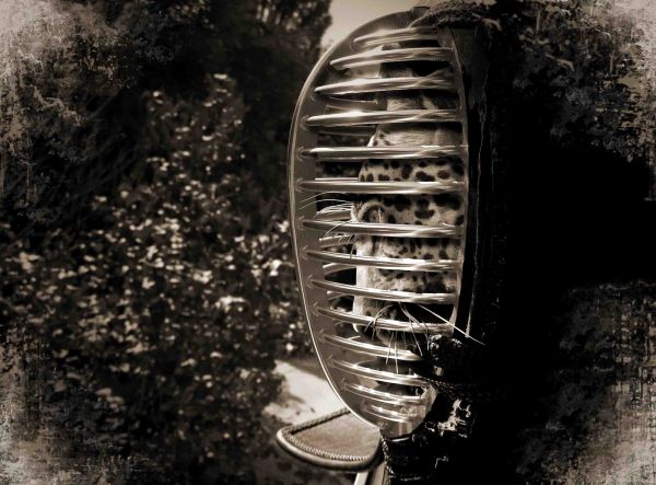
A kendo fighter! Excellent blending of images! 
When you say Tiger I assume you mean Leopard?
He's not really armored ya know? He's just locked up. It's a cool image but not sure about exact theme match though but that's just IMO.
Thanks guys...loool i just say the Tiger is actully a leopard..thanks locksmagic.... and jawshoewhah did you see the sources images...its even writen that is "kendo armor" but yeah you r right..it looks like he is locked up 
here comes the champion....!!!!
Good combination and very well constructed. Nice job!! Best of luck to you!
Howdie stranger!
If you want to rate this picture or participate in this contest, just:
LOGIN HERE or REGISTER FOR FREE
(5 years and 3761 days ago)
not bad 
Good effort....
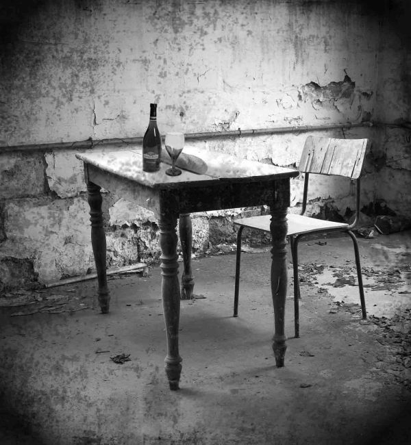
no shadows, and can't see the pipe through the glass, nice though
nice work
Good Job. GL
Howdie stranger!
If you want to rate this picture or participate in this contest, just:
LOGIN HERE or REGISTER FOR FREE
(5 years and 3767 days ago)
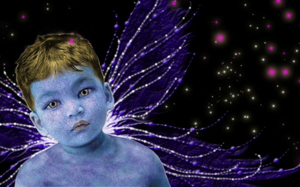
a baby avatar? lol
SBS would be good...
Very cute idea! I'd reccomend doing a bit more touchups around the boy as he still has a bit of a white outline. Unless that's on purpose...? Gj anyway, and gl.
I think I tried to make it look like his skin glows...but it does look like he needs a touch up here and there  practice practice practise
niceeee....will look good with dark purple hair 
Howdie stranger!
If you want to rate this picture or participate in this contest, just:
LOGIN HERE or REGISTER FOR FREE
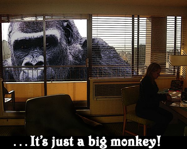
didn't add planes...its just too sad (5 years and 3773 days ago)
I agree with Nator, type doesn't work and detracts from the image. BTW on behalf of the great apes of the world, a gorilla is NOT a monkey.
nice, but did you use the photocopy filter or something like it on Kong ? I don't think he needed it, it gives him a newspaper cutout look. Nice masking around the railings mind
Really nice idea. The text and the filter on the gorilla spoil it a little.
Howdie stranger!
If you want to rate this picture or participate in this contest, just:
LOGIN HERE or REGISTER FOR FREE
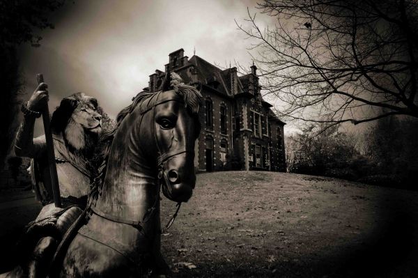
More on theme that I have seen but it looks more statuesque, rather than an armored animal.
Idea is nice, but as jaws says, I'd use real animals to take away the statue effect. Also, things would be more clear without the very dark sides (at least here on my screen). Now I know that's also in the background image you used, but right now the lion kinda fades away in the darkness, while he's supposed to be the subject. Good luck!
Thanks for the comments guys ... ok i made the dark areas more clear and now is more light ... i hope i ll have the chance to change the horse as well.. i ll be traveling for couple of days and i dont know if i can fix it before the contest finish... again thanks for the sujestions
nice work....
Good Luck!
Howdie stranger!
If you want to rate this picture or participate in this contest, just:
LOGIN HERE or REGISTER FOR FREE