Photoshop Pictures: Force


results 1 - 5 of 12

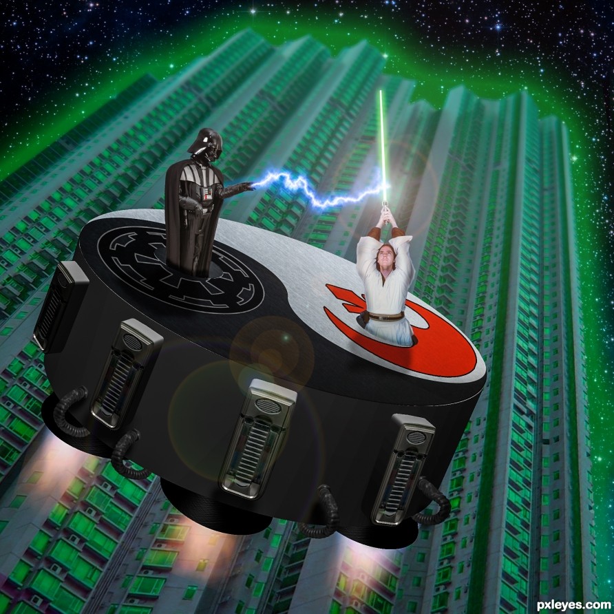
Light and Dark Side - created by rturnbow


Light and Dark Side
Favs: 0SBS: 10Hi-resRank: 5/14Score: 65.4% (16)30917 views

(5 years and 2376 days ago)

9 Sources:

avatar CMYK46
CMYK46 says:

Nice idea. IMO the figures would be perpendicular to the surfaces they're popping out of. Looks good otherwise.

Howdie stranger!
If you want to rate this picture or participate in this contest, just:

LOGIN HERE or REGISTER FOR FREE


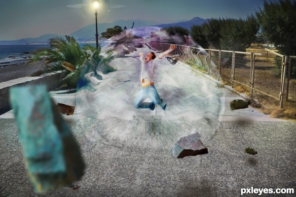
Unreal Force Field - created by Demi-B


Unreal Force Field
Favs: 0SBS: 8Hi-resRank: 5/14Score: 65.8% (16)13712 views

The road is clean and not cracking. But when force field appeared, the rocks are here. Because, this is the unreal force field. Try to be simple and please view also the hi-res. (5 years and 2654 days ago)

3 Sources:

avatar Drivenslush

How much fun!!!! Good Luck

author says:

Thanks, bro...

(5 years and 2654 days ago)


avatar CMYK46
CMYK46 says:

Author, there are several force field tutorials out there...it would be good for you to credit the one you used.

author says:

I read so many tutorials from many sites and memorized the steps that I like. I don't know what that one is. But the steps that I used could be seen in the SBS. I think I combined the steps from a few tutorials(two or three).

(5 years and 2653 days ago)


author says:

Oh!... I found it... the one I based to create this picture is "cool force field in photoshop" at the designer freelance. I hardly find it. But it's not complete. I add some steps on my own and other tutorials that i don't remember the address. Thanks for the comment ...

Howdie stranger!
If you want to rate this picture or participate in this contest, just:

LOGIN HERE or REGISTER FOR FREE


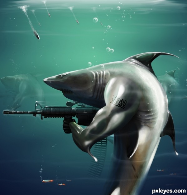
Underwater Force - created by samanway


Underwater Force
Favs: 10SBS: 5Hi-resRank: 1/14Score: 77.1% (48)19286 views

Chinese translation of the tattoo is 'Game' :P

Hope you enjoy this like the same way I enjoy yours :)

IMPORTANT: CHECK HIGH RES AND SBS


ALSO:Credit goes to the stock provides for helping me completing this ! (5 years and 2760 days ago)

3 Sources:

avatar Chalty669
Chalty669 says:

Really nice author! Good Luck!

author says:

thank you glad u liked it !

(5 years and 2760 days ago)


avatar nishagandhi

cool one author!! iske haath toh bilkul hrithik jaise hai

author says:

hahaha......lol & I have to agree ! .Thanks for the fave !

(5 years and 2760 days ago)


avatar layerstack

Super,cool and original!! Love it....

author says:

thanks

(5 years and 2760 days ago)


avatar ushurani
ushurani says:

Its super duper funny. Good Luck

author says:

:P :?

(5 years and 2760 days ago)


author says:

thanks

(5 years and 2760 days ago)


avatar pearlie
pearlie says:

Most excellent work, author! And great sbs.

author says:

Thank you so much Carol :P appreciated a lot !,thanks for the fave too

(5 years and 2760 days ago)


avatar DanielaOwergoor

Fantastic job, author!

author says:

Thanks a lot ,glad u liked it ,thanks for the fave too.. Hope to see you in tournament 3 :P

(5 years and 2760 days ago)


avatar CMYK46
CMYK46 says:

Very menacing looking characters! GL author.

author says:

thanks for ur comment.I love doing things with dangerous characters :P

(5 years and 2760 days ago)


no avatar
marina08 says:

Wow! Incredible!!

author says:

glad u liked it

(5 years and 2759 days ago)


avatar spaceranger

Very cool and well crafted!!

author says:

thank you soo much!

(5 years and 2759 days ago)


no avatar
Keiley22 says:

nice work manipulating the shark author, well done

author says:

thanks for ur comment

(5 years and 2758 days ago)


avatar DanLundberg

Awesome overall, but it's not clear why the lower portion of the front shark seems more under water than the uppper portion. The tatooo is a nice touch but I'm not quite convinced it matches the contour of the arm. I think I would have cheated on the lighting a bit and brightened the teeth to make the foreground shark more menacing. I personally find the background sharks merely distracting. I also don't get the point of the little orange fish whose bright color distracts from the central figure IMO.

author says:

why the lower portion of the front shark seems more under water than the uppper portion? thats because when you go deep underwater then, the water becomes more darker & it adds the depth of the picture ,well I thought of lightning the teeth and yes ,it would have looked more menacing but unnatural.The background sharks were blurred as possible but without them, it would have looked non powerful force & those little fishes were just extras .....(IMO)btw thanks for ur suggestions !

(5 years and 2758 days ago)


avatar anatole
anatole says:

i like how u played with light and shadows. i dont like matial themes, but nice work

author says:

thank you so much for the comment ,glad u liked it!

(5 years and 2757 days ago)


avatar robvdn
robvdn says:

Congrats for making it to the next round

author says:

thanks man ! needed ur support

(5 years and 2757 days ago)


avatar ushurani
ushurani says:

Congrats

avatar George55
George55 says:

Congratulations...... good luck in the next round.....!

avatar madamemonty

Congrats awesome work

author says:

thanks

(5 years and 2756 days ago)


avatar hereisanoop

The best of yours..... awesome.. awesome.. awesome.... brilliant lighting, concept
once again, super duper ... congrats on a well deserved first place...

author says:

Thanks man that was a great compliment !

(5 years and 2756 days ago)


avatar nishagandhi

hey congrats! and all the best!

author says:

(5 years and 2756 days ago)


avatar jordyponce

Badass work!..Big Congrats!!

author says:

(^^^)

(5 years and 2756 days ago)


avatar spaceranger

Congrats!! Well earned!!

avatar Nysoe
Nysoe says:

Congrats

avatar Giallo
Giallo says:

great job my friedn, love the bullets

avatar metalbagg
metalbagg says:

Very cool!

author says:

glad u liked it !

(5 years and 2521 days ago)


Howdie stranger!
If you want to rate this picture or participate in this contest, just:

LOGIN HERE or REGISTER FOR FREE


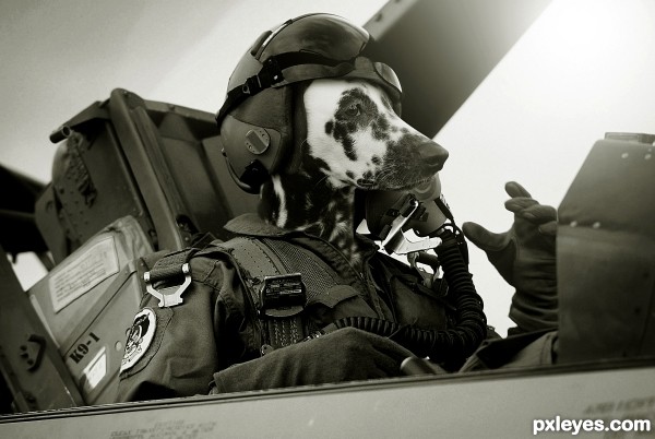
Air Force Pilot - created by Nator


Air Force Pilot
Favs: 4SBS: 3Hi-resRank: 1/14Score: 69.2% (48)16957 views

(5 years and 2882 days ago)

2 Sources:

avatar lchappell
lchappell says:

damn good!

avatar Drivenslush

excellent work!!!

avatar Eladine
Eladine says:

love the expression on the dogs face.. so cool... hahah great job

avatar pearlie
pearlie says:

Awww, what a sweetie.

avatar layerstack

Simply brilliant!! Well done..

avatar Glockman
Glockman says:

Nice blend and fit of the pooch.

avatar MossyB
MossyB says:

Really clean chop, good focus of all source images. Great job!

avatar wazowski
wazowski says:

Very convincing, nice pick of sources and well done put together. Good luck!

avatar madamemonty

Congrats, very nice work

avatar enblanco
enblanco says:

Congrats!

avatar Eladine
Eladine says:

gratz well earned!

avatar sande1001
sande1001 says:

congrats

avatar pearlie
pearlie says:

Congrats!

avatar lchappell
lchappell says:

Nice job congrats

avatar lchappell
lchappell says:

Nice job congrats

avatar Clinge
Clinge says:

Love it BIG TIME

Howdie stranger!
If you want to rate this picture or participate in this contest, just:

LOGIN HERE or REGISTER FOR FREE


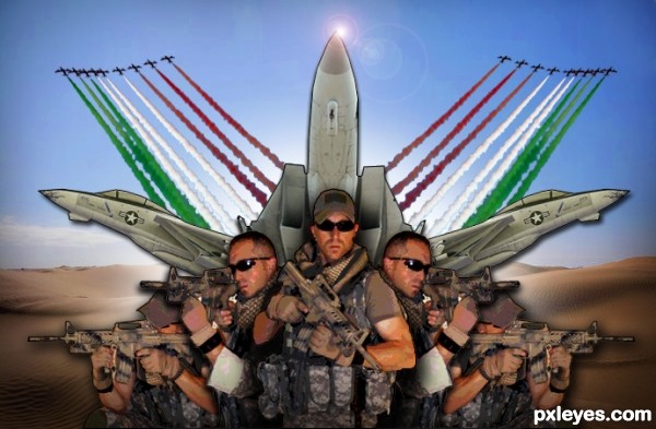
Air Force Engage Battlefield ! - created by NuTz123


Air Force Engage Battlefield !
Favs: 0SBS: n/aHi-resRank: 9/14Score: 58.9% (0)9340 views

Thank you Nemesis-19 , FantasyStock and B-SquaredStock for their stock images . (5 years and 2894 days ago)

6 Sources:

avatar Eladine
Eladine says:

I like this work but the outlines altho they might be meant to be, are bothering me.

avatar CMYK46
CMYK46 says:

The drop shadows don't work, they make planes & figures look like they're against a painted backdrop.

Howdie stranger!
If you want to rate this picture or participate in this contest, just:

LOGIN HERE or REGISTER FOR FREE