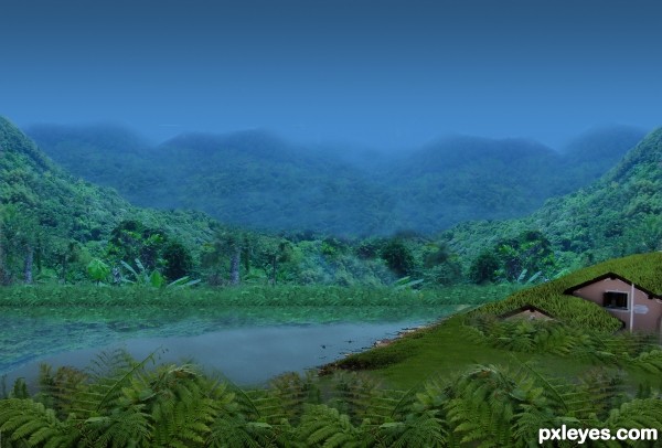
(5 years and 3150 days ago)
- 1: grass (for the roof)
- 2: plants
- 3: mountains
- 4: river
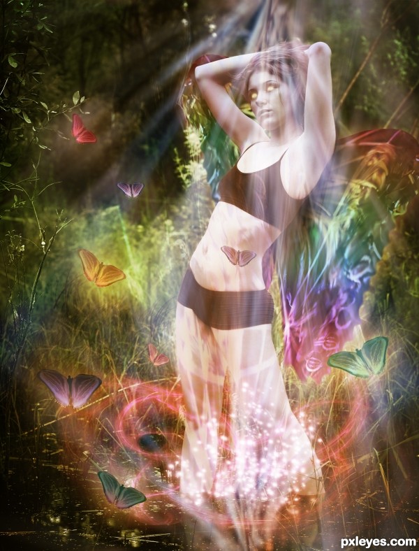
Thanks to:
african fi: girl
(5 years and 3155 days ago)
I liked the other wings better. These are too transparent and don't really look like part of the body...
Maybe you're right but I wanted to give the source image more presence, thank you for your comment 
It's better, now that you've added back a bit of the wing effect. Just colored light wasn't enough.

personal views: take out the light rays, let the girl have normal eyes,
make the two-piece suit into a glitter-like suit instead, add to the whole body with some glitters 
Nicely done author! Best of luck!
Howdie stranger!
If you want to rate this picture or participate in this contest, just:
LOGIN HERE or REGISTER FOR FREE
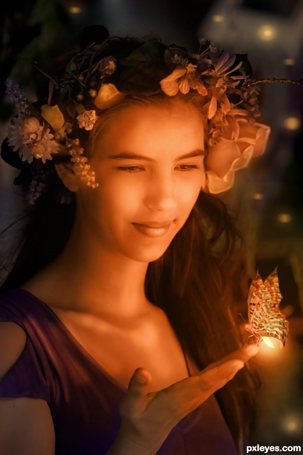
Check Step 7 for an animated gif of the steps in this piece.
Sincere thanks to artistatplay (or atistatplay) for the inspiring base image, and to hirekatsu for the butterfly. (5 years and 3177 days ago)
FAB WORK!!!
Thank you! 
Nice, but 50% orange at best.
"In this contest, we're going to create such a fantasy scene with the color 'orange' as the main theme... anything fantasy related goes, as long as the dominant color of your subjects in your scenery is made out of orange tones."
Orange tones. Please check my SBS. Thanks for stopping by.
I like it, nice job on the blending/smoothening of lady..
like the in-between butterfly-firefly idea
easily could be an image in a fairytale book 
The highlights are orange and the highlights dominate the image, so it's orange enough for me. Reshaping the butterfly wings into something more dramatic was inspired. I'm not sure what happened in Step 4 of the SBS, but she started looking at her thumb instead of the butterfly which drastically minimizes the overall impact.
Dan, I think what happened was the added light to reflect the insect glow in her eyes? I toned it down. Thank you!
Interesting composition, GL!
elegant and sweet (fantastic source find) GOOD LUCK!!!
Lovely image and beautifully done ... your "over-painting" really finishes the piece nicely. Great SBS ... you get extra points from me for that!!!
Very nice Author and I agree with Arca  good luck
Beautiful fairy tail girl 

Wow.. such painstaking work, beautiful result! 
Howdie stranger!
If you want to rate this picture or participate in this contest, just:
LOGIN HERE or REGISTER FOR FREE
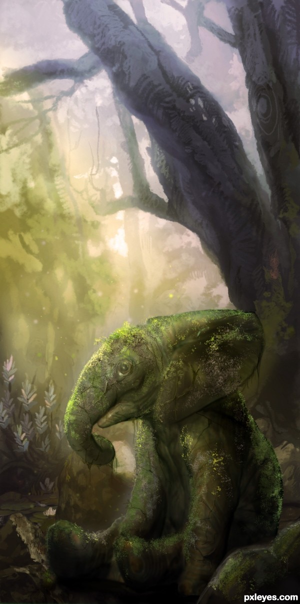
Although not all of the secrets of these Ancient elephant-like statue have been unlocked, Elephantine enhance one's abilities, bestow protection and regeneration, and can be worshiped to give greater protection and even swifter healing.
人◕ ‿‿ ◕人
Done with Photoshop CS5 with Wacom Cintiq in two days. Approximately 2-3 hours per day. (5 years and 3188 days ago)
I'm sorry to put out my Hi-res version since some of the details quite distracting for my eyes. Like the messy cracks & saturated shadows. I would like to make you enjoy the result from the preview version only as the reason for every matte painting quite embarrassing to see the messy details, so I seldom create the detailed versions of it.
Hollywood matte-painters like Dylan Cole taught me before; it isn't necessary for some paintings to be seen in detailed versions, if we're going to produce it to a large-cinema-scope scenes, we would do the 3D matte paintings, because the best-preview-renders should be in hires versions of pixels.
*Cheers*
This is lovely. The only distracting part is the white in the eyes. Being of stone, the white is too bright and distracting from an otherwise truly enchanting image.
I agree with you about the Hi-Res version not always being necessary in order to preserve the visual illusion created. Best of success to you!
Thank you, MossyB. I would like you to travel to my SBS. There's a credit to you there. ( ^~^)v
I blurred & darken the eyes before posting this, but it seems the statue so lifeless, since the main idea was an ancient idol with a protection and regeneration and blah2... so, it would be nice if the eyes should remain a little bit shiny.
its lovely work author  I really like the background, and I think we can see enough details to not need a high res anyway
goodluck.
Wow wow wow.... Amazing work, in every detail! Congrats... 
I'm agree with Dylan Cole but I'm just curious, very nice worik, GL!
Well done...congrants
love the moss effect! Congrats!
Howdie stranger!
If you want to rate this picture or participate in this contest, just:
LOGIN HERE or REGISTER FOR FREE
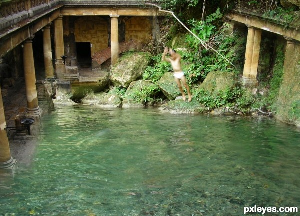
go to swim here and have fun (5 years and 3190 days ago)
Cool idea! I dont's know, I think that something goes wrong with the man! Too blur? I don't know what's going wrong! Maybe it's my idea! Good luck!!
thank you for the nice comment,you`re right,the man (my nephew) look too blur,I can`t shot him with the right position when he was doing jumping motion.i use a pocket camere
Good luck too you to
Good Luck to you too,sorry I was wrong in writing, have a great time,take care
the branch looks broken, if it is so, should add motion blur (otherwise, it looks stiff)
I like to dive in there too  feels cooling
hmm yeah..i agree with you (◑‿â—) I'm not using the blur,because i was too afraid to make something wrong,but i do that..ooooh (•̪â—)
of course you can try to dive here,if you like to come...thank you so much for your input.best wishes to you
Howdie stranger!
If you want to rate this picture or participate in this contest, just:
LOGIN HERE or REGISTER FOR FREE
Simply wow! Great concept, great execution!
add a little algae or twine growth on the house
For a higher score author, the ferns have lots of debris, the more refined the image the higher the vote, very nice idea. Good luck
Nice shot
Thanks for sharing
Howdie stranger!
If you want to rate this picture or participate in this contest, just:
LOGIN HERE or REGISTER FOR FREE