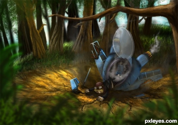
No outside sources used.
Don't worry, he's not dead :] (5 years and 2980 days ago)
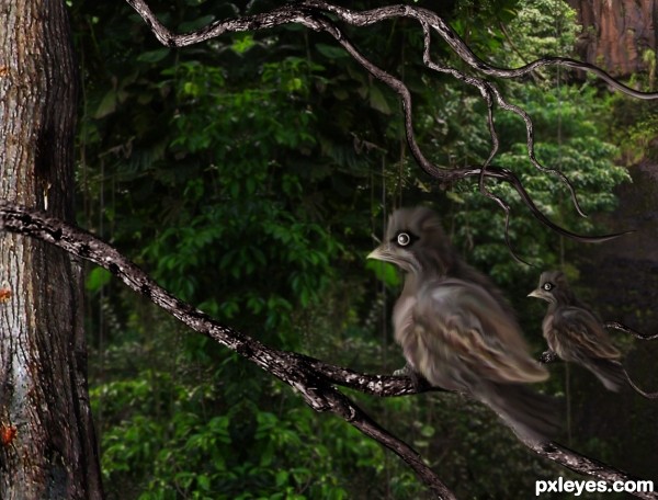
Thanks to gotmeamuse, for the pic of the waterfall. In my entry only the left part of it can be seen. (5 years and 2993 days ago)
very nice work on those birds
good work author..i really like it.
Thanks for your comments.
Nice 1 
Howdie stranger!
If you want to rate this picture or participate in this contest, just:
LOGIN HERE or REGISTER FOR FREE
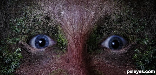
(5 years and 3005 days ago)
very nice effect author 
great! 
Spooky, well done..
Howdie stranger!
If you want to rate this picture or participate in this contest, just:
LOGIN HERE or REGISTER FOR FREE
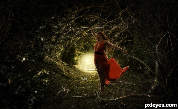
Credits to auroradreams (5 years and 3011 days ago)
i like the image, she just seems a little bright for the way she is facing?
I have no idea why, but this reminds me of the scene in the Princess Bride when they go into the swamp of fire LOL... good luck 
Excellent work and very well done! Good luck author! 
Thanks for the comments!..Keiley, thank you, u were right..she's darker now 
looks better author, i like that the bottom of the dress is still that bit lighter 
Nice one..love the rabbit!
Great in hires!
I really thought this one would win! I'm disappointed...
Anyway, my fav!
Howdie stranger!
If you want to rate this picture or participate in this contest, just:
LOGIN HERE or REGISTER FOR FREE
(5 years and 3012 days ago)
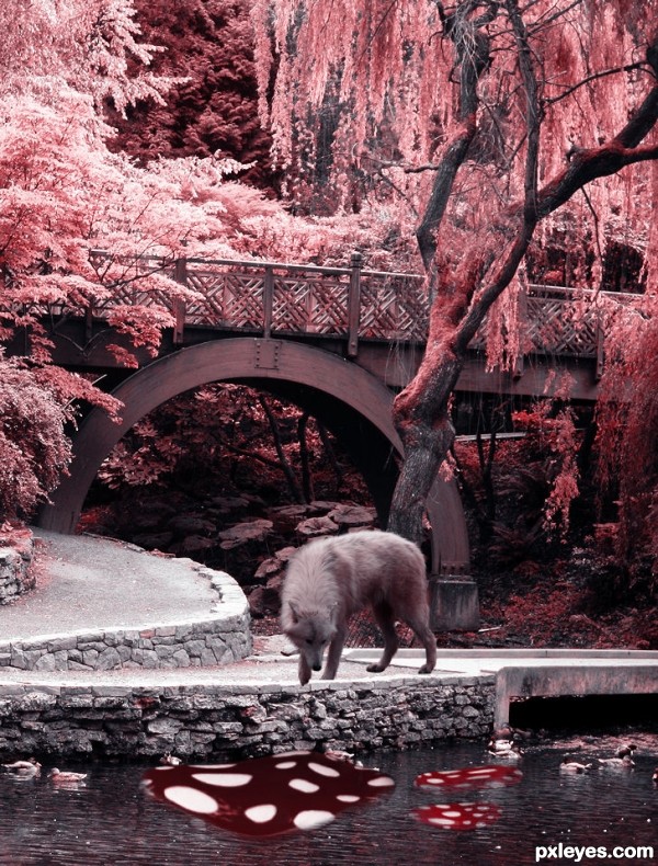
using Distort and warp on the mushroom tops might make the perspective work better.. but I like the concept.. GOOD LUCK!!!
The building's perspective doesn't match the bridge. IMO your original image is better without it, it's a lovely photo. The wolf looks too big to me, and too saturated compared to the rest of the image. Looks like you burned it a bit too much. I would really like this image with some tweaks. GL author. 
PS: What's the source for the building? If it's your photo you need to post the uncut image in your SBS.
LOL author, just my opinion again...I think your image looks better with just your original photo, but I think I'd restore some color to it. Again, good luck! 
Thank you for the tips and opinions Drivenslush, and CMYK46. I have changed things and added more color and I got to say it looks better than before. ^.^
I agree! 
Howdie stranger!
If you want to rate this picture or participate in this contest, just:
LOGIN HERE or REGISTER FOR FREE
That looks absolutely stunning! Is there any chance that the guy there is ezrael? Lol xD
Wish i had that talent great chop.
WOO HOO, Finding Nemo meets Shrek LOL great illustration
Nice drawing! However, I can not see much of the original image,
great
Thanks for the feedbacks! @ MijongE If you look at the SBS, you can see the plane is not painted but chopped from original source image
Pretty cool illustration and use of parts of source, could be used in a kid's book.
congrats
Congrats Kid awesome work
@Kid I know you used the source. You did an amazing job but maybe its a personal preference but I like images more where I can actually see the source image without looking at the SBS (in this contest for example the players or a football theme), otherwise it is more like a drawing instead of a photo manipulation. Anyway congrats
Thanks!!
@Mjonge I guess it is personal preference because I find that entries that use sources in a creative way (not just cut and blend with other photos which is what you're talking about) are usually more appealing and stand out more from the other entries.
Howdie stranger!
If you want to rate this picture or participate in this contest, just:
LOGIN HERE or REGISTER FOR FREE