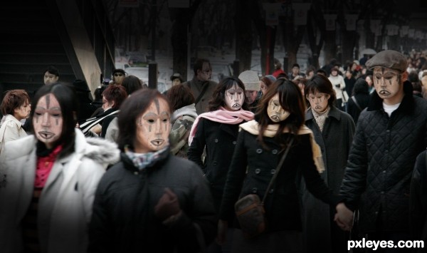
One day you notice that masks are everywhere, even on your own face.. (5 years and 2648 days ago)
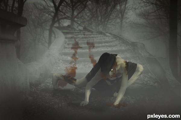
Stock model by TwilitesMuse
USed my own background stock (5 years and 2787 days ago)
Howdie stranger!
If you want to rate this picture or participate in this contest, just:
LOGIN HERE or REGISTER FOR FREE
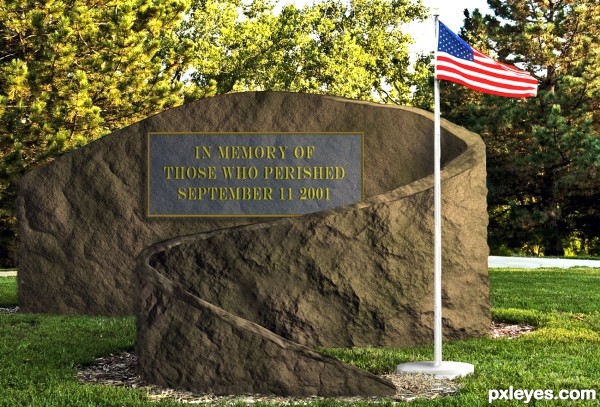
Sunday September 11, 2011 will mark the tenth anniversary of the barbaric act of terrorism committed against the United States of America. This is my simple Menhir, as a tribute to the 2,977 people that lost their lives in this horrendous act. Let freedom ring.
NEVER FORGET
http://www.fdnylodd.com/9-11-Never-Forget/Memorials/Blood-Of-Heroes.html (5 years and 3221 days ago)
The plaque is on a curved surface & should be warped accordingly. It's also transparent.
No its not transparent and it is mounted away form the curved surface. Worry about your own entry Bob. BTW Bob, thanks for your little vote always appreciated.
If the plaque is not transparent, why do I see the rock texture through it?
The texture on the plaque sure makes it look transparent - the ridges and lines correspond with the "monument" behind it...Especially along the top edge, while the side shows no texture.
If it were mounted "away from the curved surface," there would be some sort of "gap shadow."
You may want to ignore the technical shortcomings, but other members who want to learn and improve can appreciate them being pointed out, so that they can learn what to look for in an entry. It's certainly not "worry" over your mistakes, as much as helping newer members learn what to try and avoid.
Author, what does your comment have to do with the quality of your entry and my attempt to help it improve?
fixed
GREAT for this emotional time of year... good luck author.. very clever idea
First let me say the sentiment is beautiful, the incident and the loss is very personal for most of us New Yorkers and I'm sure they'll appreciate your thoughts as will all good people of Planet Earth.
I'll be totally honest with you, when I first saw your entry I thought it was a gold border and letters on a blue tinted clear panel. I actually liked that idea, I was going to suggest a drop shadow of the type and border cast on the rock seen through the clear panel to enhance the floating look, almost looking like a futuristic memorial.
I really don't think the suggestions made were insulting or derogatory, they were worded in an academic way based on the opinions of those members. Why don't we just respect the solemn meaning of the entry and not let differences of opinion overshadow that.
Thank you Rein.
good thought author like your work good luck
Very nice tribute, author, and good work making the rock texture.
Howdie stranger!
If you want to rate this picture or participate in this contest, just:
LOGIN HERE or REGISTER FOR FREE
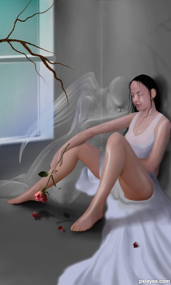
media used :photoshop cs5 EXT..
& Poser 8
hope u like it :) &
special credits to
1.psamathides
2.SenshiStock
3.zommy
& else i have used poser 8 & painted by me so i ll provide the sbs soon :) (5 years and 3344 days ago)
Her left foot seems like floating. Try adjusting the shadow and put some to her dress touching the skin to add more depth. GL!
i like it ,it is good sweet work
I really like the highlights you added to the leg and shoulders. 
this is a brilliant and amazing photo, very high vote from me. best of luck author
congrats!
Congrats for 2nd
Congrats!
Howdie stranger!
If you want to rate this picture or participate in this contest, just:
LOGIN HERE or REGISTER FOR FREE
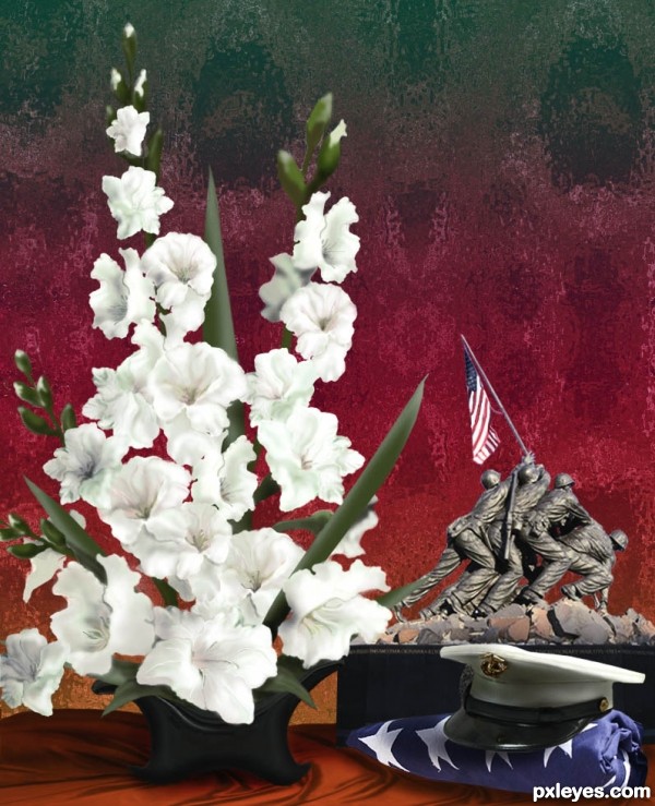
Flowers were all created from hat as was the container for the arrangement. The background was also created with many changes to the source. Please see my SBS. Thanks to Beverly and Pack at Flickr.com for the folded flag source, and to Vic Acid at flickr.com for the Iwo Jima source photo. The fabric texture under container is from cgtextures.com (5 years and 3605 days ago)
very patriotic atmosphere here.......now I have to shut down this computer and go to my DVD room to play the movie a letter from iwo jima ......I like the movie and this creation of yours too.......

Never forget.
Dunno, it seems a bit messy in places...the hat has too much shadow and the drawn flowers don't really fit with the photographic elements. But you still did a nice job with the flowers...you're known for your creative photoshop foligage, I can see. 
very nice work, clever use of source, most of all, we should never forget the heroism of our military personnel. thanks for your tribute.
Wonderful! Perfect flowers...
good work
very nice work...good luck
Amazing! 
Congrats! again for 3rd 

Congratulations always! 
I knew it from the start, congrats......again,,,..
Congrats ......... 
Oh this is fabulous sweetheART great tribute - fave ;} happy hippy hugglez
Congrats!!
Howdie stranger!
If you want to rate this picture or participate in this contest, just:
LOGIN HERE or REGISTER FOR FREE
Good thinking. In keeping with your title the faces might look happier but I still like your idea.
Thank you. When I was thinking out an idea, it was intended to be more jokey and it was matching the title, but the result turned kinda depressive, so.. Well, I've changed the title =)
Nice commentary on today's way of society, and nice change on the angles. Well done!
wow that is smthn
Howdie stranger!
If you want to rate this picture or participate in this contest, just:
LOGIN HERE or REGISTER FOR FREE