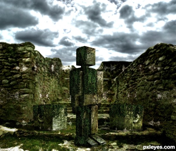
Credits to http://night-fate-stock.deviantart.com/ (5 years and 3688 days ago)
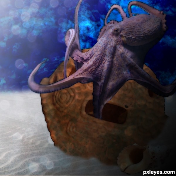
The shape of the turtle shell reminded me of those old diving suits so I tried to create something that would have the feel and mood of one lying on the ocean floor. Thanks to Jadam, Sebastian, tutu55, coolmikeol, ilko & straymuse for the stock images.
Used a gradient overlay to try and give that underwater light feel and used some blending on the background for an ocean effect. (5 years and 3697 days ago)
Nice blend, a full resolution file would be nice.
good luck
Howdie stranger!
If you want to rate this picture or participate in this contest, just:
LOGIN HERE or REGISTER FOR FREE
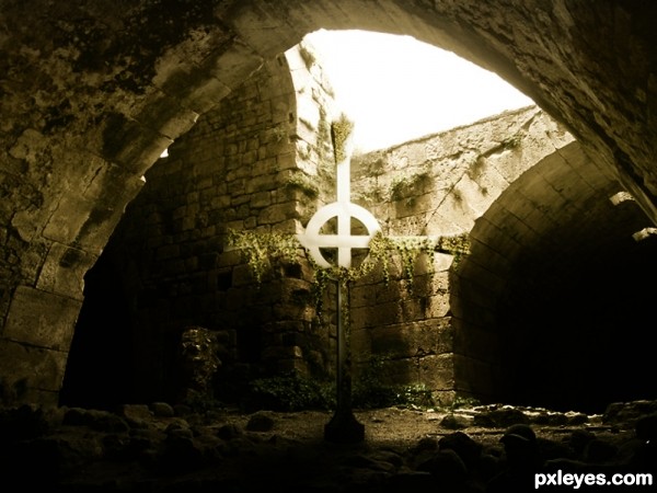
Thanks to elPedro666 for his image of the cave (5 years and 3743 days ago)
Wow, very nice work, author. One of the best so far. 
EDIT: Ahaha...coulda guessed it was you. 
Very very good. Like the blending and the "old" feeling.
Fantastic job author...well done and good luck
wow! i LOVE this one!
great entry! very well done. gl
Realistic! Really oldish mood! Nicely done... 
very good job
and congrats again!
2nd congrats for the 2nd place 
Congrats again! 
Congrats!!
Howdie stranger!
If you want to rate this picture or participate in this contest, just:
LOGIN HERE or REGISTER FOR FREE
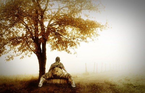
(5 years and 3854 days ago)
Nice chop! However, I'd like to forget that spread-eagle image all together. 
Nice imagination. Colors blend well.... good luck
Very nice final image...good luck author
Nice work and good mood in spite of the "model" 
Howdie stranger!
If you want to rate this picture or participate in this contest, just:
LOGIN HERE or REGISTER FOR FREE
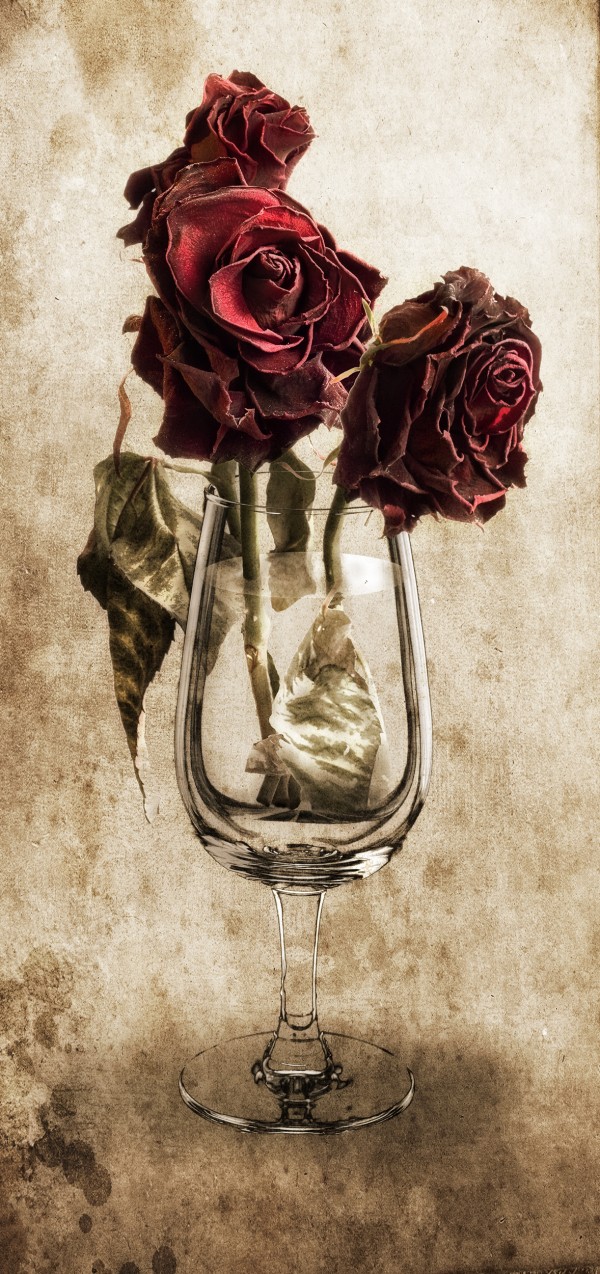
So that I could work only with the glass, I cut it out using the blue channel and dessaturaded it. The rest is manipulation :-)
...
Credit texture: Princess of Shadows http://princess-of-shadows.deviantart.com/art/vintage-grunge-textures-79040200
Credit Withered Roses: Rolve http://www.sxc.hu/photo/1154300 (5 years and 3861 days ago)
Truly a great composition. Really like its simplicity yet...it has tons of style. Perhaps if you lighten the stems in the water a bit more...it'll give a bit more difference to dry and wet. Nice job! 
EDIT: Absolutely wonderful! Love the changes! 
Thanks for your suggestions guys. I'll see about making changes. Robvdn, I didn't make any edge. It's the texture itself. Maybe I've got to get rid of this edge. About making the stems longer, wouldn't the roses go down since they are inside the glass?
...
Changed... Lightened the submerse stems and got rid of the edge on the texture.
Nice job!!!
Nice job!!!
sexy image man , nice concept
The stem wouldn't look straight entering water--refraction would make it look bent.
I agree Hawkeye, but as the stems are almost straight, the refraction would be insignificant at the rate of 1.33 
One of the best entry's...Bottom part of the roses maybe demands a bit more work...from this angle stalk don't look like its finished there..beside that great work author...high mark's from me
Okay, applied some shadow to the glass left side following Nator's suggestion. Thank you Erathion! Changed the stems' end. I erased the glass reflection since there is no polished surface.
Nicely done and good use of the source. I think you got it right  GL to you.
this one is the better entry 
Nice composition.
Thanks a lot for your comments people  Always welcome!
Fantastic work!!!
lots of work here author. you have taken on feedback well.. Good on you. IT has made a nice difference to the image. high marks from me.
very niceeee!!
great concept!
Excellent.......G/L Author.
Congrats for 3rd!!!
Congratulations for 3rd
Congrats for your third place, Divair!
Congrats on your placement! Was definitely one of my faves in this contest.
congrats!
congrats!
Congrats
Congratulations! Great job
absolutely fantastic work, would have been worthy of a win!
Congrats, nice image!
Howdie stranger!
If you want to rate this picture or participate in this contest, just:
LOGIN HERE or REGISTER FOR FREE
Very nice work author,great idea and fantastic execution.Best of luck...
WOW.. really looks like the Monoliths of Peru.. they never carry weapons.. good luck Author!!!
Great idea and mood!
Nice. I'd make the background a bit lighter so that the statue will stand out more (now the fore- and background are almost the same, gives lacl of depth). Good luck!
thanks for the comments!..wazowski, i had already tried making the background a bit lighter and also changing the color a little, but i didnt like the result i was getting, so i just gave it a little lens blur to create some depth..but your comment is really appreciated, thanks.
nice creation ......... all the best to u ........
Stunning.
Great..GL
Nice! The green plants and moss are very cool. Good luck!
Great idea.........and fantastic mood.....G/L Author.
congrats...
Howdie stranger!
If you want to rate this picture or participate in this contest, just:
LOGIN HERE or REGISTER FOR FREE