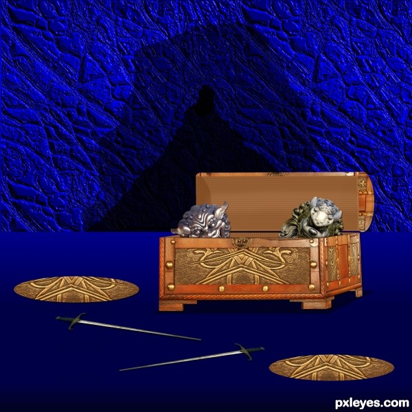
(5 years and 3222 days ago)
- 1: door knocker
- 2: swords
- 3: lion head
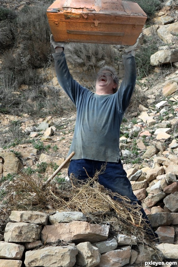
(5 years and 3270 days ago)
After the break-up, he had to remember where he hid all those Playboy mags.... lol 
Howdie stranger!
If you want to rate this picture or participate in this contest, just:
LOGIN HERE or REGISTER FOR FREE
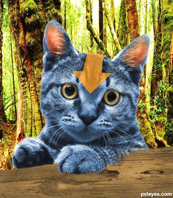
(5 years and 3559 days ago)
Good idea, but try to make the arrow on the forehead look like fur.
I would add some more contrast on the blue fur and on the eyes.. and also, as CMYK already said.. the arrow doesn't even try to blend..
Howdie stranger!
If you want to rate this picture or participate in this contest, just:
LOGIN HERE or REGISTER FOR FREE

(5 years and 3589 days ago)
only issue i have is the cemetary choice... other than my personal bias.. this entry is well done.
To me, "dancing on" needs to show feet in contact.
nice
Howdie stranger!
If you want to rate this picture or participate in this contest, just:
LOGIN HERE or REGISTER FOR FREE
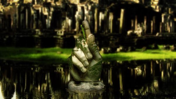
(5 years and 3726 days ago)
Really good job. The blurred background really adds depth, I think. In High Res it looks like something is wrong with the thumbnail and the edges of the Ivy are too sharp. Still. I really like this, especially the ripples in the water. GL.
Thank you very much Chaplain! I blurred the contour of the ivy very slightly, the strands connecting each leaf together are very thin, and any more blurring would result in a total loss of the stems, so i did what i could. Thank you very much for the comment 
this is very cool pic well done
Stunning work 
is this gaussian blur? try experimenting with lens blur. nice job overall
Yes it's gaussian blur, although the result i got using lens blur definitely looks more realistic. I'll try it out on future entries, thanks Elficho, and thank you all for your great comments 
congrats Matteo! 
Congrats 
Howdie stranger!
If you want to rate this picture or participate in this contest, just:
LOGIN HERE or REGISTER FOR FREE
Try a bit of dodge and burn in the lid to give it some depth -- looks a bit flat the way it is
Thanks Alan2641 I played with it trying to show dept I don't know if I got it what do you think?

much better! (sorry to answer for him...but I had the same thought) and this is definitely better!
Nice idea. Good masking on the treasures. To my eyes, the perspective of the box is not right. To see so much of that side, the front should either be angled, or the entire box moved far left within the setting.
Thanks happyme27

Thanks elemare I looked at it I thought the angle was right the chest is at an angle
is it just me or your works are just obvious..hehe..nice work..goodluck
Howdie stranger!
If you want to rate this picture or participate in this contest, just:
LOGIN HERE or REGISTER FOR FREE