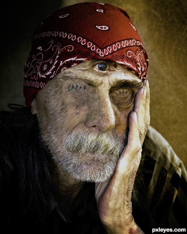
(5 years and 3112 days ago)
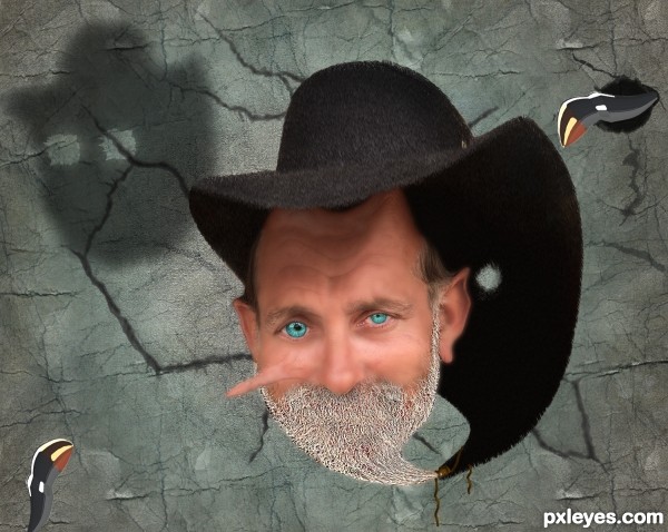
some inexplicable strangeness (5 years and 3264 days ago)
Tnx to Obsidian Dawn :
http://www.obsidiandawn.com/cracks-photoshop-gimp-brushes
Howdie stranger!
If you want to rate this picture or participate in this contest, just:
LOGIN HERE or REGISTER FOR FREE
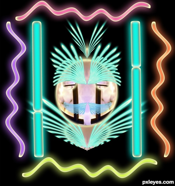
(5 years and 3321 days ago)
nice lighting's author...gl
Love the title ... suites it sooo well! The face in the center almost looks like one of those old fashion Man in the Moon images ... 
Howdie stranger!
If you want to rate this picture or participate in this contest, just:
LOGIN HERE or REGISTER FOR FREE
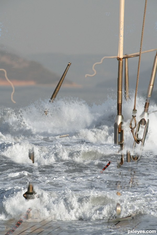
overlaid authors source image, drawn ropes (5 years and 3552 days ago)
nice one
wow! a freak wave indeed
Abandon the ship! Quite realistic, very well done. 
Howdie stranger!
If you want to rate this picture or participate in this contest, just:
LOGIN HERE or REGISTER FOR FREE
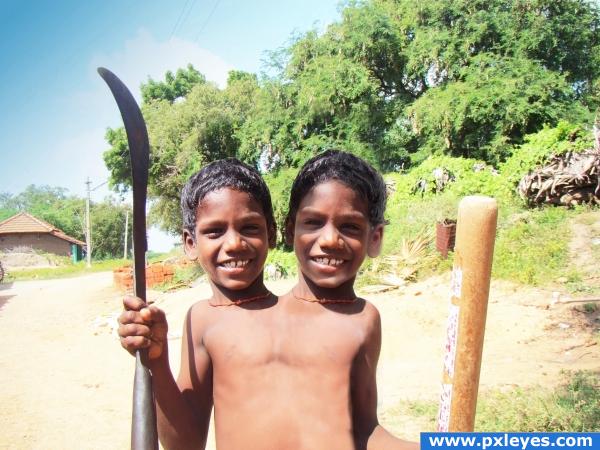
i prefer them twins and i hope shadows are good now (5 years and 3905 days ago)
this looks quite good, but what i suggest is getting two different pictures of the same person then joining them together, because your face are the same, and repetition doesn't sell too well. Good luck though, the blending is great!
my eyes were playing tricks on me when I first looked at it. It looked like the necks have scars on them and it looked as if there was a crack (sort of like a ceramic crack) down between them---then I looked at the high resolution and realized those were necklaces. lol
Flip the head on our right...the light sources are opposite.
this image has great potential, the one on the right looks almost see-thru. and the light sources don't match if you would just make them the same person, this entry would be awesome! the other head also looks too big imo but more work, same person and matching light sources, and you got yourself a fine looking entry!
Fun idea but the shadows and colouring on the second head need to be the same as the first...
ah and the right head bigger is mention,(i wanted like that) thanks for comments and tips
@ vampyriccadence: Yes, the light is from upper left, which means the head on our right would have a shadow on the right side, not on the left.
Oh my!
hmm the necklace with the tooth on kinda looks oddly cutout... it would also requier a shadown and not a halo :p just remove the necklace  nice picture
dang i just figured out why the tooth ecklace looks odd.. you flipped it and therefor the shadows on he necklace are flipped too XD it looked better on the other boy
thanks Eladine this i haven´t notest i did this image in work without time, this suppose to be an image only for joke and become serious, i will fix it soon as possible
I think the whole body should be widened a bit more, there's no room for the shoulders.
two heads are better then one... is it so? 
image is quite fun
Howdie stranger!
If you want to rate this picture or participate in this contest, just:
LOGIN HERE or REGISTER FOR FREE
Interesting idea, but the eye is off center.
BAd surgeon Bob....nice idea!
Thanks Bob! It's corrected now.
eeeekkk Shivers! good luck
Changing the color balance didn't improve your pic.
well done.
Thanks again Bob! Adjustment done.
now this is art, excellent theme following, good luck
The 3rd eye.........Good thinking
Howdie stranger!
If you want to rate this picture or participate in this contest, just:
LOGIN HERE or REGISTER FOR FREE