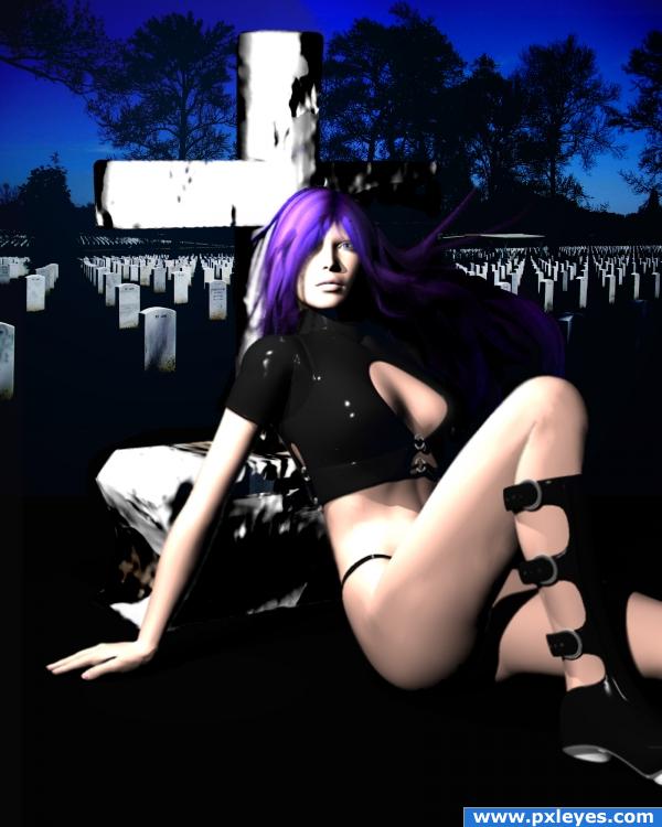
No sources used except original image....
DAZ freebies used:
RAVENOUS boots/jacket/panties, can be downloaded at renderosity.com; Mitsu-hair for Aiko, can be downloaded at Daz3D.com
touched up the gravestone a bit... (5 years and 3984 days ago)


I don't really understand, but it's a nice image! Good job
Light source on figure is opposite light on tombstones, edges of cross need blurring, bottom edge is too regular, since it's on grass...
i'm gonna stick with the lighting...my light in the Bryce scene is placed to the left of the model, and that's where i placed my light filters as well....but i'll def work on the rest of what you mentioned...
All you have to do is flip the background for the lighting to match...
i like this image! and i dont get it either but i like it all the same!
either way, in order to flip anything, i'd have to do it over, because of the masking.....so here's a semi touched up gravestone, my quick fix.
btw, cmyk - which background did you mean i should flip, the graveyard scene, or the model?!?!?
back ground is usualy in the back.. meaning the graveyard in this case...
hey Eladine, you're pissing me off. (:
The graveyard scene...I thought it would be an easy fix.
(Assuming the girl & cross are on different layers and the graveyard's behind them...).
thanks cmyk....i had to question cuz my original BG layer is the model scene...and i layered the graveyard on top, thus my confusion. It's a pretty simple do-over, so even if I don't do it for the contest, I want to do it for practice, so I can get a better perspective on lighting. i appreciate the tips....
author ur reply is uncalled for O.o if you have personal issues can you keep that to privat? this is not the place to vent them...
eladine: i'm sorry, but you choose to comment on my work, and i can't say i've been happy with some of them.
while the idea is good and points for playing with the 3d programs, the poser and her tombstone look very blurry... but again, nice try, you will improve fast
thank you everyone for tips and advice; although i may not re-do this piece, i keep it all in mind for future work.
Very nice... Love the hair colour...
Howdie stranger!
If you want to rate this picture or participate in this contest, just:
LOGIN HERE or REGISTER FOR FREE