(5 years and 3464 days ago)
3 Sources:
Photography and photoshop contests
We are a community of people with
a passion for photography, graphics and art in general.
Every day new photoshop
and photography contests are posted to compete in. We also have one weekly drawing contest
and one weekly 3D contest!
Participation is 100% free!
Just
register and get
started!
Good luck!
© 2015 Pxleyes.com. All rights reserved.

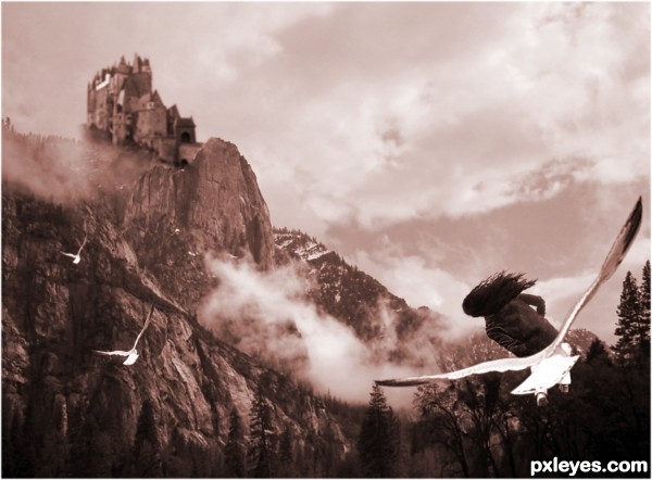
Idea is good, but the girl definitely needs legs (unless she's half human, half bird). If you flip the castle it will receive the same light as the mountains & I think you'll be better able to fix the main entrance (which is now fading away and has a bit weird perspective).
Now that I'm checking the composition (which is not bad), you may want to flip the mountain image, put the castle left on top (so it'll become higher) so you get a nice diagonal composition between the foreground (girl, right under) and the background (castle, right above). Just an idea. Good luck!
wazowaski, thank you for your constructive comment - I made the changes and it does look better thanks
I think the birds could be better not so symmetrically positioned in the air, for a more natural feel, IMHO.
Howdie stranger!
If you want to rate this picture or participate in this contest, just:
LOGIN HERE or REGISTER FOR FREE