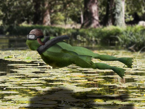
fat frogs flying past fast (5 years and 3711 days ago)
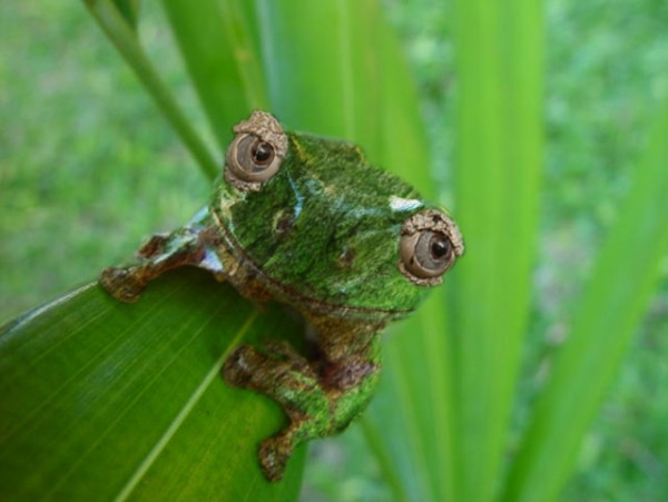
(5 years and 3737 days ago)
I really would like to see more done...
very nice. I didn't even realize that the skin was texturized with the bark until my son told me it was.
this is one of my favorites... its simple and creative... i think it would be cool to have a fly or something...
very nice 
great job! I like its expression, so grumpy and unamused LOL
Howdie stranger!
If you want to rate this picture or participate in this contest, just:
LOGIN HERE or REGISTER FOR FREE
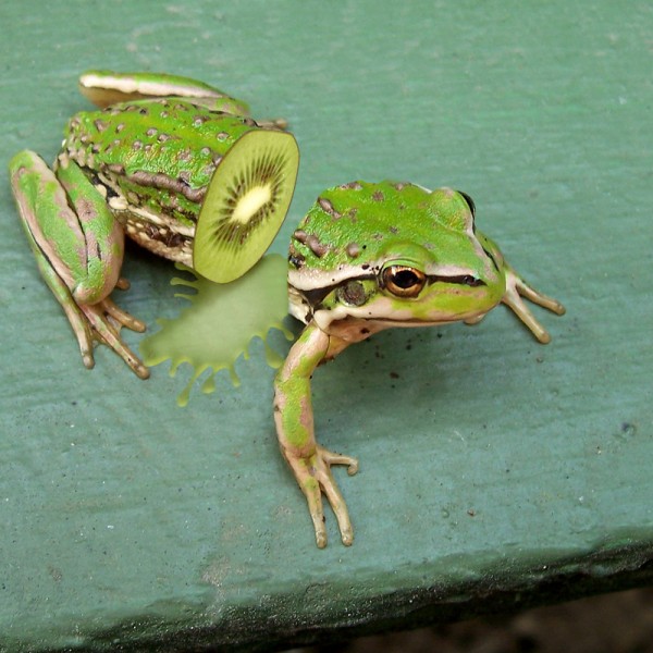
(5 years and 3741 days ago)
very good
This is such a wonderful image!! Great job!
simple, but it looks good.
this was my first idea. couldnt make it work , so i did another idea ;D
Nice & clean, splash looks good. 
nice idea ,highlight ur fluid with some hard dodge it will look more real , try it will really works. good luck
very nice............ntry.....................n clean chop................gl
this is actually amazing!
great job 
Yuk, fantastic work. 
This is too cool!. I think you have a winner. 
thanks everyone!!!!
Congrats for your first place, Jaescoe!
Congrats,nr1
Congrats on another 1st place! You've come a long way, Jaescoe. I bet you feel like a million bucks right now. 
Congrats 
congrats on 1st 
Congrats!
Congratulations!
congrats.
Howdie stranger!
If you want to rate this picture or participate in this contest, just:
LOGIN HERE or REGISTER FOR FREE
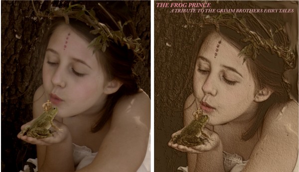
i really wanted this to look
like an old grimms fairy tale
page
and i used a million filters
brushes fade glow
dodge burn etc...
i am happy with the results
the little girl is my granddaughter
the frog and crown are from
sxc.hu (5 years and 3761 days ago)
i like the final outcome too..what ever filters you used it is a nice outcome.. GL
Good image, but too filter heavy...somewhere between step 4 and step 5 would have been better.
i agree cmyk46 ... so here is both, hope this is allowed
hard choice... I still stand by my comments.. filter heavy YES, but has that book cover look. BOTH images are nice GL with your choice.
I would pick one or the other...I like the less filtered look on the left.
IN low res it looks like it needs a contrast adjustment but in high it has a lot of detail so. I don't know. Maybe too many filters like CMYK said
Howdie stranger!
If you want to rate this picture or participate in this contest, just:
LOGIN HERE or REGISTER FOR FREE
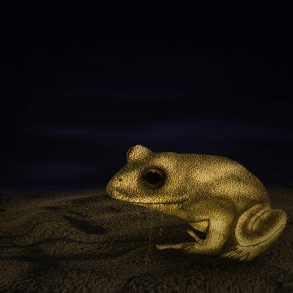
My first attempt at something like this... Thanks to Hatestock. (5 years and 3768 days ago)
Pretty dark, but well done...
Looks great!Very creative idea! (Maybe you can blur some of the edges)
nice work
Very original idea. Sand out of mouth is a nice touch.
Oh, love this froggy with golden highlights 
nice image
Howdie stranger!
If you want to rate this picture or participate in this contest, just:
LOGIN HERE or REGISTER FOR FREE
It's not fat :p
Make him plump ..lol...GL
Ok i think its plump no i hope you like it
Howdie stranger!
If you want to rate this picture or participate in this contest, just:
LOGIN HERE or REGISTER FOR FREE