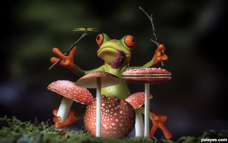
Froggy Rich could never find anyone to accompany him so he just sits in the woods and does his thing. His favorite jam, the theme from Hawaii Five-O (the original). (5 years and 1308 days ago)
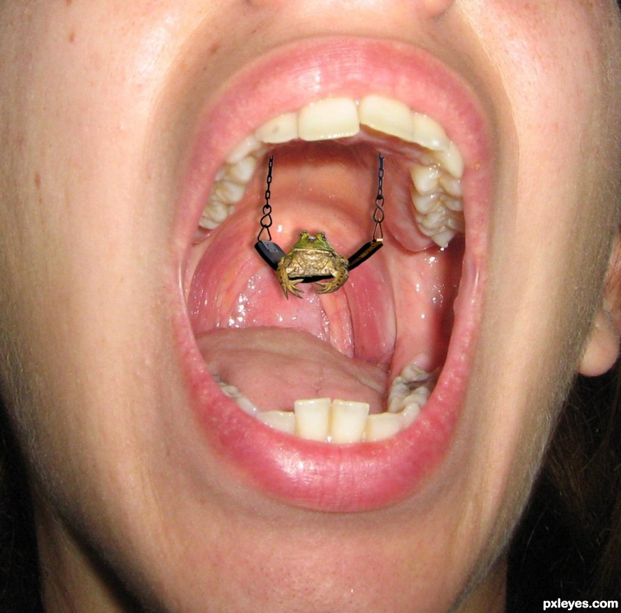
(5 years and 2510 days ago)
Howdie stranger!
If you want to rate this picture or participate in this contest, just:
LOGIN HERE or REGISTER FOR FREE
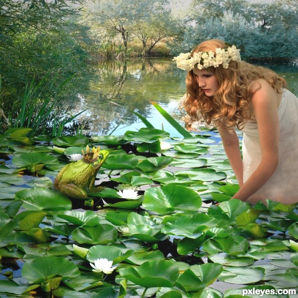
Thank you to the following at flickr.com: to ann althouse for the waterlily pond source; to gharness for the trees and water background source; to blurdom for the frog; to jeffgodfrey for the crown; (5 years and 2547 days ago)
Nice work, well done!
Good blend. IMO her gaze is focused in front of the frog, more on the white flower in front of him.
I like colorfull works! Well done composition! GL
I agree with CMYK here. Maybe move the frog forward a bit so it is in her line of sight. Other than that great work!
Frog prince has jumped all over the place already to get her attention! She finally opened her eyes and - voila- she now sees him!!! Thanks friends!!!
looks great!
Congrats!
Congrats again Lois  very well done
Congrats Lois!!
Thanks again, my friends, for your votes and nice comments.
Congratulation ! Well done and deserved! Wish you a nice week!
Thanks! And you, too Chrys.
Howdie stranger!
If you want to rate this picture or participate in this contest, just:
LOGIN HERE or REGISTER FOR FREE
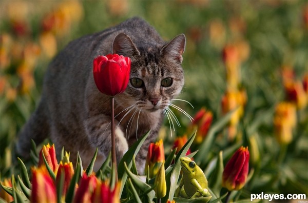
Blended with layer masking. Some photo filters and the dodge and burn tools used also. (5 years and 2568 days ago)
bravo!
Indeed, well done! The only thing I dont get well is why the white fur from the cat turned out a bit bluish. Personally I'd keep it (more to) the original color of the cat source. For the rest, nice masking! Good luck!
EDIT: imo looks better this way, author!
Thanks Waz, I made a subtle change to the cat color. Hopefully for the better.
wonderful work. really good. a big well done from me
Howdie stranger!
If you want to rate this picture or participate in this contest, just:
LOGIN HERE or REGISTER FOR FREE
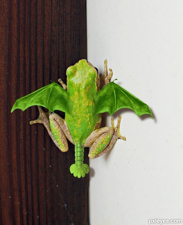
I want one! (5 years and 2604 days ago)
Pretty cool idea, not a bad job at all. If I could make one observation, that would be about the shadows of it's wings. Maybe lower their opacity slightly would help. Also you might add some wing shadow to the left foot of your frog.
The wing shadow's opacity is already lower than the body shadow in the source pic. Shadow added to leg.
Nice recovery on the shadow over the foot. Maybe it's me but there sure seems to be some noticeable differences in the man made shadows vs. the original. Especially on the white wall. 
A brief lesson on shadows: The closer a thing is to the surface upon which the shadow is cast, the darker the shadow. Notice the shadow of the frog body is darkest, as it is closer to the wall. The wings, being higher up, cast a slightly lighter shadow. To observe how shadows work, look at the foot against the white wall...the shadow is very dark right at the wall, and fades with distance.
It also depends on the nature of the light source as to how sharp a shadow is cast, assuming the light source you are 'using' is slightly diffused, you are pretty much spot on IMO; otherwise something that close to a surface would have sharper and darker shadows all around (depending on the nature of the surface)...
It looks as if you have tweaked the shadow since my first observation, for the better I might say. At least you made some shadow...lol
I think what was/is bugging me is the color of the shadow. The shadow area where the wing joins the body on the right side at the rear just beneath the wing itself, could use some attention IMO. (noticeable in the high res)
I like the chop itself and your concept. You've done a commendable job blending the wings and tail, Good luck author.
There was no tweak. It was fine the way it was.
Okay then....whatever you say man.
Very nice  GL
GL
nice blending of the body and the wings -- like the colour as well
Dragons and frogs! Awesome! I love it, and think you did a great job blending the wings and frog body.
very realistic ! Good luck author
Nice blending of sources.... good luck!
Well blended, good pick of sources. The simple division into two planes works very well.
Brilliant work. Awesome. Well done !
Congrats Bob!
Congrats!!
Congrats! 
Howdie stranger!
If you want to rate this picture or participate in this contest, just:
LOGIN HERE or REGISTER FOR FREE
Good one.
Thanks!
Make the dragonfly bigger... I thought he was a cymbal hehehehe Great job
Flying cymbal, lol
Cool
Thanks!
Fun, good idea, and use of source. GL.
Thanks much!
thanks!
congrats .. fabulous
Too kind, thanks!
Congrats again Randy
Thanks much!
Congrats!
Appreciated Bob!
Congratulations....
Thanks G!
Congratulations.
Appreciated!
Congratulations.
Congrats again Randy!!
Thanks Rein!
Congrats!
Thank you!
Congrats!
Thanks!
Congrats!
Thanks Ernie!
Howdie stranger!
If you want to rate this picture or participate in this contest, just:
LOGIN HERE or REGISTER FOR FREE