Extra Sources
http://www.sxc.hu/photo/268921
http://www.sxc.hu/photo/482033
http://www.morguefile.com/archive/display/19805
http://www.flickr.com/photos/wvs/2961075596/in/photostream/ (5 years and 3723 days ago)
10 Sources:
(5 years and 3729 days ago)
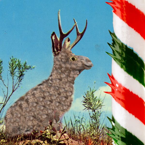
Sorry but i dont really see the point of the candy cane in this image, it just seems stuck on...
I could not understand little, you could put the step by step?
Howdie stranger!
If you want to rate this picture or participate in this contest, just:
LOGIN HERE or REGISTER FOR FREE
Big thanks to Mark Monciardini and his great tutorials...
hat aufge-STOCK-t-http://sed-rah-stock.deviantart.com/
Thanks for the lovely winter image...
(5 years and 3736 days ago)
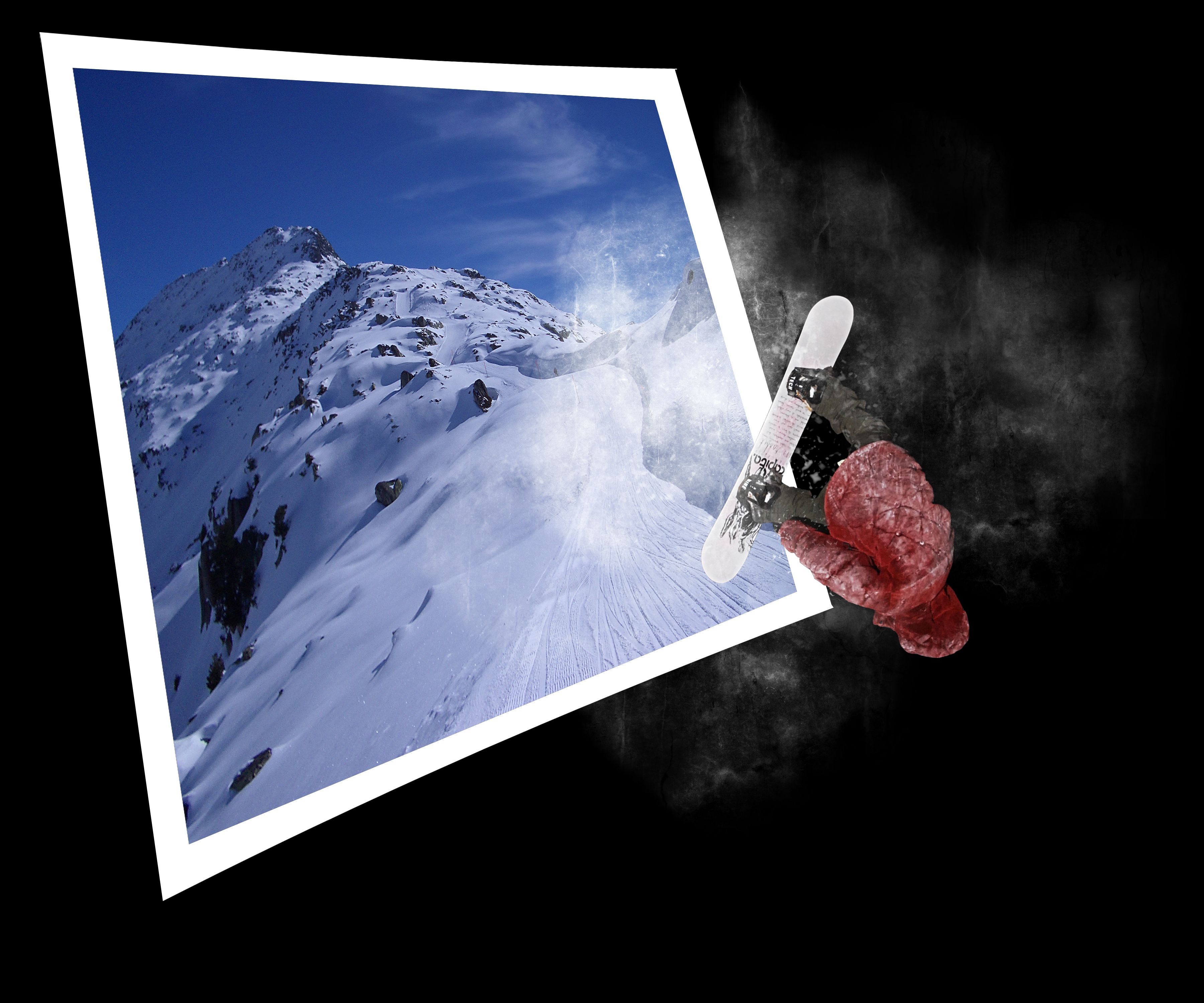
I was waiting for a copy of photoshop top secret... the snow in the black area looks more like a smudged hand print than snow dust...

i've seen this a lot
it is very nicley done but i do have to agree with jamesd
Make sure you mention the tutorial you used.
agrees with jaescoe.
its nice, but has been done more than i can count. would have been better to use the original bg of the image, and edit the snow boarder out, well done but not very original
don't just copy a tutorial. nobody's interested in seeing that. it's a big no no
Really nice!
This would have been kinda decent if he was actually jumping from the image provided. + the tutorial thing :S
personally i love OOB images, always have. But he doesn't look like he is actually coming out of the photo, you need to play with the angles more 
very good,gl
Congratulations for 3rd
Congrats for your third place, Erathion!
Very good work! congrats!!!!
Howdie stranger!
If you want to rate this picture or participate in this contest, just:
LOGIN HERE or REGISTER FOR FREE
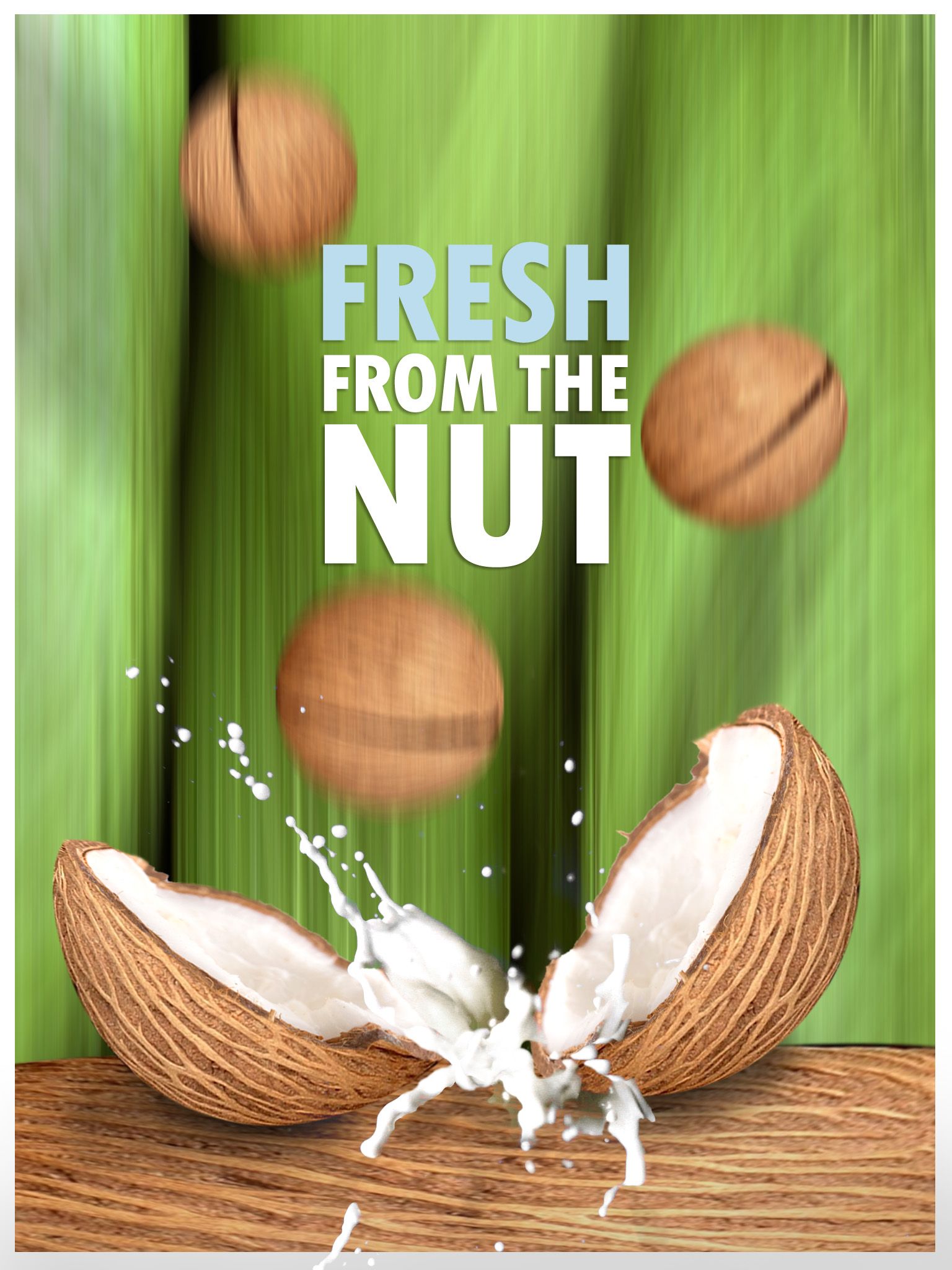
Coconut milk is fresh straight from the nut, enjoy!
thanks to obr_sandro's on sxc for the milk and Egahen on sxc for the coconuts insides (5 years and 3738 days ago)
it's in fact a realy fresh image too, the green, realy good.. only, a little thing, 'fresh' isnt exactly in the middle of the image, maybe u can fix that?
Edit: Changed text for a profesional look

Great work...looks so juicee....gl
i like this soo much , great work , just continue >>>
hey which font is that? it really looks 'fresh'
A sure contender. Such a great job you did with this one.
Thanks for your comments! I try to think of images that are not cute, note cliche, and as original as posible.
Howdie stranger!
If you want to rate this picture or participate in this contest, just:
LOGIN HERE or REGISTER FOR FREE
Texture by Princess of Shadows http://princess-of-shadows.deviantart.com (5 years and 3754 days ago)
I'm guessing you're still working on your SBS
EDIT: just for future reference, try the "Post entry later" feature. You can post your entry and SBS at the same time that way and no one can ever say, "HEY! Where the eff is your SBS?"
This is a nice work. Great imagination. Good luck author.
Thank you George! There it is the SBS jawshoewhah 
very nice!!
Nice!
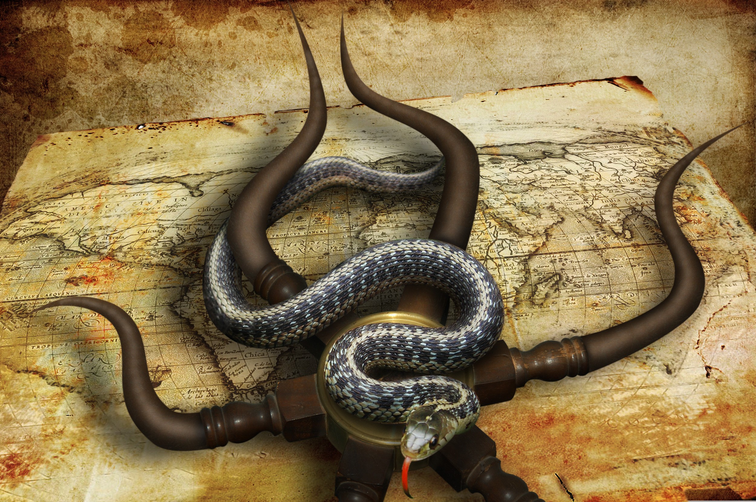
Really creative, the thing under the snake makes me remember an octopus :P
i like the idea of thiS and also the color choices. Good luck on your entry
An interesting idea Nator But I've been making too much photo-manipulation, so I wanted to create something from scratch, not all that beauty, just create  Thank you for the tip jawshoewhah!
awesome job
Very nice image, gl
great job
Amazing image!
greatt i like thiss... nice idea,
Very creative entry also very good execution....good luck to you author!
Congrats for your third place, Divair!
Congrats,
Congrats on another placement, divair!
Congrats for 3rd, Divair....
Congrats
Congrats, good work!
Congrats!
Congratulations!
Congratulations on the top-three place!
Howdie stranger!
If you want to rate this picture or participate in this contest, just:
LOGIN HERE or REGISTER FOR FREE
Photography and photoshop contests
We are a community of people with
a passion for photography, graphics and art in general.
Every day new photoshop
and photography contests are posted to compete in. We also have one weekly drawing contest
and one weekly 3D contest!
Participation is 100% free!
Just
register and get
started!
Good luck!
© 2015 Pxleyes.com. All rights reserved.


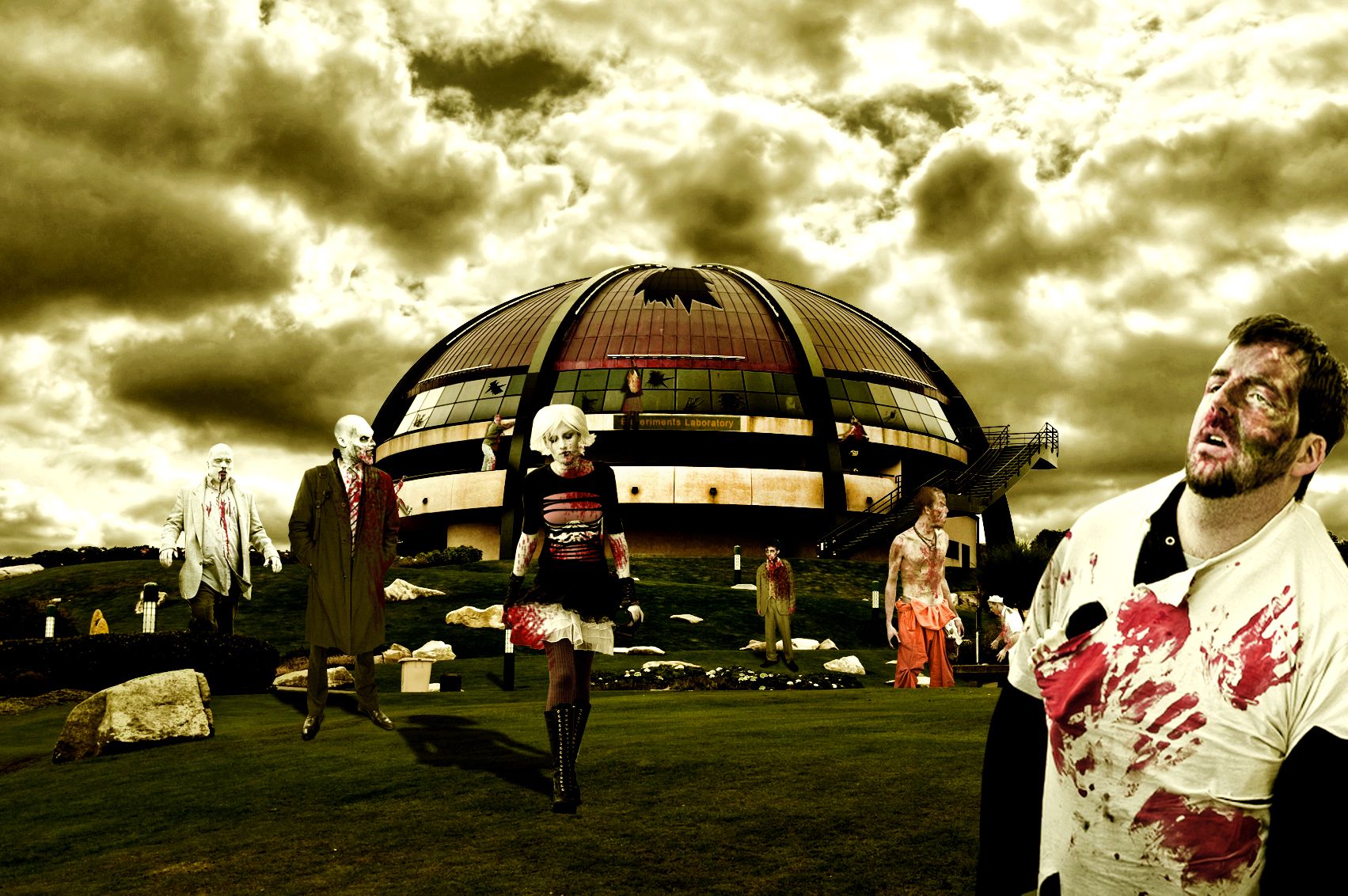
Now this looks like you took a lot of time on it. That's quite the collection of sources. Everything seems to appear correct so GL!
Nice compilation but the lights are a bit off, the shadows are on the front meaning the light comes from the back, how comes all their front part are really lighten? :P Good luck!
Lots of action here, nice job . GL
. GL
Thanks for all the comments!..and yes, i was busy doing everything else that i didnt even pay attention to the lighting problem..thanks akassa for pointing that out..but i changed it now..hope its better
Beautiful work....
Very nice work, GL
Very cool!
Shadow on girl in center is opposite her light source...figures in background are too big.
The proportion is wrong, the zombies nearer to the back are huge, but still.. nice mood.
Howdie stranger!
If you want to rate this picture or participate in this contest, just:
LOGIN HERE or REGISTER FOR FREE