(5 years and 2849 days ago)
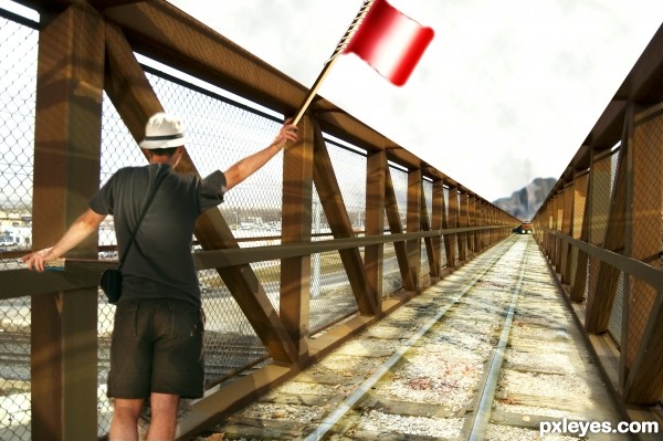
I used two external sources of man and train
thanks to
http://www.sxc.hu/photo/1331496
linder6580
http://www.sxc.hu/photo/913831
forwardcom
(5 years and 3326 days ago)
very nice ,i like the shadows that u made over the track ..good luck author.1 vote from me .......
Total three sources 
Thanks samanway 
very nice piece of work author...gl
I can almost hear the train
the alert flag waving guy looks very alerted almost panicky ...
good chop 
Thanks for your comments 
Howdie stranger!
If you want to rate this picture or participate in this contest, just:
LOGIN HERE or REGISTER FOR FREE
(5 years and 3709 days ago)
nice!
Great idea, try feathering the edges of your selections before turning them into new layers. GL 
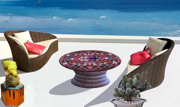
Not a bad idea but you really need to flip the coffee table. The light source and shadow are in the same place. Just flip it horizontal. Your edges on the seats could use work as well. Feathering would help.
Thank you for constructive comments, I fixed the edges and flipped the table. 
Looks better but I think the shadow for the coffee table would be bigger. Edges look good though.
left chair don't look realistic,work on that closer edge...this is nice work,and try to make him better...good luck author
Nice...
the shadowing's slightly unrealistic :/ great table though!!
Howdie stranger!
If you want to rate this picture or participate in this contest, just:
LOGIN HERE or REGISTER FOR FREE

(5 years and 3822 days ago)
nice .gl
This work look's more on the web site,but well done
it doesn't really say much about the actual website or anything it does, but the visuals are nice. Good luck.
Beautiful image, I think you have missed an 'e' from Create
the visuals are great, but this is more like a book, not a magazine imo.
 GL
GL
nice work author, i like that you did you own thing 
nice work.
Nice!
nice 
Howdie stranger!
If you want to rate this picture or participate in this contest, just:
LOGIN HERE or REGISTER FOR FREE
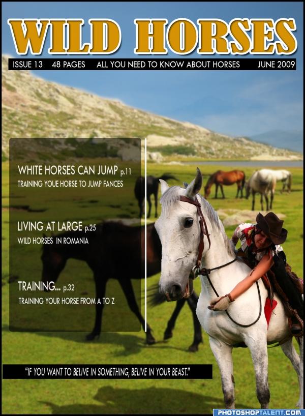
This is a fictional front cover of a magazine. I used two fotos(and that are made by me). Hoppe you like it. It sure was fun making it. (5 years and 3945 days ago)
whole lot of fun.. good luck!!
If this were a real cover, the type would be better under the logo and on the mountain, rather than in a ghosted box that obscures the main image. The line at the bottom would be better in white against the background, not in a black bar.
Great use of the source...Sorry but I'm a stickler about spelling...You misspelled "Training Your Horse To Jump Fences" Definitely on theme  Good Luck
sorry about the spelling mistakes.I'm not english, but i will do my best to overcome this problems.
good idea. reduce the size of the box.
thank you guys for your advices, but your missing the point. If this would be an actual magazine it would have more text on the cover, because the photo would be presented inside the magazine without any alterations. But thank you for your input.
i like this cover
i like it 

Faza cu caii salbatici din Romania face toti banii, tine-o asa.
mersi billyboy. bafta
Howdie stranger!
If you want to rate this picture or participate in this contest, just:
LOGIN HERE or REGISTER FOR FREE
Well done, my favorite in this contest =)
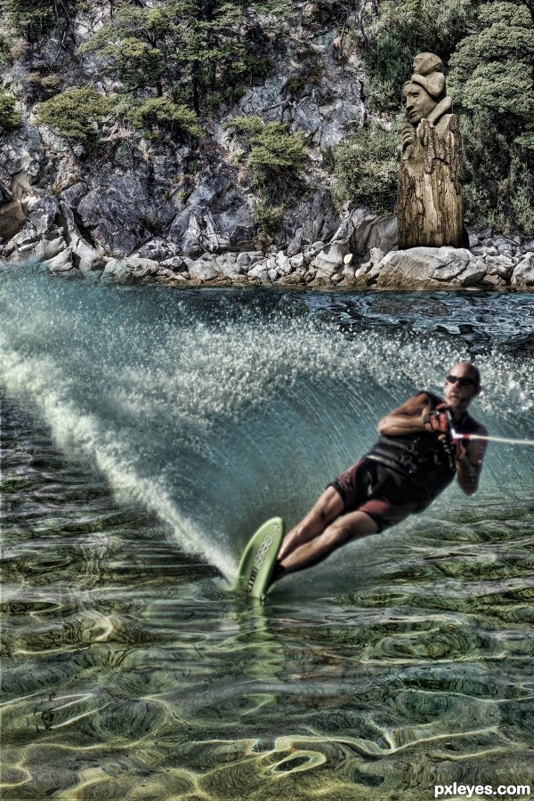
everything perfect, but I think the trail behind must be broader. I live in a seaside town. just my opinion
Howdie stranger!
If you want to rate this picture or participate in this contest, just:
LOGIN HERE or REGISTER FOR FREE