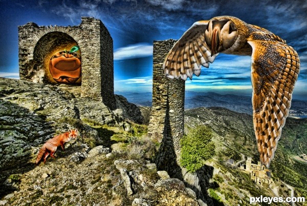
(5 years and 3083 days ago)
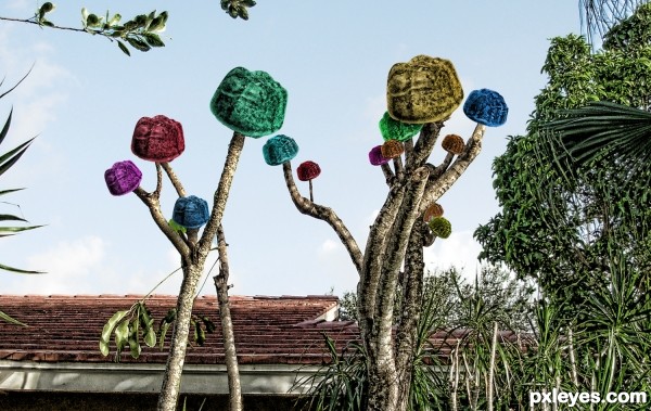
(5 years and 3138 days ago)
nice entry
Howdie stranger!
If you want to rate this picture or participate in this contest, just:
LOGIN HERE or REGISTER FOR FREE
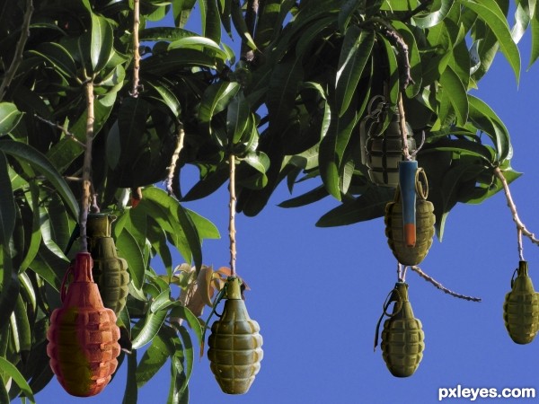
Only dangerous when ripe. :)
IMAGE EDITED: Watch out, there's a ripe one now! (5 years and 3141 days ago)
LOL! They still look too green to pick...Great image!
agree with MossyB, make some red ones for picking... and "booom!" 
but seriously, change the sky to real sky and make better 'shadow-n-light' of the grenades 
Aheman, check the source photo...that IS the real sky. And if you check the source pics of the grenades you'll see there's plenty of light & shadow added. Enough for me, anyway.
Howdie stranger!
If you want to rate this picture or participate in this contest, just:
LOGIN HERE or REGISTER FOR FREE
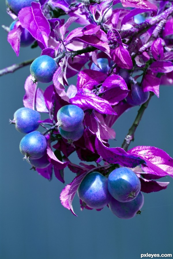
(5 years and 3152 days ago)
Wild colors! Blue crab apples would make some interesting apple butter, for sure!
Not sure if this qualifies as "realistic"...
"Realistic" is not the same as "still looks like a REAL photo..."
"...you can clone out or add in, change colours, apply filters ... generally ENHANCE your own photos."
The author changed colors, but it still looks like a real photo.
I guess the key is that the apparent starting point for the enhancements must seem to be a "REAL photo"—but Photoshopping could occur anywhere along the way. This image certainly fits the bill.
Very interesting change!
Howdie stranger!
If you want to rate this picture or participate in this contest, just:
LOGIN HERE or REGISTER FOR FREE
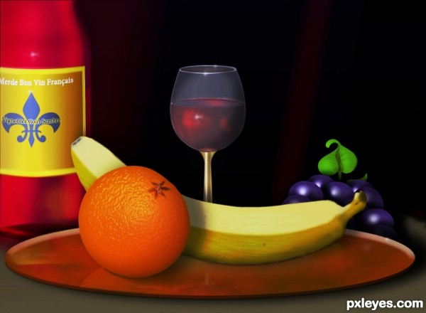
Made completely with CS5 (5 years and 3158 days ago)
Great job on this, wine glass, orange and banana especially. 
The wine in the glass does not look like a clear liquid, so much as paint inside the glass, because of the bluish/gray lighting on the bottom, while the inside of the glass shows a darker red with no gray tones. Likewise, the light grayish coloring above the wine and even lighter along the top far edge of the glass looks out of place for something transparent.
MossyB your observations (duly noted), seem to be based on your belief that my glass was intended to be totally transparent. It was never meant to be. From my point of view, I wanted it to be a translucent blue-gray color. As for the wine looking like paint...well you are entitled to your opinion. I however seem to think it is somewhat clear or liquid looking, seeing how dark the back ground is. I did however make a change to attempt making the wine a little more see through if you will.
This is fantastic work author...every single element is made very neat and final product is perfect...best of luck
Great work!

Howdie stranger!
If you want to rate this picture or participate in this contest, just:
LOGIN HERE or REGISTER FOR FREE
nice work!
Howdie stranger!
If you want to rate this picture or participate in this contest, just:
LOGIN HERE or REGISTER FOR FREE