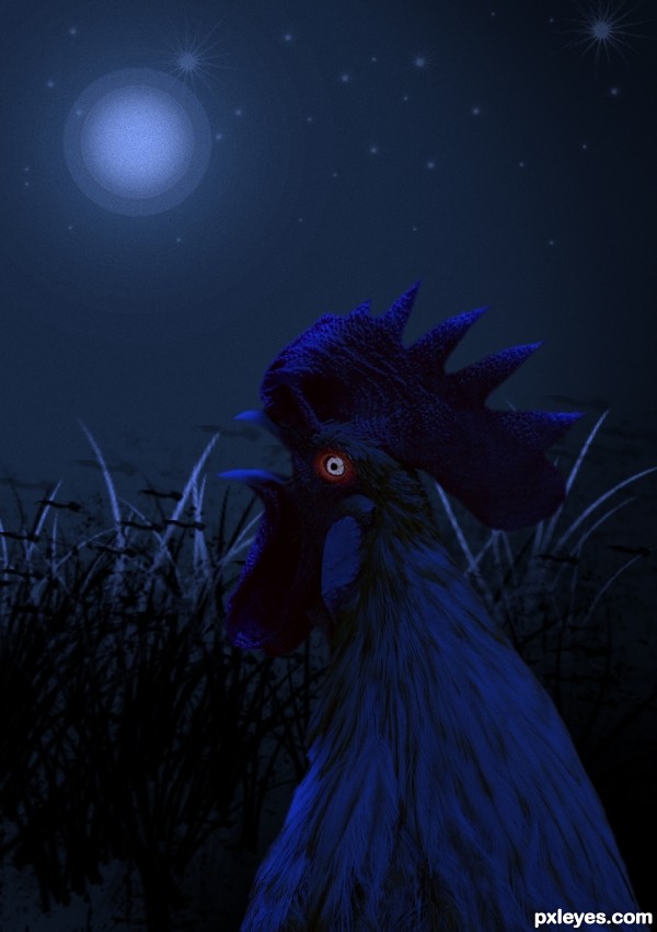
Rooster given a blue make-over with a background created with photoshop tools (5 years and 3566 days ago)
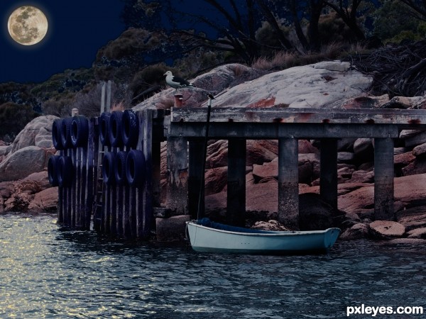
supplied iamge and 3 of my one
1. dingy
2. sea gull
3. moon (5 years and 3572 days ago)
Nice image, but needs a better masking among branches and around the trees. 
Pretty nice image couple of things to look out for future reference the seagull is to sharp the edges would need to be softer,and the moon is an odd color and takes the realism a way from the scene plus the glow would be a bit more apparent than it is at the moment.
Good idea, but too much color for a night scene.
pretty decent
The landscape colour is pretty ok if the sky would be a bit lighter shade.. at least here in Finland at summertime you can have that kind of landscape easily. But the masking is pretty sloppy, especially with the trees.. should be way better on this level entry..
Howdie stranger!
If you want to rate this picture or participate in this contest, just:
LOGIN HERE or REGISTER FOR FREE
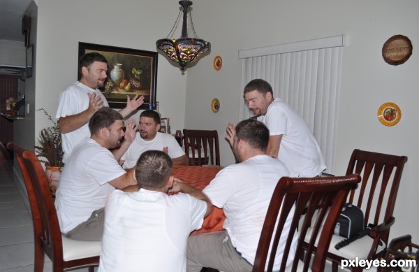
Auto align layers, mask .
I used my own photos. (5 years and 3597 days ago)
great...! love this one...
awww man u stole my concept  , very well done however
great idea author...good luck
author.. while it is OBVIOUS you took all seven images please place the uncut ones in your SBS (it would be a shame to have this pulled on a simple guideline)
BTW (SUPER DUPER JOB!!!!)
? Howcome the other one was pulled?
my mistake
thats good
Fantastic concept....well executed...good luck
Funny and interesting! 
*lol2* clever. A higher res would improve your score BTW. GL!
Ha-ha, very funny and nice blending 
Congrats for your third place, Jojeda!
thank u everybody for ur votes
Congrats! 
Howdie stranger!
If you want to rate this picture or participate in this contest, just:
LOGIN HERE or REGISTER FOR FREE
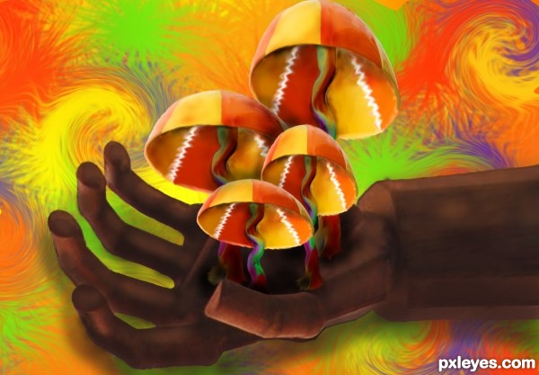
hehehe. i couldn't resist.
only source picture used. (5 years and 3662 days ago)
I love this work , good luck author
Mushrooms ...
...
Nice. I like it.
Good luck on this very psychedelic entry.......Trippy
*giggle* yes. mushrooms.  it was a fun image. thanks for all the comments guys!
good luck 
Howdie stranger!
If you want to rate this picture or participate in this contest, just:
LOGIN HERE or REGISTER FOR FREE
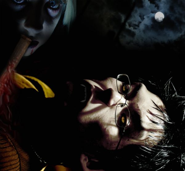
liquified the source image to change facial features slightly, colorized to change skintone, illustrated teeth and eyes and turned down the opacity to soften the layers....added the other 3 sources for final effect. Unfortunatly the full moon is not the lightsource couldn't quite work it.
(5 years and 3694 days ago)
The blood looks quite unnrealistic and it looks like the woman is eating the stake...also, I'd agree to try what Nator suggests.
nice idea but i think the man should be vertically placed 
it does look like the stake is being eaten.
Howdie stranger!
If you want to rate this picture or participate in this contest, just:
LOGIN HERE or REGISTER FOR FREE
things aren't so blue during nighttime. i'd suggest desaturating the image a bit
hahahahanow this is cool!
the moon looks blue...?
Nice, but using a real moon would make it better.
Howdie stranger!
If you want to rate this picture or participate in this contest, just:
LOGIN HERE or REGISTER FOR FREE