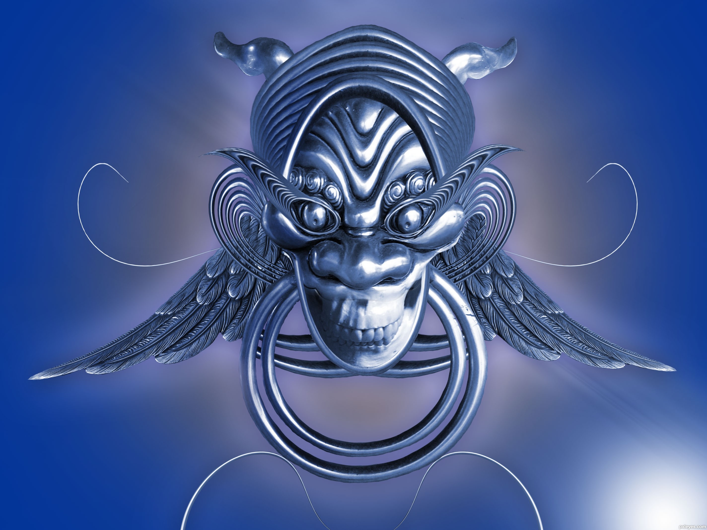
Please see in High Resolution. (5 years and 3660 days ago)
Heh, I spent most of the time actually thinking of the idea rather than on the work itself.. Although I did have fun making this one.. Enjoy :) (5 years and 3660 days ago)
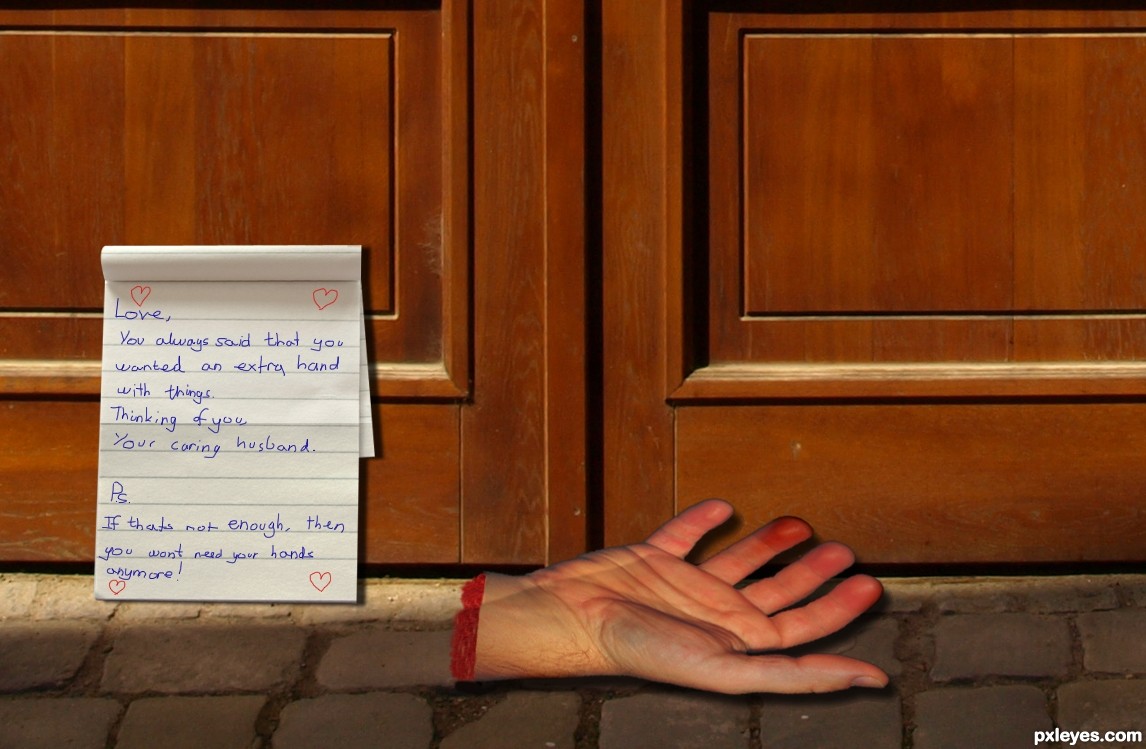
Not bad at all, but according to the text not threatening enough, imo. What if you change it a little bit that i.e. the wife (I guess) demands from her hubby to be more a helping hand at home instead of help his friends to get rid of money that has been spent on beer and such? And then the hand is from one of his friends. Just an idea  . Good luck!
Hand is a bit distorted... 
Howdie stranger!
If you want to rate this picture or participate in this contest, just:
LOGIN HERE or REGISTER FOR FREE
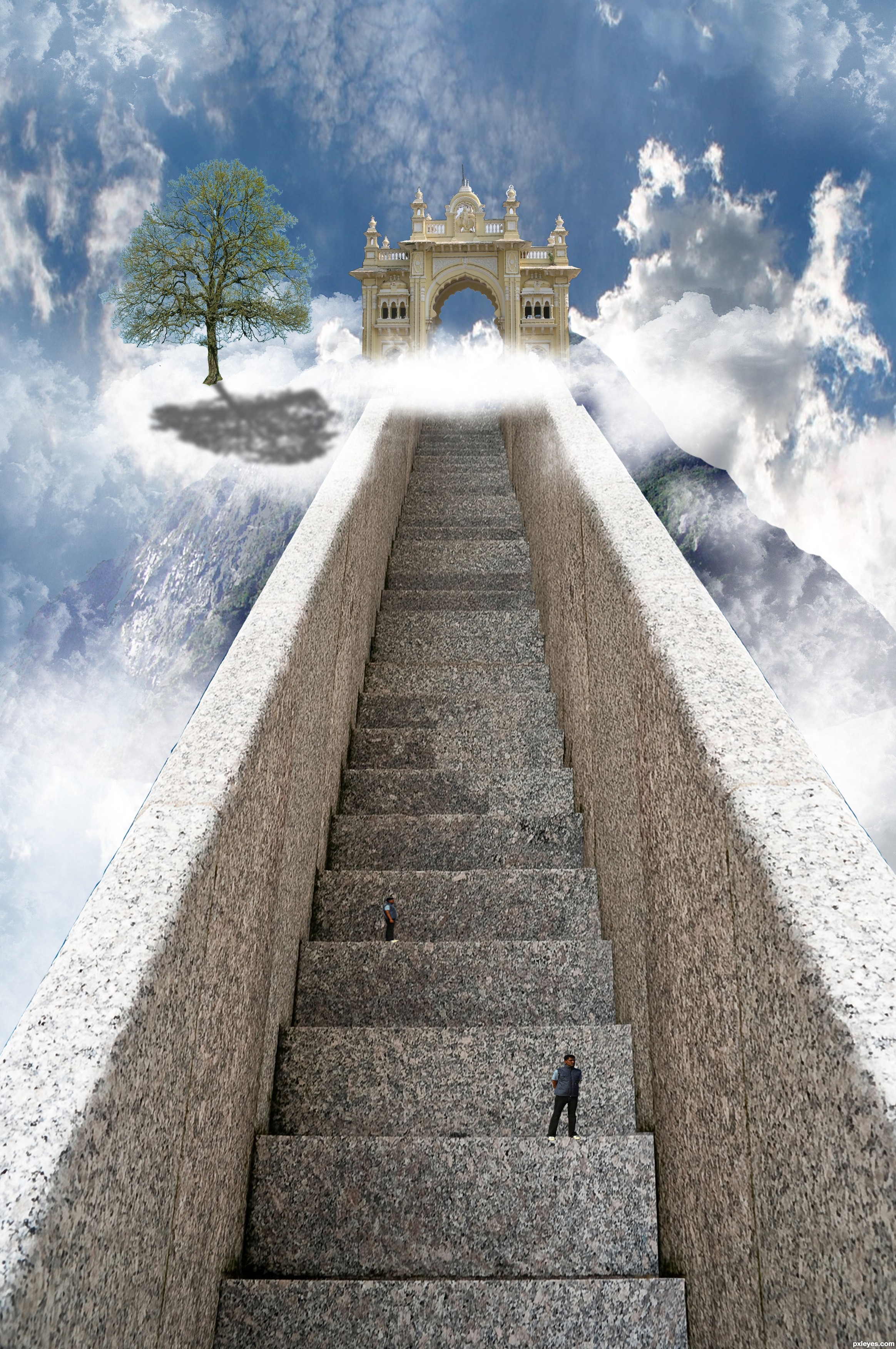
Well, this one took me quite a long time.. But it was quite simple to make..
I gave the stair a right side by copying and then transorming into shape..
I then took the gate and cut that out using the pen tool, did the same for the mountain.
I put it all together and at the end added some clounds and people which I cut out using the quick selection tool.
I also added a tree but I'm sorry but I cannot find the link to the image anymore..
Hope you like it and Thanks to asifthebes for images 1 and 2. (5 years and 3685 days ago)
GO WEST!!! pet shop boys.. hehehe..
I think if you move move the gate over to the left a little more and lighter the tree shadow it will look much better. Imo it feels like something is missing but I can't put my finger on it. Overal it is a well thought out entry. gl
I agree about the tree shadow. Maybe give it a gaussion blur and bring the opacity down. I'm a little confused at the clouds that follow the steps to the right? Also, I would get rid of the top guy that looks exactly like the bottom guy. Fix those and this will be very nice!
Thanks for the advice, it was taken on board
I agree with the shadow, but instead of lowering the opacity the shadow should be broken up with the texture of a cloud. I would also finish masking the arch way and soften the edge of the "mountain" on the right side. Great entry. Good luck!
The brightness of the right front of the tree seems inconsistent with a light source coming from behind the tree. There's an inexplicable notch in the right railing near the top. (Using the Clouds filter to create a mask for the tree shadow might help 'wispify' it.)
This looks great
not to many people getting into heaven lol... nice work author
lol @Keiley22 I wish I could favorite your comment
beautiful ....
Very nice job, only thing that I think of is that the person further up and away is taller than the stair, with perspective in mind, that person must be huge comparing to the person standing closest to us. IMO...Otherwise - really nice job!
sunzet, you are very correct, thanks for the notice ill change it
GL
Howdie stranger!
If you want to rate this picture or participate in this contest, just:
LOGIN HERE or REGISTER FOR FREE
(5 years and 3723 days ago)
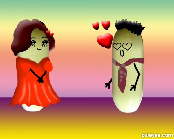
creative usages of the pills
this is cute well done author
What's panadol? A medicine?
Nice try.....
thanks to all , yes erikuri it is a medicine ^^
That tie is so funny!  great job!
funny
great title and great job! (still laughing!)
Howdie stranger!
If you want to rate this picture or participate in this contest, just:
LOGIN HERE or REGISTER FOR FREE
(5 years and 3728 days ago)
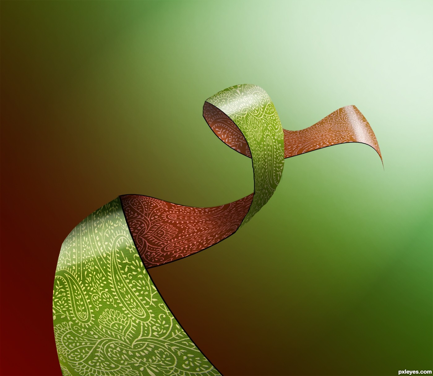
GREAT Idea.. now add a MOBIUS Strip.. woo hoo.. GOOD LUCK
I like this a lot, I love to play with ribbon type imagery myself. I don't want to call it simple, more like elegant. Like the juxtaposition of inside and outside of colors.
just a few TINY things... where the first turn is, they don't line up perfectly, there is a bit of line that's sticking up, and on the curve coming down from the top (in the brown part) is sort of angled and not smooth. Most likely you had too many anchor points when you used the pen tool. The highlight on the bottom, closest curve could be a little more gradual , but it's not a big deal.
Over all, Really visually interesting, good job!
Very good idea! =)
nice idea and nice result 
very cool work author...gl
i think the background should be a little bit more contrasting. with blue or pink
simple but beautiful
thank you all for comments and suggestion. However i coudnt fix the image , because i didnt had the psd file after i submited. Thanks anyway
Nicely done, love how you did this.......Very effective!
Congrats for your third place, MrHack!
Congratulations for 3rd
congrats
Congrats! again for 3rd place
congratulations!
Congrats!!
Congratulations!!!
Howdie stranger!
If you want to rate this picture or participate in this contest, just:
LOGIN HERE or REGISTER FOR FREE
Photography and photoshop contests
We are a community of people with
a passion for photography, graphics and art in general.
Every day new photoshop
and photography contests are posted to compete in. We also have one weekly drawing contest
and one weekly 3D contest!
Participation is 100% free!
Just
register and get
started!
Good luck!
© 2015 Pxleyes.com. All rights reserved.


Good image and color! Please post source links.
cool!
Excellent shapes! Lovely work
Yes this is good
Super cool! Looks like a heavy metal's pendant All Iron Maiden's fans would be proud to have it
Howdie stranger!
If you want to rate this picture or participate in this contest, just:
LOGIN HERE or REGISTER FOR FREE